Russell Hunt

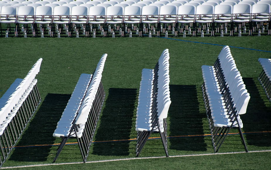
August 2026 - Highschool graduation seating
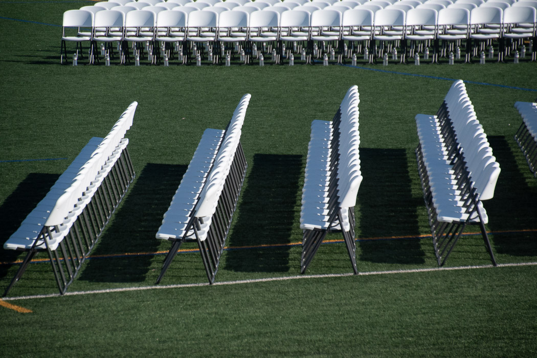
Original
About the Image(s)
1/8000sec @ f6.3_ fl170mm_.33ev_iso 1000.
Processed in Lightroom. Converted to monochrome.
4 comments posted
A well seen subject. An innocent set of seats that look very different without people sitting on them and spoiling the photographer's view. :)
However, I prefer the original, coloured version. I like the set of seats at the top which are almost perpendicular to the other seats. They also act as a 'stop' and hold the eye in the image. The angle of the seating is also more prominent as you looking at 4 sets of seats rather than just the three. Also, and I don't know if it's how I'm viewing it on the monitor but the processed version does not look as sharp. Posted: 08/07/2026 15:46:13
However, I prefer the original, coloured version. I like the set of seats at the top which are almost perpendicular to the other seats. They also act as a 'stop' and hold the eye in the image. The angle of the seating is also more prominent as you looking at 4 sets of seats rather than just the three. Also, and I don't know if it's how I'm viewing it on the monitor but the processed version does not look as sharp. Posted: 08/07/2026 15:46:13
Interesting contrast in black and white. I like the lines on the field that draw our eye back and forth horizontally. The grouping of three rows is effective. I would have liked to see all of the shadow in front of the first row. Possibly a crop starting with the second row of the original image and then using content aware or cloning to eliminate the angle of the original first row would do that. Posted: 08/08/2026 23:57:17
I notice you were at 1/8000sec and ISO1000. Seems like you were dipping way into the ISO bank to cover your shutter speed. Had you been at a lower shutter speed, 1/125 - 1/250sec say, your ISO would have been in the 100 - 200 range giving you more room to play with the contrast. I've done this myself in the past and then struggled in post.
Consider playing with the Texture or Clarity sliders. I agree with Steven, it seems to have lost something in sharpness when you converted to B&W. Posted: 08/12/2026 21:07:31
Consider playing with the Texture or Clarity sliders. I agree with Steven, it seems to have lost something in sharpness when you converted to B&W. Posted: 08/12/2026 21:07:31
Hi Russell, Well spotted image, thanks for including the original coloured image, I think the original has more contrast and is a better shot than the converted one, the first 2 rows have great shadows and the legs of the chairs all in line look great, the horizontal rows across the top with all those water bottles and shadows show great contrast, when you have cropped and converted, I think you have lost sharpness as it is the horizontal chairs that are in focus and sharper. I had a play with image,(cant help myself sometimes) if you don't like me doing that please say so. Posted: 08/13/2026 12:27:54