Suzanne Wacker
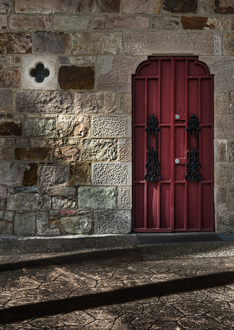
October 2026 - St Stephens Cathedral
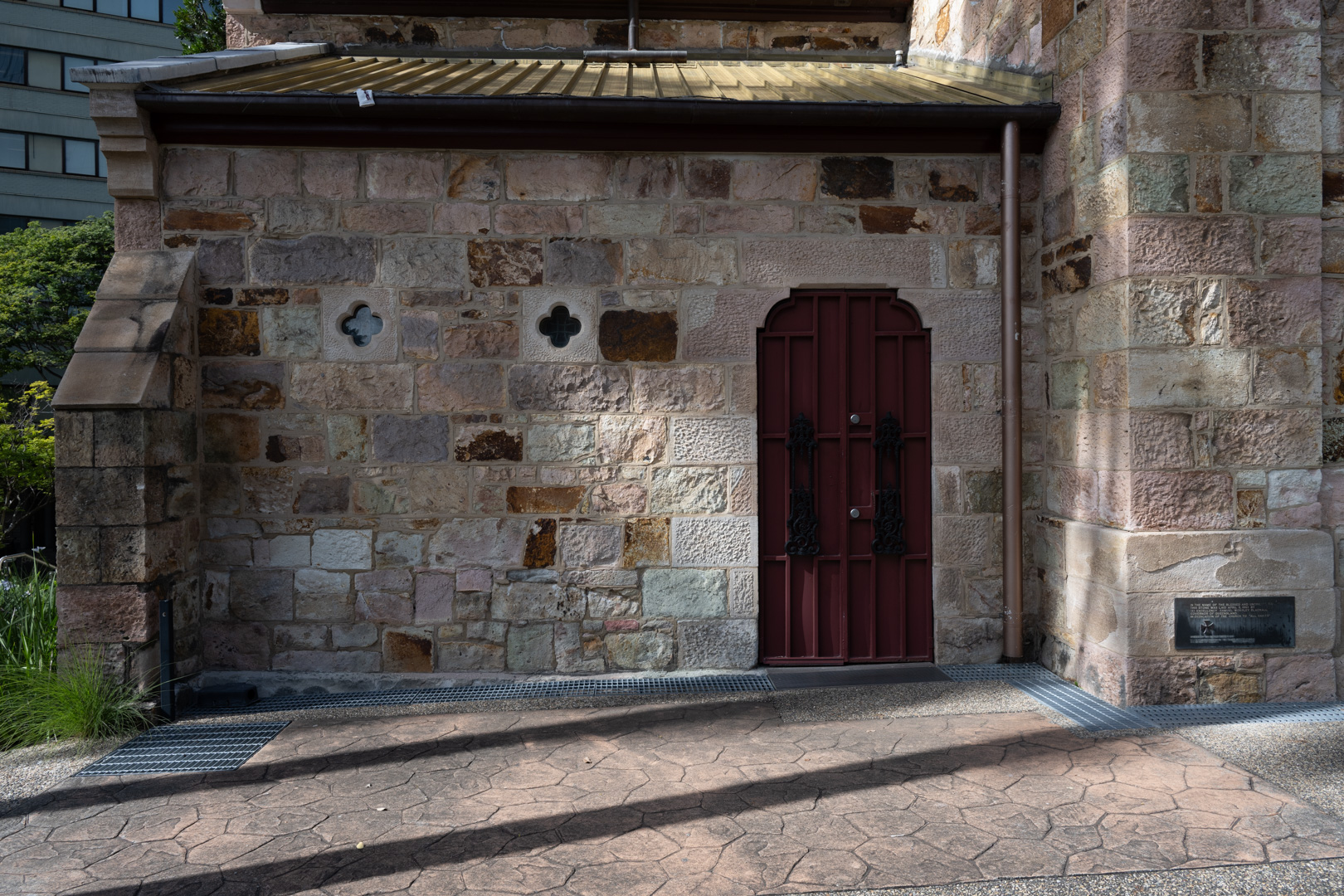
Original
About the Image(s)
I was drawn to the colour and textures, as well as the shadows. I increased clarity and saturation, while also deepening the shadows. I'd love to know everyone's thoughts on whether I can improve it further.
Nikon Z7II, Nikkor Z 24-120mm f/fS, f/10.0, 1/160, ISO125, 26.0mm
2 comments posted
Hi Suzanne, I like what you saw in this image. The light is coming in at an angle creating an enhanced texture in the stonework and the color of the door creates some interesting color contrast. Noted you have removed the metal grating which helps take us back in time. You have gone for increased contrast in the foreground and the diagonal shadow is now very black. Actually I thought there were two steps initially. I would question the need for that so maybe just crop off the bottom shadow. Posted: 10/01/2026 04:32:00
Suzanne, I think the tighter crop works very well and really brings attention to the red door, beautiful stone textures, light, and shadows. I would not increase the clarity or saturation any further. I might slightly open the deepest shadows to retain a little more detail.
Overall, you did a very nice job recognizing the photograph within the larger scene. The crop transformed a busy architectural view into a much more intentional image about light, texture, color, and shadow. Posted: 10/02/2026 00:58:23
Overall, you did a very nice job recognizing the photograph within the larger scene. The crop transformed a busy architectural view into a much more intentional image about light, texture, color, and shadow. Posted: 10/02/2026 00:58:23