How I Did It:
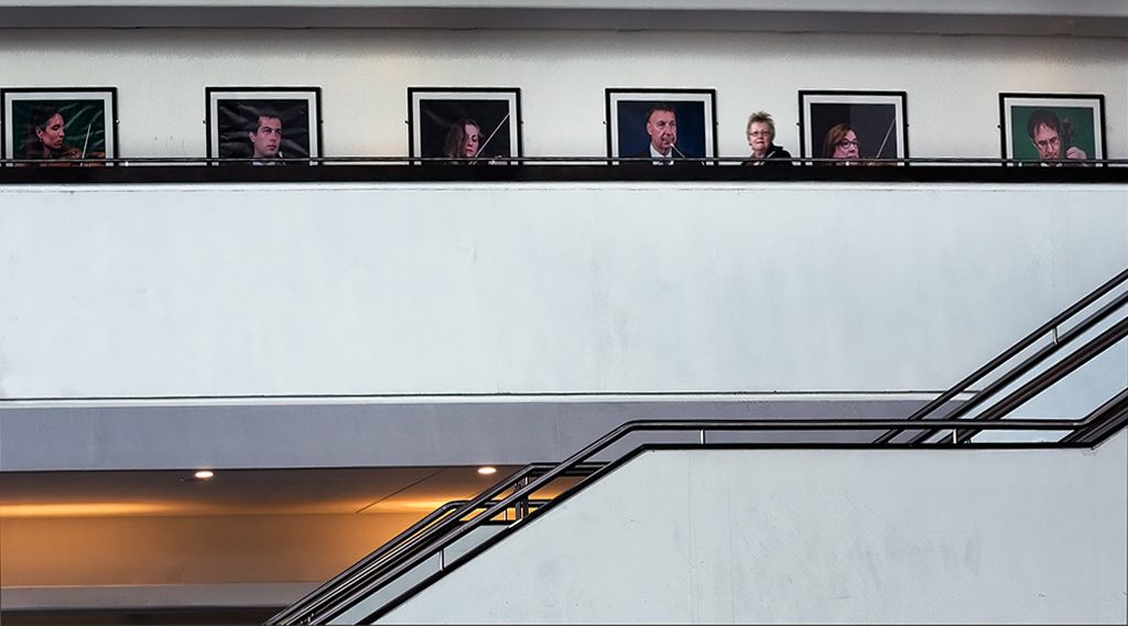
This was taken in the Sage Centre in Gateshead, North-East England. Gateshead is the town which lies directly across the River Tyne from the City of Newcastle. The Sage is a very modern building housing two auditoriums, a gallery and various other attractions. I spotted this lady (actually a friend) looking over the balcony and fitting in between the portraits on the wall behind her. You can see the modern architecture which I thought added to the composition. Taken in November 2019, camera was my Lumix GF1 with the Lumix 14-45 zoom lens at 45 mm (90 mm equivalent). Exposure was 1/25 at f/8 and ISO 200. Back home in ON1 RAW, I evened up the lighting, brightened the whites and adjusted the contrast using Curves, before cropping to cut out some of the staircase at the bottom
7 comments posted
Dr Isaac Vaisman
Guy, I see this image as a juxtaposition of geometric images, which monotony is broken by the presence of your friend in the upper level. Well exposed and sharp. The diagonal lines created by the stairs handrail takes us to the upper level. Posted: 11/01/2026 17:46:42
Erik Rosengren
This image offers a good leading line, proper color and tack sharp. I agree with the remarks that Isaac recorded. I took the liberty to straighten your vertical lines. I believe that change provides better balance as well. Posted: 11/03/2026 19:41:53
R Gary Butler
Guy, I think Erik was headed in the right direction when he fixed the horizontal lines. But in this case, you do lose a little bit by losing the color and the dimension of the portion of the wall is above what I will assume is the sconce lighting. I think I would've fixed the lines and then added to the canvas on the left side and then duplicated the darker portion above it across from right to left. I think this would give the overall image a little more depth. Posted: 11/03/2026 20:56:42
Ian Chantler
Hi Guy
Another picture with geometric shapes which as you know I so love, I think the pano crop is a perfect choice the orange works so well it is not over saturated but very muted so it adds great contrast to the image without being overpowering,the stairwell leads the eye so well to the top level and allows the eye to scan across the upper level, so well spotted and composed. Posted: 11/06/2026 12:01:32
Vella Kendall
The addition of your friend turns a static geometric image into a delightfully fun image. Good use of angles. Posted: 11/06/2026 17:45:16
Bill Buchanan
I agree with Erik's assessment with the horizontal lines. What bothers me is the area in the lower left corner which in my opinion is out of character with the monochromatic tone of the image. I ask if the composition was moved to the right side and include the rest of the staircase. Posted: 11/08/2026 13:00:50
Guy Davies
Thanks Bill. I should have moved the view to the right. Posted: 11/09/2026 17:33:03