Karen Botvin
November 2025 - November Tulips
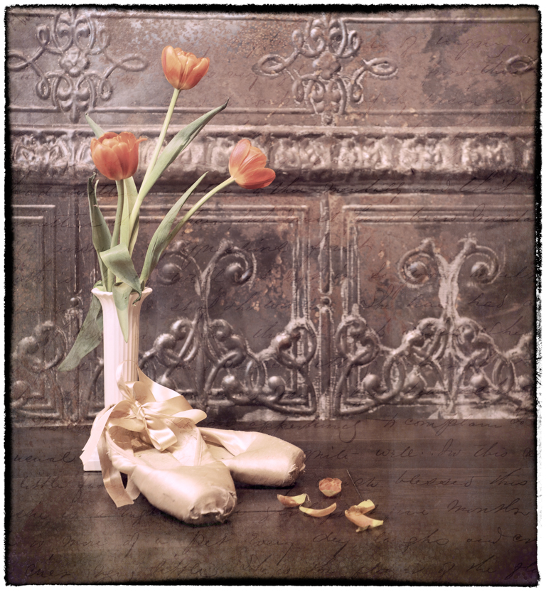
Original
About the Image(s)
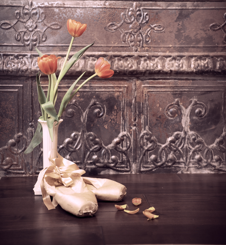
To all whom commented on my owl last month and I didn’t respond, I’m sorry but I was struggling with COVID. I had been lucky enough not to have gotten it all this time, but it finally caught up with me. At any rate, I’m feeling better and trying to get back into shooting since the weather is changing. This month’s image was taken at a workshop on still life that I attended with my camera club. The speaker brought all the props and we created our own stills. Actually, it wasn’t the easiest to create on the spot with someone’s props. A learning curve for sure! The background on this image was a piece of tin that had an orange tint to it. I thought the peachy tulips would look great with it, but after I shot it, the tulips got lost as the colors were too close. I desaturated the background a bit in LR and also used the Vintage 03 profile. I took it into PS and added 2 textures; one a , and one a grunge. Then I took it into NIK and added the border. This was shot from a tripod with a Lensbaby Velvet 28mm lens. Since they are completely manual and don’t record the lens info, I’m guessing this was around f/4. My ISO 320 at 1/20 sec. Personally, I wish my camera would have been lower so that all the flowers would have been above that border on the background, but I’m only seeing that now. Comments always appreciated.
3 comments posted
Sorry to hear about the virus onslaught and hope you have come out on top. Posted: 11/11/2025 01:18:30
I, too, prefer the original image to the processed image in that the processed image appears (to my liking) too soft and about 1/3rd to 2/3rd stops too bright. I also agree with you that your point of view should have been slightly different since 2 of the 3 tulip heads are in direct alignment with the busiest section of the background - the horizontal scrolling. There's not enough contrast between them to visually separate the flowers from the background.
I'm certain it was a fun day of still life photography. There certainly is a learning curve, but that's also the part of the joy of photography. Posted: 11/15/2025 20:04:28
Hope you are now immune for a long time now! Posted: 11/18/2025 19:10:20