Martin Newland, QPSA  


Repetition by Martin Newland, QPSA

July 2025 - Repetition

July 2025 - Martin Newland, QPSA

Original

July 2025 - Martin Newland, QPSA

Original 2

About the Image(s)

I looked at the upcoming competitions on our Camera Club calendar and saw that "Repetition" was on the agenda.
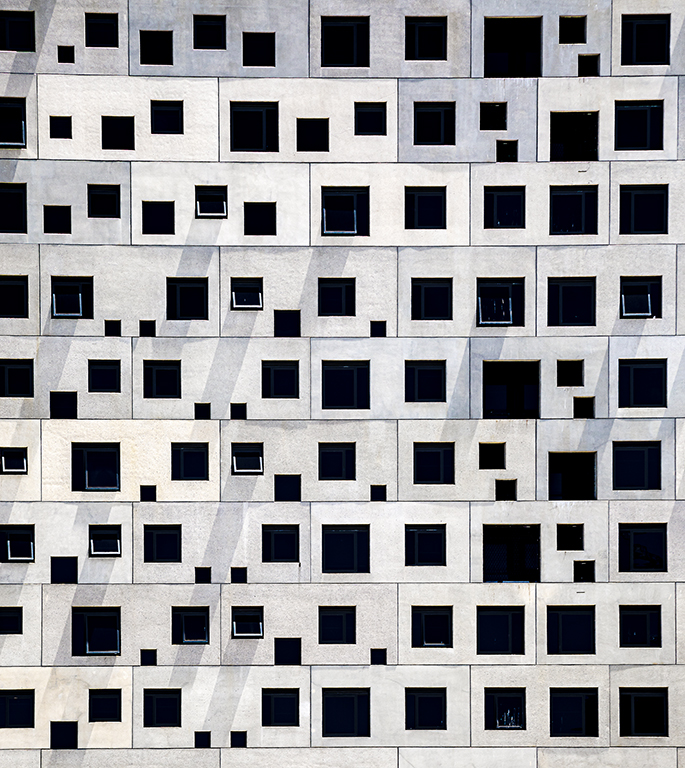
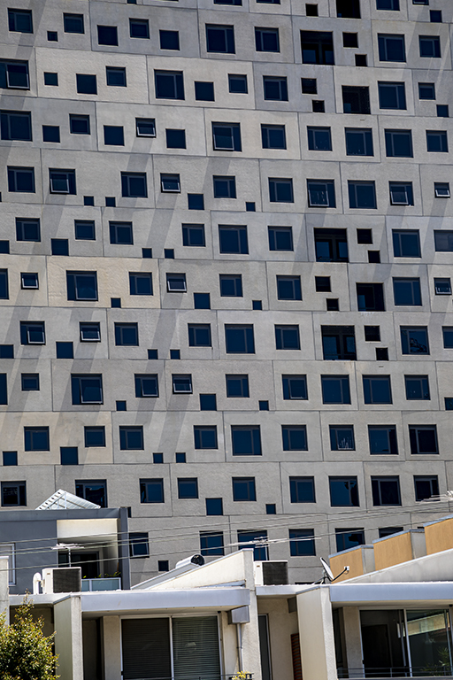
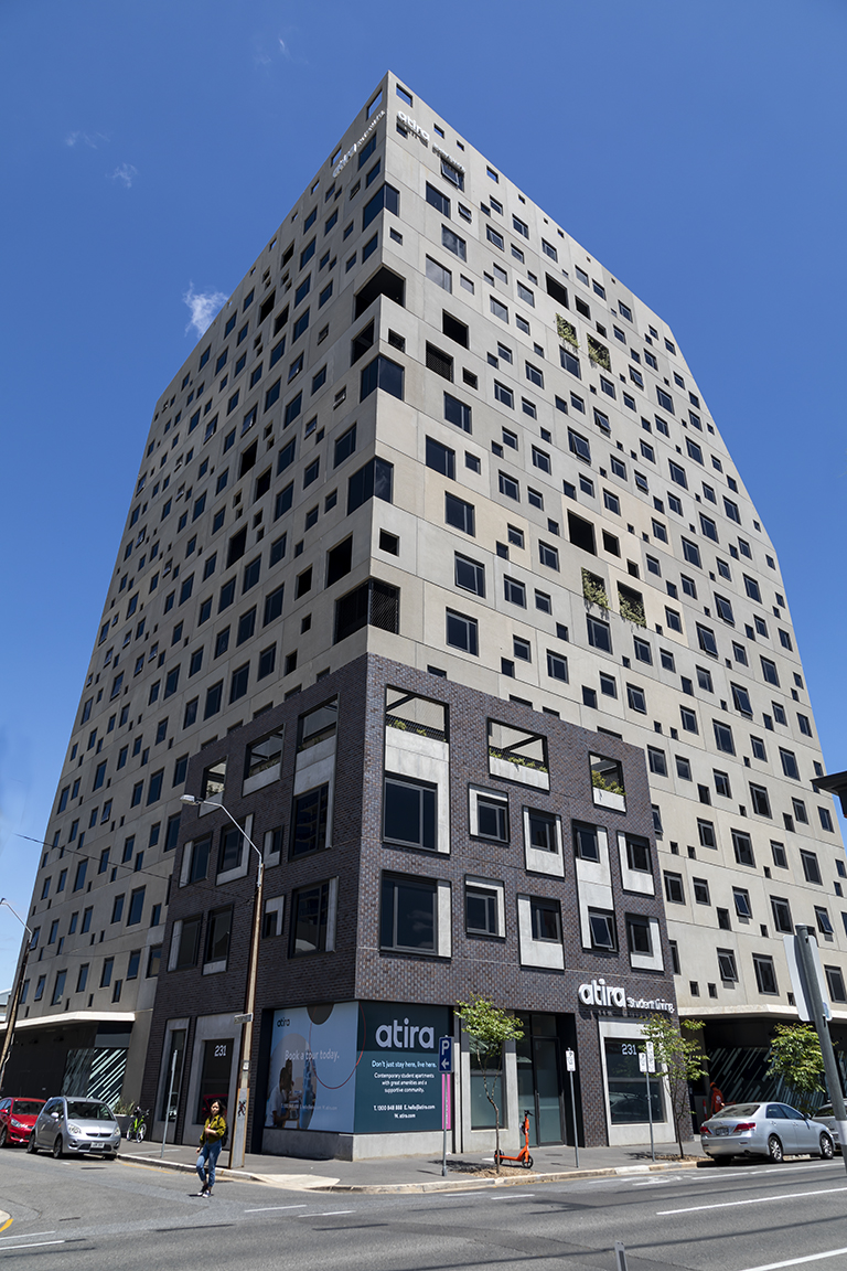
I have almost decided to use this photo of the precast concrete facade of a local multi storey building. This building is student accommodation and regularly receives "brick bat" awards for being the worst looking architecturally designed building in the city.... but it is an interesting image that fits the definition of "Repetition."

Post production: Stretched and made all the vertical lines vertical until the facade looked "square on", brightened and slightly desaturated the image, all in Lightroom and Photoshop. Then cropped it until the pattern was random and yet repetitive.

Canon 5D Mark IV, 1/100 sec, f/11, ISO 100 with 24 -105mm F/4L lens at 105mm


10 comments posted


Shirley Pohlman   Shirley Pohlman
Yes, I don't believe this would receive the award for best design in most cities--unless the city has departed from standard! Your rendition appears to be a newly inspired game board. I believe you caught the challenge of "Repetition" very well with your crop and straightening. I would suggest that the building itself would be a better example of the realism of the repetition--just as your original is with perhaps the cars removed.   Posted: 07/02/2025 21:01:53


Karen Botvin   Karen Botvin
My first thoughts when looking at this photo was "patterns"! Repetition works as well. There must be hundreds of students accommodated in that building for all the windows that it has. I agree, not very nice looking, but probably very functional. And yes, your image should do well in the upcoming competition.   Posted: 07/02/2025 21:48:11


Piers Blackett   Piers Blackett
For some reason looking at your original has more impact for me. I think it must be the combination of contrast and perspective contributing to a human story that is missing from your presented version. A possible way to get around it is to pick one or two of the two-windowed apartments or flats and paint them. My choice would be yellow or light blue.   Posted: 07/03/2025 22:32:53
Martin Newland   Martin Newland
Thank you for your suggestion, Piers. Is this something like you had in mind?   Posted: 07/06/2025 04:16:12
Comment Image
Piers Blackett   Piers Blackett
Maybe, but Stanley's idea is better.   Posted: 07/07/2025 15:42:17


Stanley Cheong   Stanley Cheong
Dear Martin, The photo is full of patterns, which fits well with the theme of "repetition". The problem is that it looks more bland, because there is no particularly eye-catching focus, and if one of the windows has a person looking out of the window, it would be perfect.   Posted: 07/06/2025 14:03:47
Martin Newland   Martin Newland
Thanks Stanley. I have added a lady in red at a window as you suggested   Posted: 07/06/2025 23:44:19
Comment Image


Jim Wulpi   Jim Wulpi
Hello Martin. I, too am a fancier of patterns and repetition, as well as minimalism. Well done.
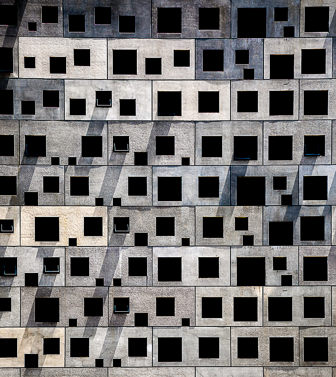
I modified your image slightly(?) to accentuate the diagonals that exist due to top-hinged windows. Your presented image has these diagonals very subdued, but the image is dramatically changed by the accentuation of the diagonals. This was done by lowering the shadows and black sliders all the way to the left.
Overall, I think that I like your modification with 2 colored rectangles as the best of those presented (including mine).   Posted: 07/11/2025 20:55:38
Comment Image


Julie Deer   Julie Deer
(Group 40)
Hi Martin, Interesting take on the subject. Will be interesting to see how a judge handles your abstract repetition. The blue wall option is interesting. The red lady looks shopped in. Good luck!   Posted: 07/17/2025 07:11:00
Martin Newland   Martin Newland
Thanks Julie. Only time will tell how it goes!
  Posted: 07/17/2025 23:08:53


Please log in to post a comment