Jim Wulpi
July 2025 - Untitled
Original
About the Image(s)
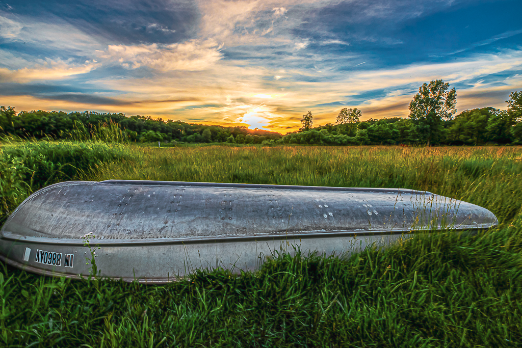
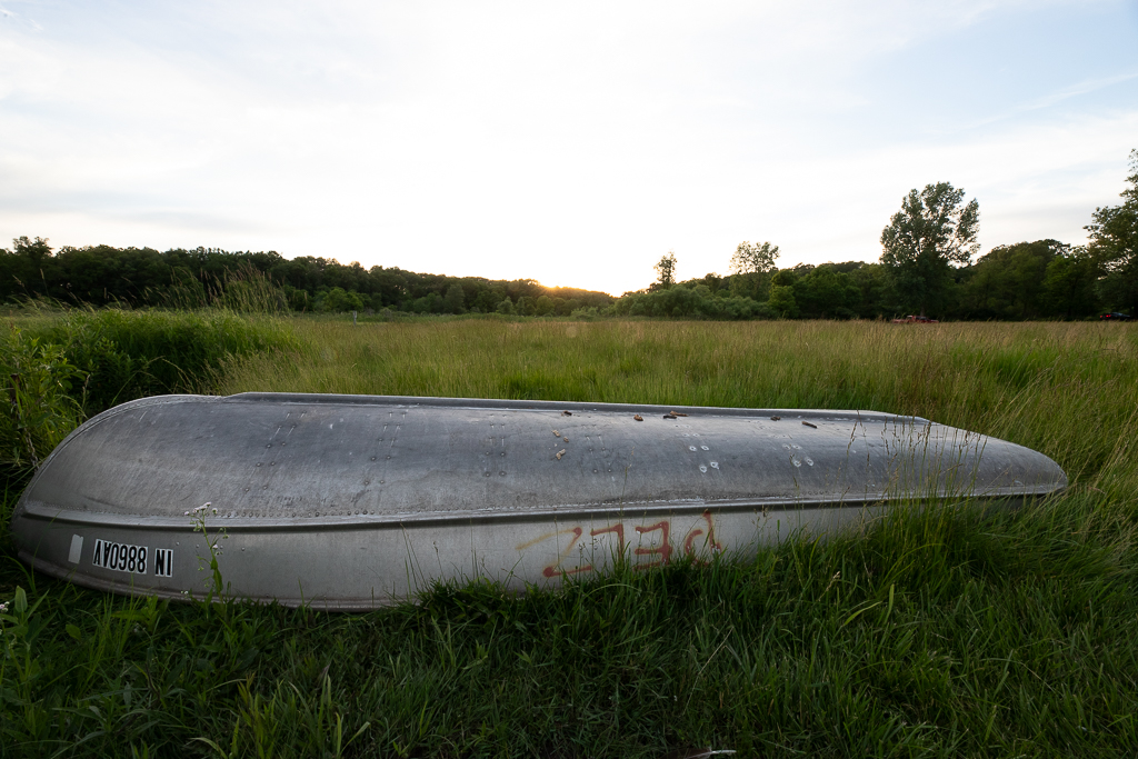
This is an image I took last summer in northerast Indiana while awaiting darkness to fall in order to photograsph the Milky Way with a few folks from my local Photo Club. One of the guys in this group has acess to local preserve properties that are normally off-limits to most people. There was a small lake at this property that provided a level of interest to the setting, and I wanted to use that to atttempt to get a refelection of the Milky Way. That little lake is why there is a small row boat present.
As you see from the original, there was a significant amount of contrast in this scene that the sky was nearly completely blown out. The setting sun was just hitting the tree line/horizon. I attempted a 3-image HDR, but the sky was still not wonderful. Ultimately, I replaced the sky in Photoshop to (what I think) is a very nice, similar high clouds sunset scene. The row boat had some unsightly grafitti that had to be removed via the Generative (AI) remove tool in Lightroom. I also used that same removal tool to erase multiple piles of goose poop off the boat. I then adjusted the contrast and lighting of the boat and overall scene.
I like how this image turned out.
Your thoughts?
Metadata: Canon 6D MarkII with Sigma 14-24 f2.8 DG HSM ART 018 lens at 14mm; 1/100 sec.; f20; ISO 1000, Mounted on a tripod. (my focus point was just beyond the boat)
13 comments posted
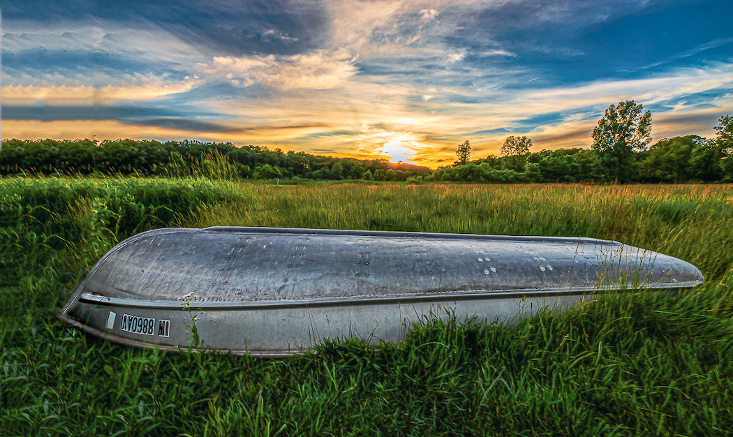
Pertaining to cropping, I feel it's a little tight on the left side of the boat. When I scroll my screen, the image seems to pop more when I cut the sky to just above the tree on the right. It seems to then take away from the emphasis from the sky to what is below--the glowing grasses and boat. Very welcoming image! Posted: 07/02/2025 21:16:58
This is what I like about this forum; I agree (now) that this image is a bit too saturated, and that it needs extra space in front of the boat. While this version of the sky is fairly dramatic, I will also crop down slightly and put the treeline slightly closer to the top 1/3 line. Posted: 07/10/2025 15:47:57
I like and appreciate this forum to be able to capture all variaties of impressions relating to an image. Posted: 07/10/2025 15:55:11
My eye wanders a little bit, from the solid upturned boat to the sun set and back again.
Maybe allow a little extra space on the left hand side of the image, so the boat is not so close to the edge.
I am not a great fan of drop in skies, particularly if you let Photoshop select it for you. The masking of the trees on the right hand side of the image needs some extra work, as the bright sunset reverts back to your original sky behind them.
An interesting and colourful image. Well done
Posted: 07/06/2025 03:11:01
I like and appreciate this forum to be able to capture all variaties of impressions - good and bad - relating to an image.
Thanks, again, for all that you do for this group. Posted: 07/11/2025 18:34:33
(Groups 21 & 48 & 71)
I winter in Ft Myers, and am a member of the Ft Myers Camera Club. I met you and your wife briefly at the Naples Swamp Bugggy races 2 winters ago. I hope our paths cross again.
Thanks for your input on my image and extending the space in front of the boat. I agree that it did need that.
I really like and appreciate this forum. Good feedback is so important.
I agree that the image is a bit too "overcooked". If I ever do get around to print this image, I will tone things down a bit - in addition to adding space in front of the boat. Posted: 07/10/2025 15:39:55
(Group 55)
I really like the comments that my fellow Group 02 members come up with. That's what I like about this discussion group concept.
Yes, it was nice getting a comment from Tom. I'd love to get to know him better.
See you in October. Posted: 07/28/2025 19:58:38