Karen Botvin
About the Image(s)
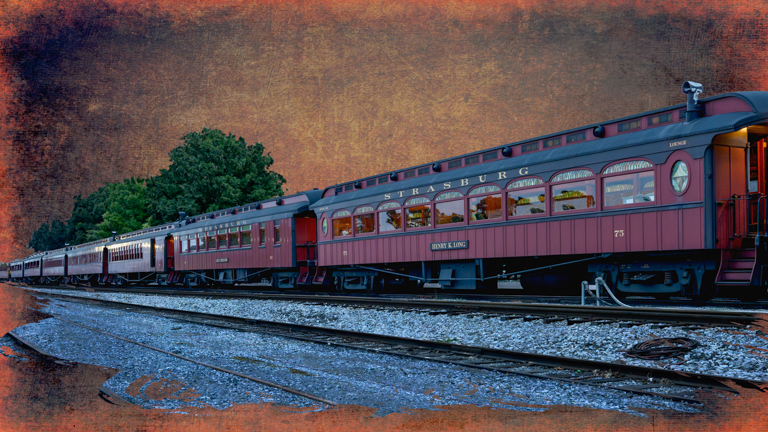
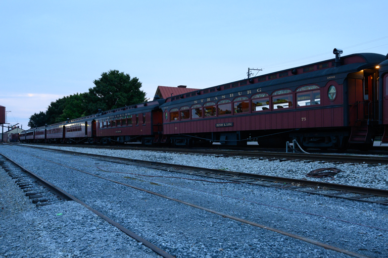
I don’t do landscapes very often but this past September I went back home for a visit with family and friends to Lancaster County area in Pennsylvania. One of the places I wanted to photograph was the Strasburg Railroad station. When I arrived it was very early morning and just starting to rain. I took a few images but was kind of disappointed in what I had. When I got back to FL I played around with this one and I really liked the outcome. In LR, I cropped the image increased the exposure a bit and lifted the shadows. I dropped the highlights slightly, added a bit of clarity and ran it through denoise. In PS, I removed the electric wires and pole as well as the roof top from the building across the street. I also lighten up the windows of the first car. Then I played around with adding a few textures and also clipped a mask to the bottom of the image to get that raggedy edge. I worked on the tree in the background. First, darkening it, then thought maybe to remove it, but I finally settled on leaving it as I thought it added some depth to the image. What are your thoughts? Is it too much? Could I have done something else?
4 comments posted
Your submitted image, to me, is too much of a conflict between the sharpened, denoised, polished train and the background that you imposed around it. I can't suggest an alternative because I'm generally not oriented towards that type of manipulation.
It certainly looks like you had fun playing with it and trying various options. Posted: 11/04/2024 21:42:56

