Sol Blechman
May 2021 - After The Fire
Original
About the Image(s)
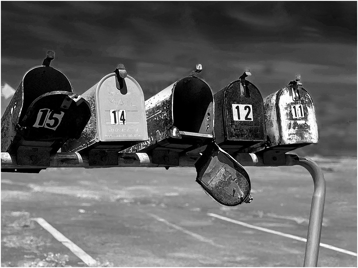
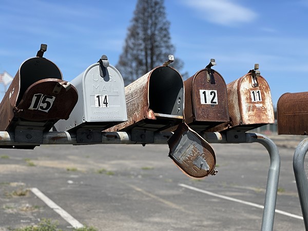
We had some wicked fires here in So. Oregon last summer and these mailboxes serve as a reminder of that. The color original seems too joyful so hence my B&W conversion. There is also some Filter Gallery stuff in there to try and grunge it up a bit but that may not have worked. The Red Channel slider was useful in darkening the sky.
This round’s discussion is now closed!
5 comments posted
This pops in black and white. I think I would crop in a little more on the right. The space doesn't enhance the image. And, I might crop out a little more of the parking lot. Or maybe dull out the white lines so they don't distract. Powerful image even if you don't know they are charred. Posted: 05/09/2021 16:03:08
Nice image Sol,I think the conversion to monochrome works well. The open boxes really add to the image. Might consider darkening the foreground a bit. Nice capture. Posted: 05/09/2021 16:49:49
The picture tells a story, rough neighborhood. I didn't get the fire part till after reading your description.
Resized with out the parking lot. Posted: 05/17/2021 18:58:01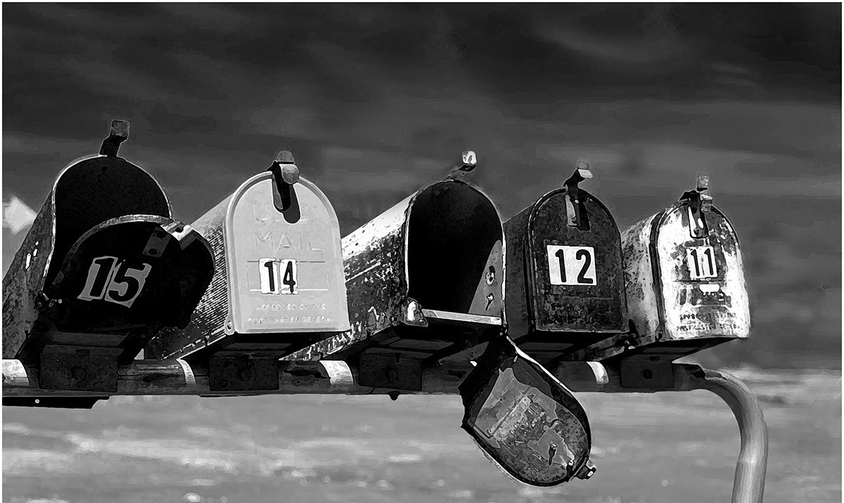
Resized with out the parking lot. Posted: 05/17/2021 18:58:01
It is a storyful B & W version. I agree with Mr. David to resize slightly. Posted: 05/25/2021 20:49:42
The black and white was really the way to go with this. You might have moved just a little to the right so you could have cropped off the partial mailbox. You might have been able to get all of number 15 included without including any of a possible box to the left. Posted: 05/25/2021 21:33:29