Barbara Asacker
Hi Peter,
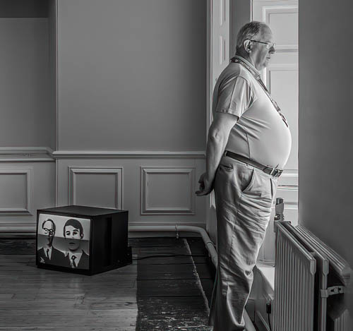
This is a good street photography image. Good contrasting tones on the tv and floor. My only suggestion would be to darken the background behind the man, or darken his clothes. It may give more focus on the man, as he seems to blend into the background and needs more contrast. Posted: 07/06/2021 20:27:22

Linda M Medine
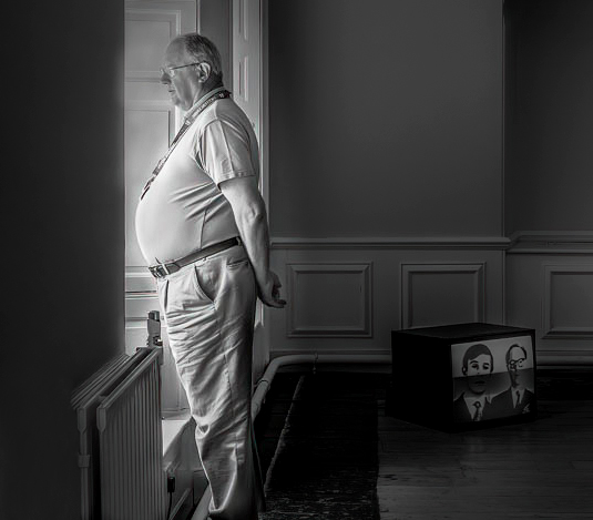
I like the black and white better than the color. I flipped the image and added a little more real estate. I darkened the background to have my eye go to the lighter things. I took out the top left hand dark spot. Very interesting image. What do you think he was thinking.? ( I used Barbara's suggestion )
Posted: 07/07/2021 11:04:07

Michael Hrankowski
(Groups 3 & 83)Linda, I'd like your thoughts on why/when to flip an image. Especially why you think this image is better flipped. It's odd, I think, that some flipped images do have a different feel from the original, but I can't quite figure out why that is. I've asked the question in other groups but never really got any clarity. I have my theory that it may have something to do with Western written language reading from left to right, where the eye is trained to look at the left side of an image first. Does the converse preference hold true, say for Arabic- or Hebrew-speaking people? Posted: 07/07/2021 14:11:33
Linda M Medine
Yes, Michael you are right. We do read from left to right. I feel like the object near the man's waist is a leading line to the man and the man is the subject. When I look at the image posted the first thing I see is the TV on the floor and I wondering is the subject the TV. Then I see the man looking out the window and he is the subject and story. Posted: 07/07/2021 15:21:48
Print ads are often set to scan starting at the top left in an "S" shape with our eyes leaving the ad at the bottom right. The bottom right corner is often what we remember so that is where the logo/company/product name goes. I agree that it has to do with reading left to right. Posted: 07/09/2021 11:09:33
Interesting mood to the entire photo, old tv, messed up floor an overall feeling of old not cared for which matches the attendants feeling of not impressed. I like the editing by Linda, it does pull more attention to the attendant. For whatever reason I keep looking for the attendants feet and for the rest of the radiator. Missing feet often distract me. Posted: 07/07/2021 11:42:07
Linda M Medine
Randy, Me too. Cutting off someone feets is distracted to me too. Posted: 07/07/2021 15:23:23
Michael Hrankowski
(Groups 3 & 83)Peter, I like the image and the mood it conveys - I'm just not sure I like the edit. I think Linda was on the right track with her suggestion, but I think the TV needs some emphasis as it is a part of the story. As for the flipping of the image.... I would love a discussion of why/when to flip. Posted: 07/07/2021 14:05:46
Linda M Medine
I always look for leading lines. I want to get the viewer to look at what I want them to look at. Sometimes I have a hard time doing that. Posted: 07/07/2021 15:25:56

Peter Elliston
Linda, Thanks for your comments and suggestions which were very helpful especially regarding darkening the back wall. But I feel that flipping the image does not work for me as I want the tv to be on the left and the man looking out the window on the right as for me the lead in line is always left to right - see Gerard's comments below. I have also reworked the image and for fun taken on board a suggestion from Gerard - see image below. Posted: 07/08/2021 03:39:11
Peter Elliston
Michael, thanks for your comments. Please see my replies to Linda and Gerad and the new revised pic. Posted: 07/08/2021 03:39:55

Gerard Blair
I favor the original orientation. Just the feel for me is so much better. But in terms of the criteria advanced in earlier posts let me suggest that: lines lead even from right to left, so the radiator points to the subject in either flip; to add emphasis to the TV, it should be on the left so that it is seen first by those used to Western art; and since the subject is staring out of the image, it is better he stares to the right because that too follows the way are eyes would go (I really feel that he confronts me when he is looking left).
I like the contracts in the image, little and large, tall and short; I also like the implicit rejection of the TV, since the man has his back to it and is looking elsewhere. If I were to change it, I would remove some extraneous details by cropping from the right slightly to eliminate the skirting board's end behind the radiator, and by lightening the dark ceiling of the alcove on the left: I like the two subjects, and I think that they would be even better if more isolated.
It might also be fun to put the same man's face, from a different shot, on the TV screen - but that would be a wholly different story. Posted: 07/07/2021 23:08:32
Peter Elliston
Gerard, many thanks for your detailed comments and those from the other members of the group. It was pleasing to see so many responses and interesting suggestions. I agree with you on how we generally read images in the West and so for me the lead in has got to be left to right with this image from the tv to the man looking out the window. Actually flipping him would also reverse the words on his neck cord even though those are small. As for him not having any feet - this kind of irks me too a little but then everyone knows he will have feet otherwise he wouldn't be standing up! I think sometimes that photographers worry too much about things like this even though I do admit I try to get everything in the frame when taking the shot.
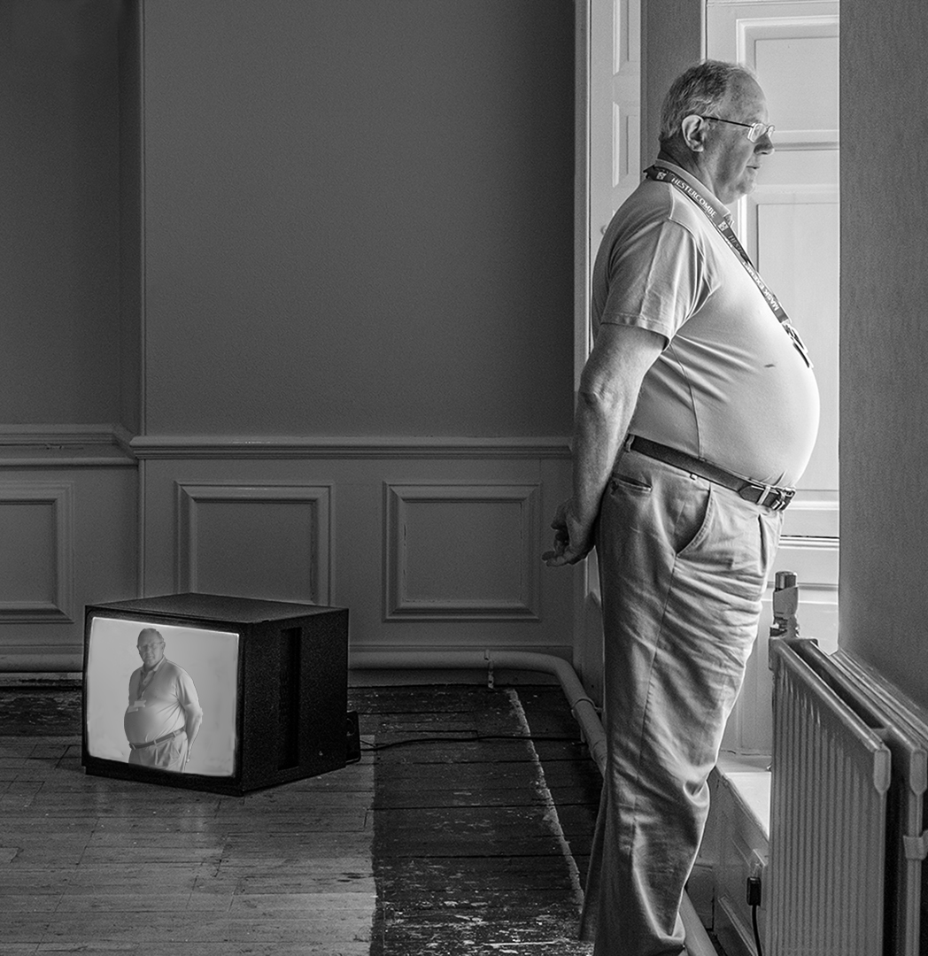
I also liked your suggestion of putting the man in the tv - something I have done before and oddly enough with another image from this art gallery. So here it is but whether it makes it better or not I don't know. Fortunately I did have another image of this attendant and I have used it to give a direct line of gaze from the tv to the viewer of the image with the attendant oblivious of the fact that he is on tv.
Posted: 07/08/2021 03:47:10
Linda M Medine
This was a GREAT exercise and enjoying hearing all the different opinions. Posted: 07/09/2021 12:26:50
Hi Peter,
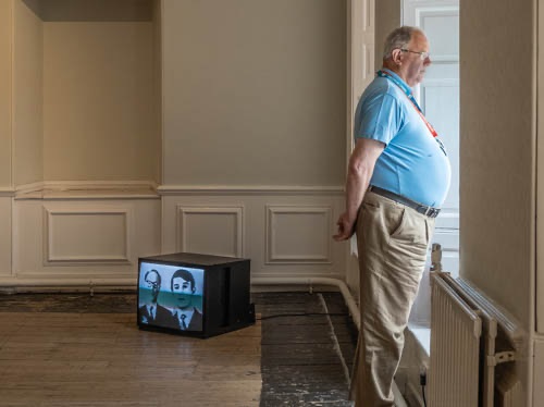
I do agree that this image is better in monochrome rather than colour. I like Linda's suggestions, but can't make my mind up which orientation I like best. I think the man looking out left or right are both ok compositions. I don't know about the same man being in the tv, but I do think its not so distracting and blends in better with the image. It is a very well taken image, nice and sharp and the tonal range is great. Theres not much else to say, everyone has said it.
Posted: 07/21/2021 21:56:37