Haru Nagasaki

August 2022 - ZEN garden – spring
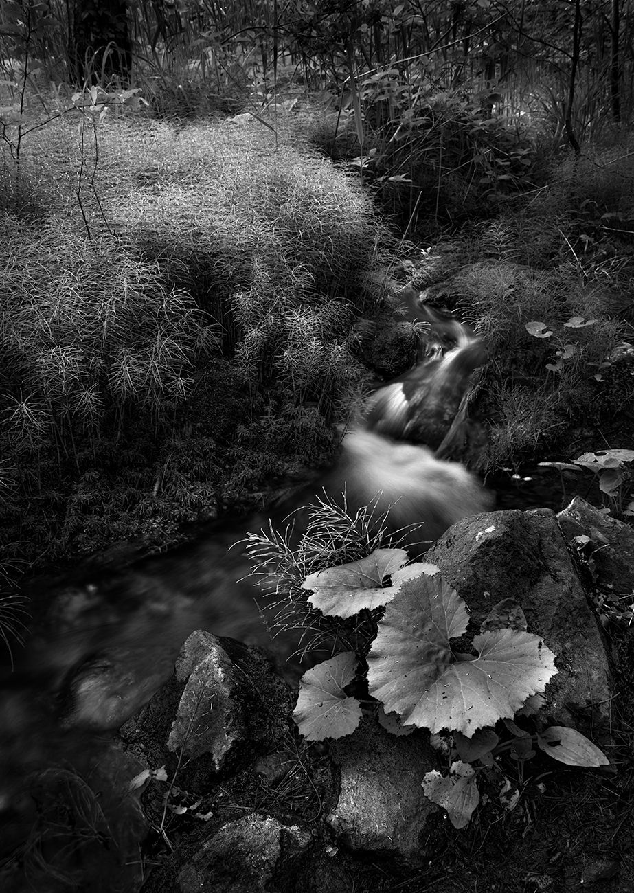
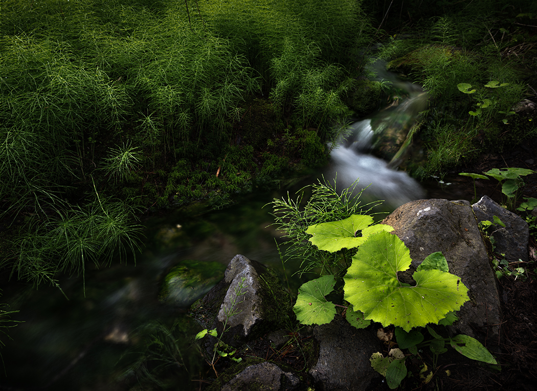
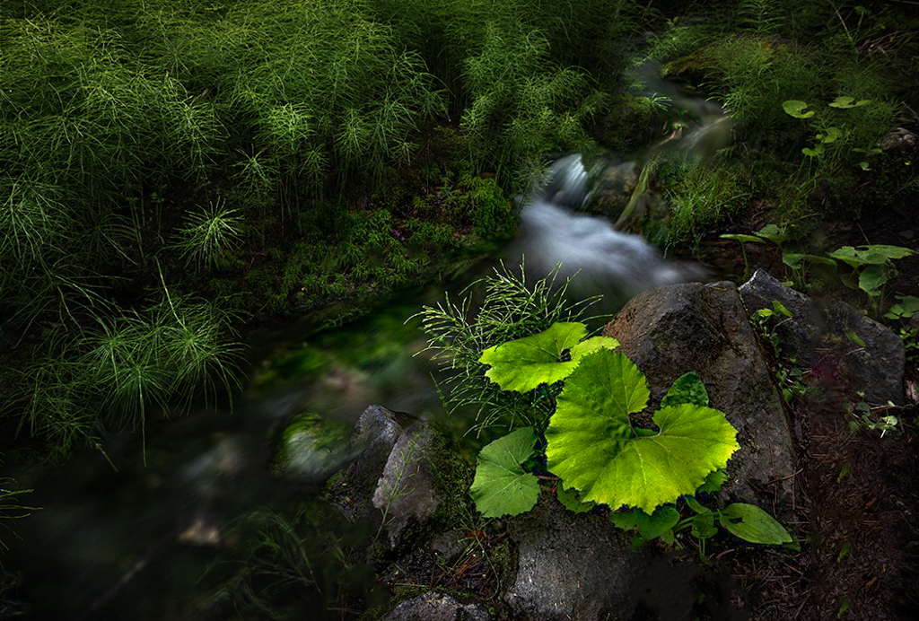
Original
About the Image(s)
This is a small scene with a creek and plants.
The young horsetails (I am not sure how it is called in English exactly) caught my eyes.
It has small creek, young butterbur leaves, and bunch of horsetails are beautifully aligned for my eye. It looks like a small ZEN garden.
I shot with landscape and portrait but I chose portrait because it give a sense of depth in my view.
Now questions to the group;
1. Does the composition work for you? Or do you think it is too busy and complicated?
2. To take out the color factor, I tried BW conversion as well. (attached in Original section ) Which do you prefer, color version or BW?
3. Do you have any other idea to make it better?
I welcome any comments and suggestions.
Nikon D850 ISO31 26mm f13 1.6sec. PL filter, tripod
This round’s discussion is now closed!
11 comments posted
I prefer the color but this is a matter of personal taste. You might consider dropping the green saturation. Posted: 08/03/2022 08:21:21
Thank you for your comments.
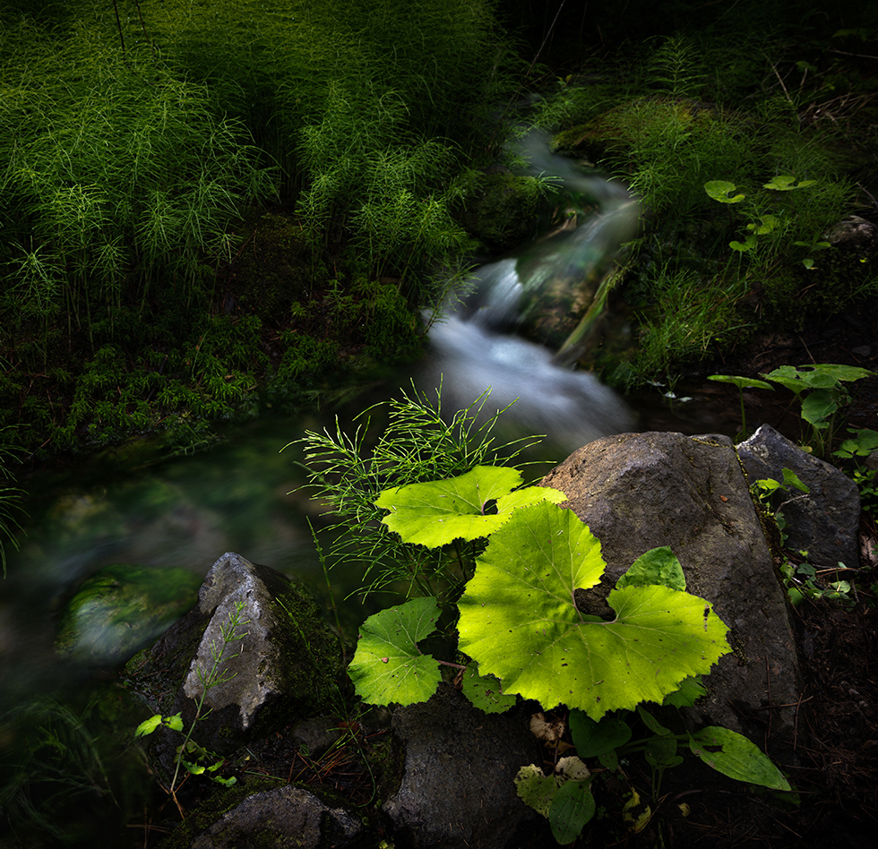
I shot 2 version (as mentioned in description). I am attaching the landscape version here.
As you suggested, I dropped down the saturation and darkened down the horsetail a little bit.
How about this for your eye now? Posted: 08/03/2022 23:36:55
Please be open to share your eye with me. I would like to learn from you. I respect your good eye and perspectives.
Posted: 08/04/2022 21:14:50
I wouldn't go B&W as I think the colors are part of what makes this image for me.
I picked up where you left off with Dan and did some small subtle things. I cleaned up some bright spots - maybe a dozen or so - that I thought just contributed visual clutter. I brightened the darker areas of the stream so it would not be as buried as a supporting element. I also cooled the stream down a bit to give a little contrast. And I warmed the butterbur with a radial mask to make it pop a little more as the subject. I also lightly applied color contrast and polarization in Nik Effects to similarly make this subject pop a little more. Finally I did some edge burning. Small stuff, but those would be my other thoughts for your consideration. Very beautiful scene. It is not easy to pull simple elegance out of complex woodland scenes, so very well done. Posted: 08/20/2022 09:42:49
Yes, your edit looks better. It has more punch.
I will try it myself. Posted: 08/20/2022 18:19:29
This is a really nice small zen garden!. I agree with all the suggestions above except I don't like the square crop. I like the wider version which to me provide more balance in the image. I really like Roberts edits and the only other suggestion I would make would be to remove some of the blemishes on the leaves in the foreground.
Posted: 08/21/2022 15:41:18
I will remove the blemishes. Posted: 08/21/2022 15:55:44
I am late getting into this month. Your colors are fine. Sharpness is great as always and the composition is good, but some cropping has improved it in other's comments. I might remove the blue cast from the stream, and let it pop to match the light green. I might also look at dodging especially along a Fibonacci and the Golden Ratio overlay, which could be useful in cropping to your final image. Posted: 08/29/2022 13:56:15