Bob Wills

June 2022 - Artist's Paintpot
About the Image(s)
I took this image on the Hayden Loop Road in Yellowstone NP. Not a lot of color, not a lot of shapes, but it reminds me of the natural beauty in Yellowstone. The Artist's Paintpots are kind hidden and are seldom visited due to the long road construction and short visiting season. I'm not sure what I can do to spice it up, and make it pop, but I will probably just use it to remember this wondrous NP.
Nikon D800, 40-70 mm f2.8 lens @ 60 mm, ISO 100, 1/30 sec @ f16 handheld.
Just cropped and adjusted contrast in LLCC.
This round’s discussion is now closed!
12 comments posted
Hi Bob. There is a great extent and diversity to the beauty of Yellowstone. It would be difficult to capture prize winning images of it all without living there and getting to experience it everyday. But it is still beautiful even when conditions are not photo perfect, and having remembrances of that are wonderful nonetheless.
If I were to try to spice this one up, I'd start with trying to correct the lack of sharpness. I gave Topaz sharpen AI a try and it helps a lot. Then I might tighten the composition. The left side is not as interesting to me, as I find the steam the center of attraction. Of course steam looks marvelous with the right back light, so I might then try to play with the luminosity to add as much of that kind of drama as I could. Finally I'd further play with the luminosity and crispness of the details to give the eye a path through the image. Since there is not a lot of color, I might take a look at the end result in B&W and see which I liked better. I took a shot at all of that in the image below. Of course, I don't know that this is necessarily how you remember the location, so the original may be a better remembrance.
Posted: 06/05/2022 14:12:13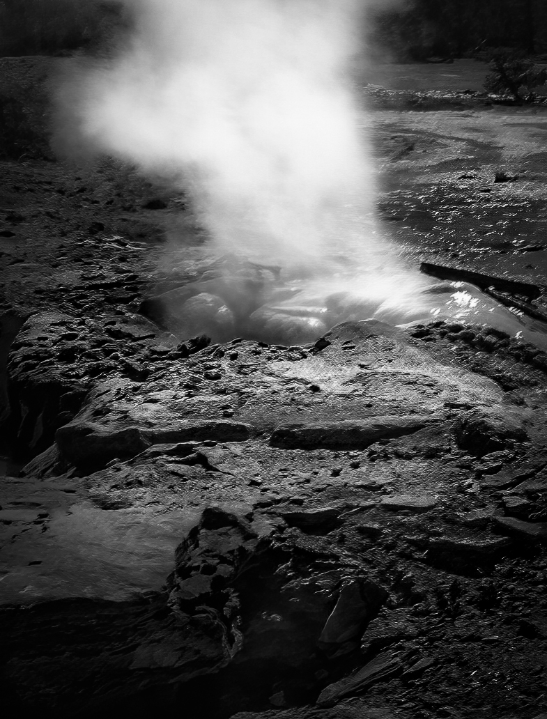
Thanks, Bob
After reviewing the comments, so far, and my own "About..." I decided the beauty and power in Yellowstone can mostly be revealed as abstractions and wildlife. I may still be wrong, but I'm going to go back through each year and see what I can find. Bruce Benson, DD72, grew up near the east side of the NP, and takes beautifully realistic images of nature, especially wildlife. B&W is definite for this image at least and will help. Thanks for the comments. Posted: 06/09/2022 18:02:07
After reviewing the comments, so far, and my own "About..." I decided the beauty and power in Yellowstone can mostly be revealed as abstractions and wildlife. I may still be wrong, but I'm going to go back through each year and see what I can find. Bruce Benson, DD72, grew up near the east side of the NP, and takes beautifully realistic images of nature, especially wildlife. B&W is definite for this image at least and will help. Thanks for the comments. Posted: 06/09/2022 18:02:07
Hi Bob,
I have stayed there maybe 30 years ago. Some of the shots (they are pretty bad shots) from Yellowstone are still hanging on the wall in the living room.
This reminds me of good old days. Thank you for posting this.
Now, As Robert pointed out, there are some weakness in the image, i.e. loose focus. But there are some strength in the image as well. I like the edges of rock and layers of rocks.
So here is what I would do;
1. Reduce exposure significantly and re-paint where I want to see with light brush. The image looks so flat due to the even light, I need to make light/dark contrast.
2. In painting the light, mostly I painted the edges of rocks to highlight the ridge line. That will become the leading line toward the center of attention, the steam.
3. lighten up the background partially to show depth.
Posted: 06/09/2022 02:34:08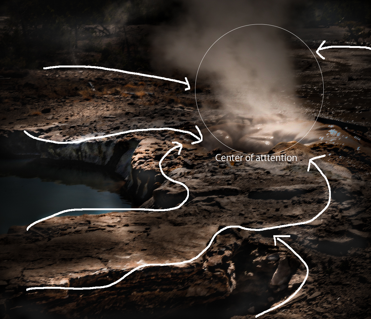
Thank you, Haru. Definitely needs more work. Posted: 06/09/2022 18:04:16
Now this is the result.
I might be a little dark and it might be a bit too obvious.
Posted: 06/09/2022 02:35:11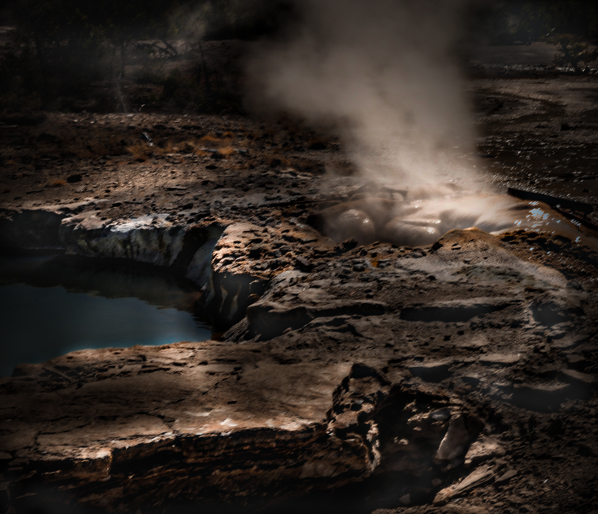
I might be a little dark and it might be a bit too obvious.
Posted: 06/09/2022 02:35:11
Thanks for the re-worked image. I like it much better than mine. I did this today, but I'm still mulling it over. I must get better at manipulating the light. This image may be too abstract. Posted: 06/09/2022 18:07:51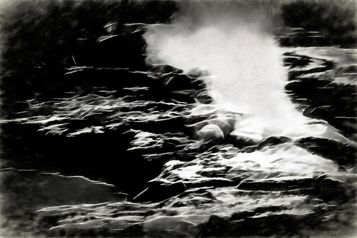
Hello Bob, The image is very suggestive - it gives me the sense of the earth being alive. Beautiful. I agree on sharpness comments. In terms of composition, I wonder if you had a version where you could see all of the cloud of smoke - now it is cropped on top. I do like the color version - the blue of the water and the green of the trees I feel enhance the image. Posted: 06/15/2022 10:24:15
Thank you, Gloria.
This image was cropped, and I took out the top of the steam due to the uninteresting background exposed. I probably misused the word "beauty" as this isn't a beautiful spot. Few visitors clamber up the slope to take images here. Now the park is closed due to flood damage.
"It's not nice to fool with Mother Nature!" Posted: 06/15/2022 11:42:48
Hey Bob, I like Robert's rendition - especially converted to B&W. I think it hones in on the story you're trying to tell.
Compositionally, to my eyes, the half circle was a good choice in how you framed the shot.
Viewing through this platform, the image is very blurry and pixelated. Was it radically cropped? Or, is it motion blur from camera shake? Do you have the opportunity to go back and retake the shot?
I'm glad you see this as a good memory of Yellowstone. It's a fun place to visit and photograph. If you ever get the chance to go there in the winter, you will be treated to an even greater wonderland. Posted: 06/19/2022 09:35:04
Thanks, Dan. No, I can't go there anymore because of my physical limitations. I am unsure what platform you are using, but I don't have any pixelization on my laptop. No one else mentioned that as an issue. I agree I may need to make this a B&W for any impact at all. Posted: 06/21/2022 10:58:04
Hi Bob
I like the leading lines provided by the rock on the bottom left leading to the rocks and steam. I too tried Topaz sharpen and I am always amazed at what it can do. To me the story is the steam coming off the rocks. I would darken most of the image a little then lighten the steam while trying to add some detail there as well for interest. I would also try to add a little more detail in the wet rocks themselves. I like Roberts idea of black and white and Haru's idea of lightening the leading lines (but not as drastically). As for the crop I would only take a little off the bottom. Here is my humble attempt. Posted: 06/23/2022 21:34:31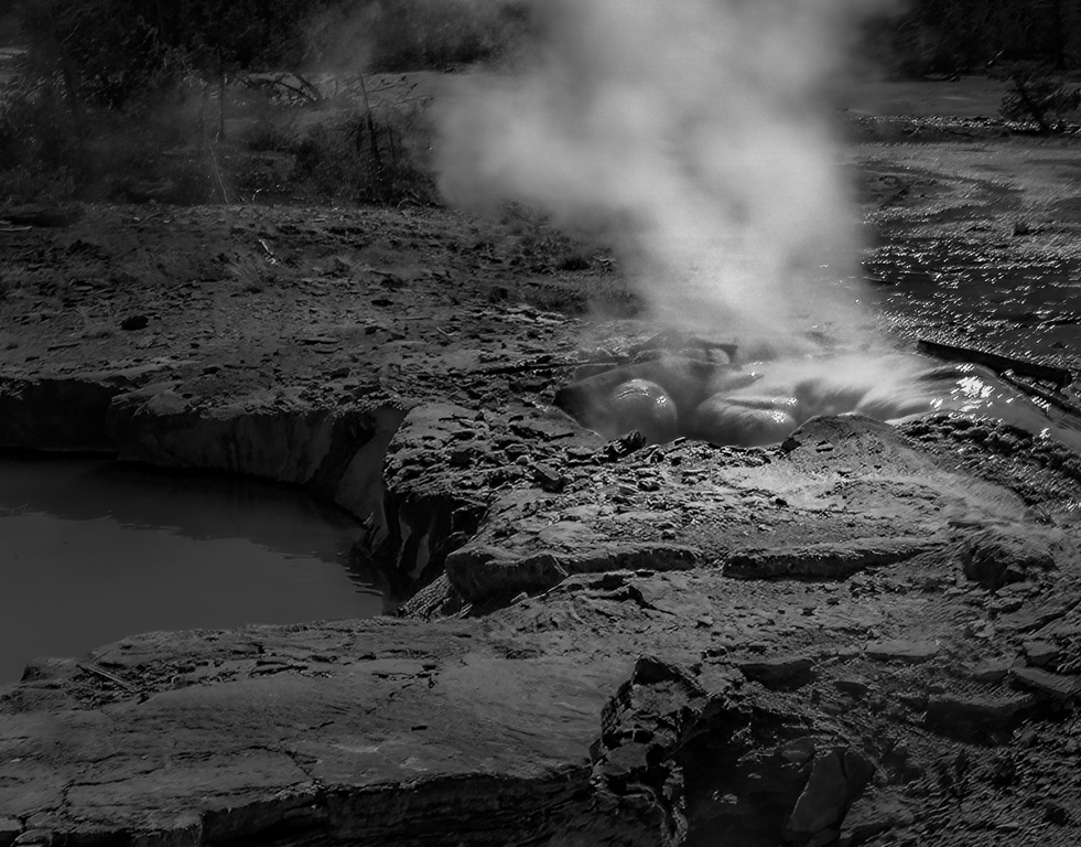
I like the leading lines provided by the rock on the bottom left leading to the rocks and steam. I too tried Topaz sharpen and I am always amazed at what it can do. To me the story is the steam coming off the rocks. I would darken most of the image a little then lighten the steam while trying to add some detail there as well for interest. I would also try to add a little more detail in the wet rocks themselves. I like Roberts idea of black and white and Haru's idea of lightening the leading lines (but not as drastically). As for the crop I would only take a little off the bottom. Here is my humble attempt. Posted: 06/23/2022 21:34:31
Thank you, Cheryl. You are close to what I want as a final image. Good suggestions. Posted: 06/24/2022 13:23:22