Bob Wills
About the Image(s)
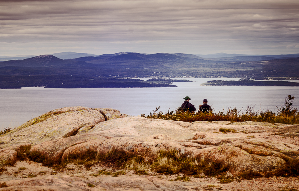
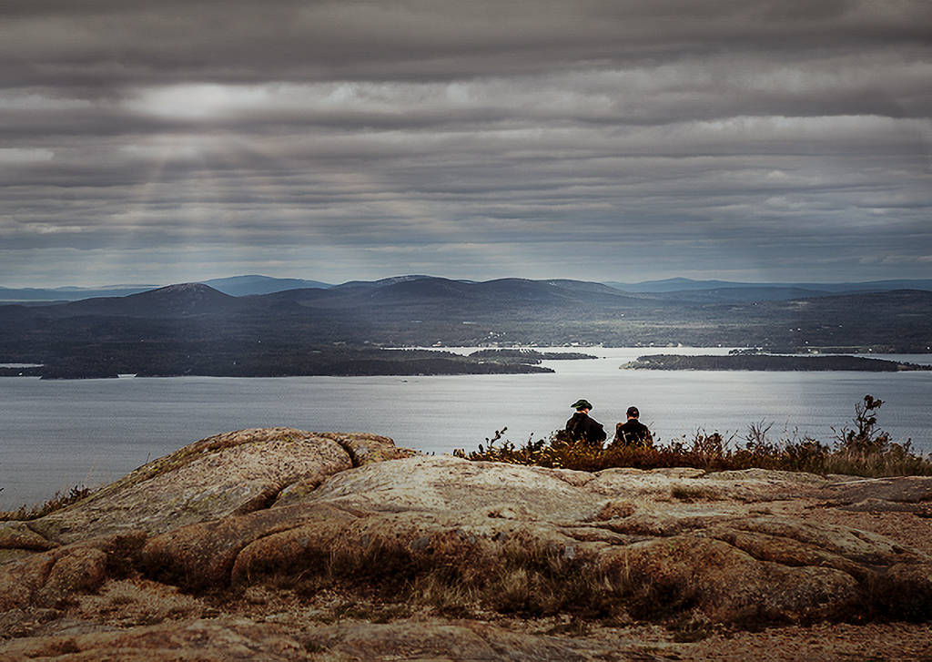
I shot these two folks admiring the view across one of the sounds. We travelled the Acadia NP loop road and stopped whenever the mood struck. It was cold and dreary most of the time we were in Bar Harbor, and I packed for September in Washington, not Maine. It would have been one of my favorite National Parks except for the rain. You must be careful walking around the rocky shores where all the good photos are because they get slippery. I recommend using tide charts while there and sticking to high tide.
Nikon D800, 24-70 mm lens, no tripod, 1/40th sec @ f8, 1oo ISO.
Cropped in LR and cannot figure out what it needs.
This round’s discussion is now closed!
20 comments posted
I'm beginning to recognize a particular style in your image making, Bob. It's a high contrast signature that you apply to your photography. I'm not saying this is bad. However, to me, the hard contrast in this shot does not match the scene. But this is what makes your images so interesting. Here, you have chosen to go in the opposite direction. Instead of a soft, dreary look, you punched it way up.
The two people bring your photo to life and invite interest. I wonder what they're doing and talking about. They seem like brothers to me. Your photo makes me think that the best times in life are spending it with a close friend. Posted: 09/06/2021 18:40:03
The two people bring your photo to life and invite interest. I wonder what they're doing and talking about. They seem like brothers to me. Your photo makes me think that the best times in life are spending it with a close friend. Posted: 09/06/2021 18:40:03
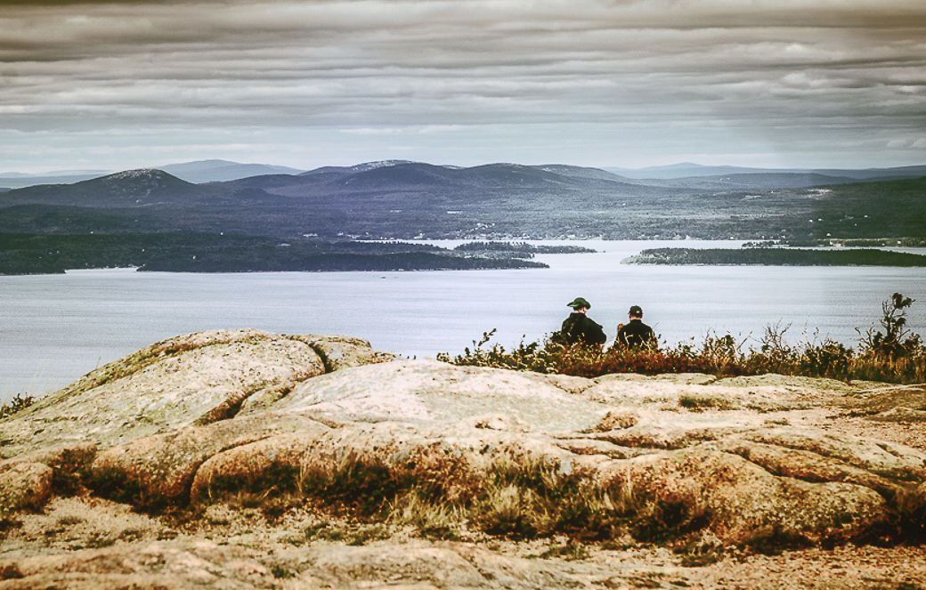
Thanks Dan. Your input is important to me as a critique. I don't really have much success in competition, and maybe your "high contrast style" comment sums up my problem with others. At times I have an image where that works well, but as you have said, not so much with this subject. Would you consider giving me a reworked image to help me see your comment. I'm including what I think is less contrasty, but I may not have a handle on your thoughts. Let me know. Posted: 09/07/2021 12:12:05
Yes, I would like to give it a try. Can you email the RAW file? I will give it a workup and post it here. Posted: 09/07/2021 18:31:10
Thanks, Dan. Please don't take offense, but I wish to use your request as a DDG admin moment.
I do not encourage anyone to share their RAW files. There are many reasons why, and of course, in this case trust isn't an issue, just my preference.
I actually was trying to (not too subtly, evidently) get you to work the jpegs that are available to us all in the group.
I think that including a reworked jpeg, in your comment/reply is a visual aide that helps you make your point. You can click any image in DDG, save it in a folder, then work on it in any program you choose. Posted: 09/08/2021 14:00:10
No offense taken, Bob. I actually thought of working with the JPEG here but I'm afraid the foreground rock is blown out. I wouldn't be able to bring the midtones back. I completely understand why you don't want to release your RAW file. Frankly, I wouldn't either.
I was thinking about your image last night. Do you regularly calibrate your monitor? I wonder if the contrast on your monitor is set too low. This would make you drive up the contrast in your processing.
When contrast is driven up, color saturation is also increased. Going too far would create a luminance and color blow out. Just a thought. Posted: 09/08/2021 16:28:18
Good question, Dan. Yupper, I calibrate my monitors each month. (Spyder 5 Elite) I also pay attention to the histogram and set the highlight and blacks warnings in LRCC and PSCC. I don't always back off from blown highlights however as I really don't like the muddy gray that sometimes result.
Blown highlights just appear as the paper color when printed, so I am careful to select the right paper when I print.
I have found that since I moved to Fuji X cameras, I have better control over exposure than I did with my Nikons. Or maybe it is just a matter of being more careful in setting my exposure.
I'll see if I can provide a better jpeg for this image. I am including the original. Posted: 09/09/2021 12:09:23
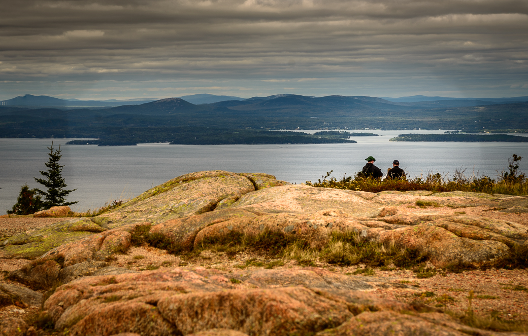
Bob, this version feels better to me. Compositionally, the warm tone brings my eyes to the foreground rock, but the tone of the exposure looks much better. I like the glow that the rock has.
Incidentally, are you using a filter that might have been wet? Posted: 09/10/2021 09:24:05
Incidentally, are you using a filter that might have been wet? Posted: 09/10/2021 09:24:05
I don't think I used a filter, but the lens was probably not dry, as there was a mist in the air or rain constantly during the week. We finally gave up after a fog rolled in permanently and left Maine early. Posted: 09/10/2021 09:32:14
Hi Bob. I like this version better than the version you posted initially. I think the colors are more realistic and the tonalities not as harsh. I do think there is something beyond water on the lens going on. It is even more apparent in the "original" below. It looks almost like dodge and burn streaks with a broad hard brush. Are you sure that is the "original"? Posted: 09/11/2021 13:20:00
It is a jpeg copy of the NEF (Nikon's RAW format). I did a bad job of wiping the lenses off. It was cold, wet and foggy, and my attitude was not good for this part of the trip. I hate driving 5K miles for crummy weather. Posted: 09/11/2021 13:32:50
Hi Bob,
Thank you for sharing.
This image has a good story and mood. It looks like a old photo taken in a old good day. I like it.
As Dan says two people is the star of the image.
In order to highlight two people, I would crop half of the sky and a bit of left/right - still put the people in 1/3 line from right. That way the people stands out more in my eye.
But again, this is a good story telling image for me.
Posted: 09/08/2021 20:31:35
Thank you Haru. I should have asked what they were discussing, but it was probably the horrid weather. Posted: 09/10/2021 15:23:56
Hey Bob
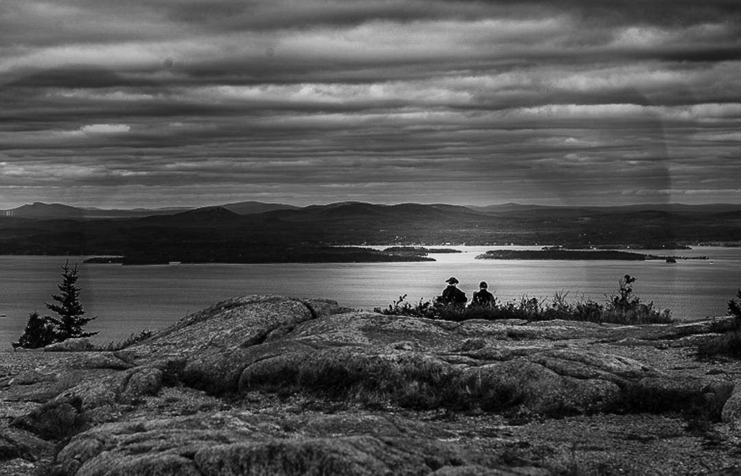
This a great story telling type of image. The viewer does indeed wonder what the two are talking about. Makes me wan to sneak up and eavesdrop :). Since the colors are so muted and not really necessary to the story, I wondered how it would look in black and white. I gave it a quick try. I'm not sure if it is better or not. You be the judge. Posted: 09/10/2021 15:02:27
This a great story telling type of image. The viewer does indeed wonder what the two are talking about. Makes me wan to sneak up and eavesdrop :). Since the colors are so muted and not really necessary to the story, I wondered how it would look in black and white. I gave it a quick try. I'm not sure if it is better or not. You be the judge. Posted: 09/10/2021 15:02:27
That's an interesting interpretation that Cheryl offered. It changes the whole mood. My suggestion would be to open NIK's Silver efex and click through the presets. Then when you find one you like, tweek it from there. Posted: 09/10/2021 15:12:06
Don't use NIK since they changed owners. Thanks for the suggestion.
Posted: 09/10/2021 15:21:29
Posted: 09/10/2021 15:21:29
Thanks, Cheryl. I do make B&W's of most of my high contrast images, and I had to rule this one as bad, due to what Dan noticed. The lens was wet, and B&W shows that more than color. I am now thinking this was not a good choice for me to present. Garbage in-Garbage out! I'll do better next month, hopefully. Posted: 09/10/2021 15:20:23
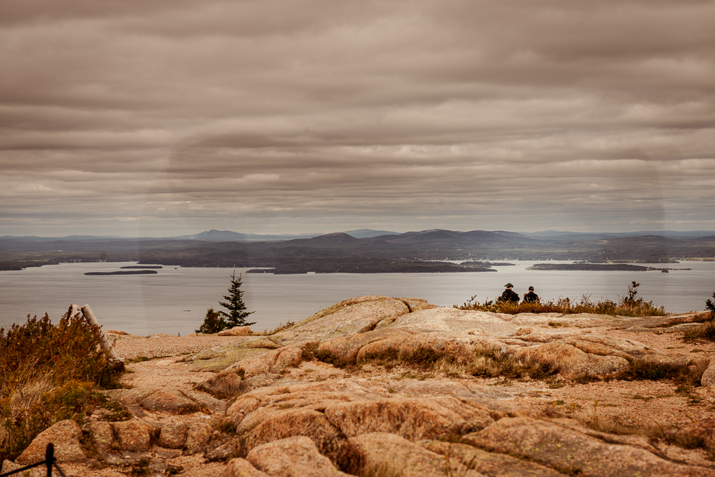
I think it is far from garbage. I think you just have to pick a direction of what you want to make it, and move a little further there. For example, I took it one direction in the attached below. I decided the two people were watching dramatic weather. So I took it into Luminar 4 and added some sun rays to give the weather a little more drama. Then in camera raw I cooled it down and darkened the top - again for more drama with the weather. I also darkened it overall, but brightened up the area across the water from the two people to give them something more to be "looking at". I desaturated everything a little to make it bleaker - again dramatic weather. And I added a vignette which I often do to just help hold attention in the frame. Since it was cropped small from the original, I also used Lightroom's new super resolution to give more pixels. Might be forgetting one or two things, but that is the most of it. I think it gives the image more mood and emotion, and also helps connect what is going on with the two people. Just one option, I am sure there are more. :) Posted: 09/11/2021 13:29:48
Really nice work Robert. You've gotten rid of a lot of the smears. I may work this some more using all the comments. The subject and story are there, just my camera work was off. I mean my camera work was off, bad, horrible, aaaaggghhh! Posted: 09/11/2021 13:44:59
Bob, I think that you shared an image that has good qualities/potential, and elicited a lot of helpful insights and suggestions. I like how Robert's edit reduced the smears and brought in a more balanced range of colors and added a more specific focus to the scene.
Your image has very different (warm rocky foreground) and cool (sky, water, silhouette of land in background) tones, so kudos to you for composing an image that balances those two color elements. Posted: 09/19/2021 15:24:45
Your image has very different (warm rocky foreground) and cool (sky, water, silhouette of land in background) tones, so kudos to you for composing an image that balances those two color elements. Posted: 09/19/2021 15:24:45
