Chan Garrett
January 2022 - Dale
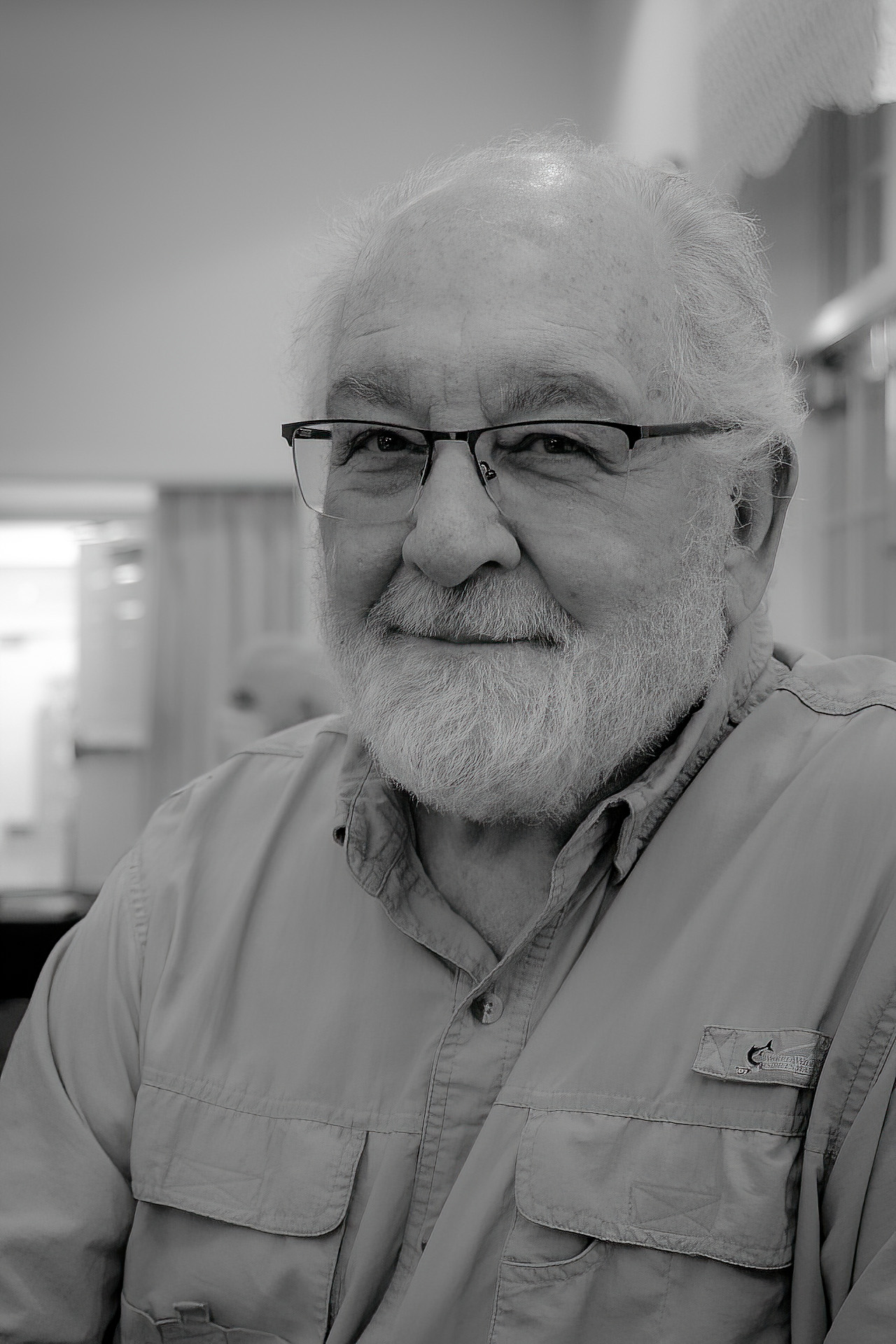
About the Image(s)
I was sitting at an information table at a recent event at our clubhouse with my camera in my hand. The room was well lit and the crowd was not yet large. As I turned to the man sitting next to me I decided his face was of too much interest for me not to take a "street photography" style portrait. I gave him no posing instructions, and by the time he realized what I was doing, I had composed and pressed the shutter button.
Hand held using only available room lighting.
Canon EOS RP with RF 24-105mm 4.0L lens at 35mm.
1/60 sec. f.4.0 at ISO 1600
PP in LrC. I realize I could have worked to "clean up" the background, but decided to stay with the more "street photography" feel.
This round’s discussion is now closed!
15 comments posted
I like the eye contact and the sharp focus. You have a steady hand. The bright window is distracting...unintentional though it was. Can you do something in post, like burning that area in? Posted: 01/01/2022 17:19:20
Will. Thank you for your response. Yes, I could darken the window area to keep it from drawing attention. However, this style of photography does not seek to create clasic portraiture. Instead, it tries to capture the moment and place. By the way, the "steady hand" is due to the good image stabilization built into the lens. Posted: 01/01/2022 18:11:00
Hello, Chan and welcome to 2022!
"Dale" is very charismatic, indeed, thus making a wonderful sitter. Will brings up a fine point that needs to be addressed in post...either Burning or altogether cropping out part or all of the background window.
Next, the particular soft aesthetic you have chosen, together defining "place" is well conceived. Actually quite refreshing, as almost every portrait I come across is represented through (too) hard of contrasts...(see Linda M Medine portrait I commented last month in DD-99-Mono for a recent example). subsequently, Linda asked me to Lecture at her Camera Club.
In your featured piece I suggest maybe your presentation is, however, a bit too soft: see my two examples that only slightly increase contrast between white and black (or in this case, between the entire Midtone scale that defines Dale's face). I selectively Dodged his face, beard and shirt, while Burning (as Will suggested) the glare from the window. As always, I use a very light-touch while working. (At home, bring them up side-by-side to study differences).
I also included one other alternative in presenting Dale to the world, and that is a Square formatted portrait, that of course, only defines the sitter and takes out "place" from the composition. Actually, your featured version (and my slight-cropped version) that invites the viewer to share the space he resides in, is my favorites.
Thank you for posting this fine portrait and discussion starter! Posted: 01/02/2022 05:49:09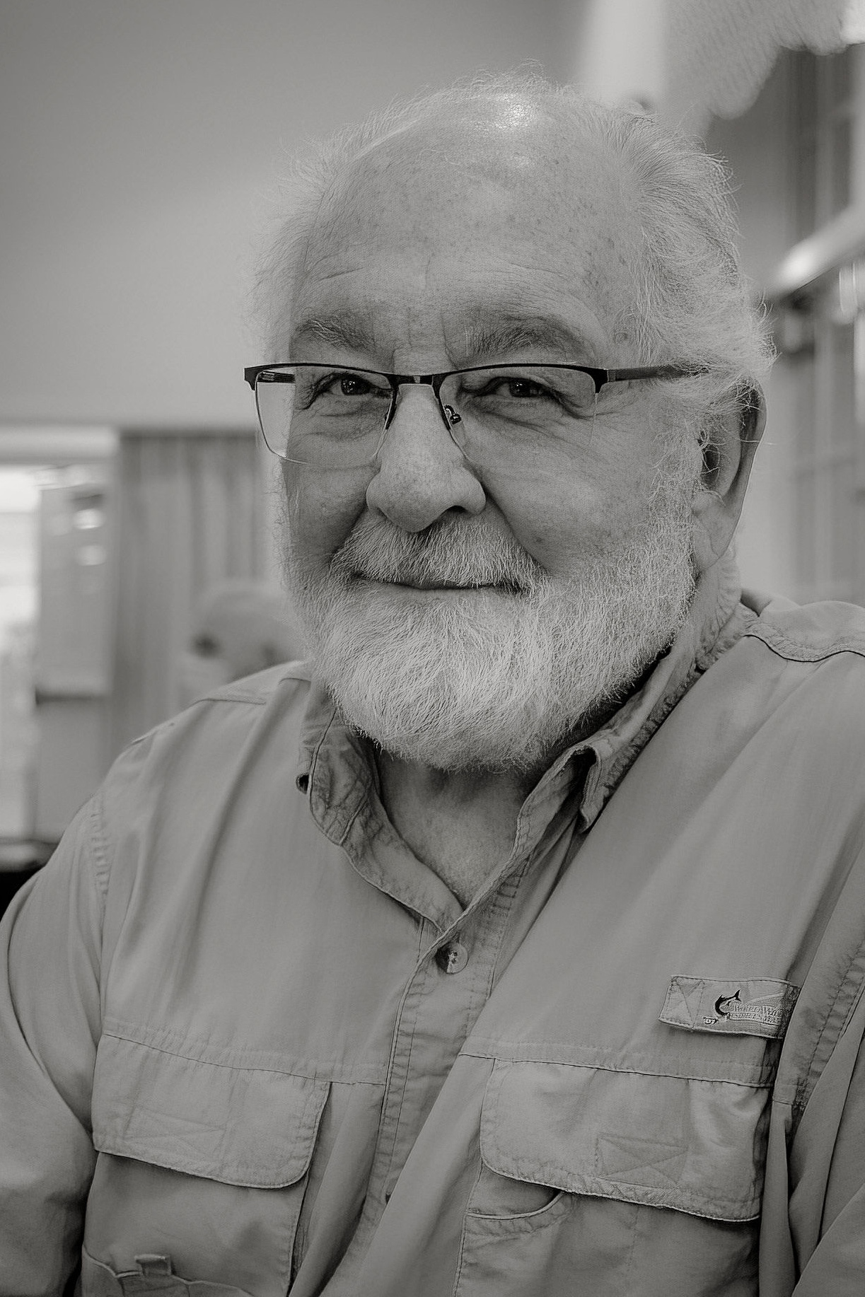
(Square Crop) Posted: 01/02/2022 05:50:15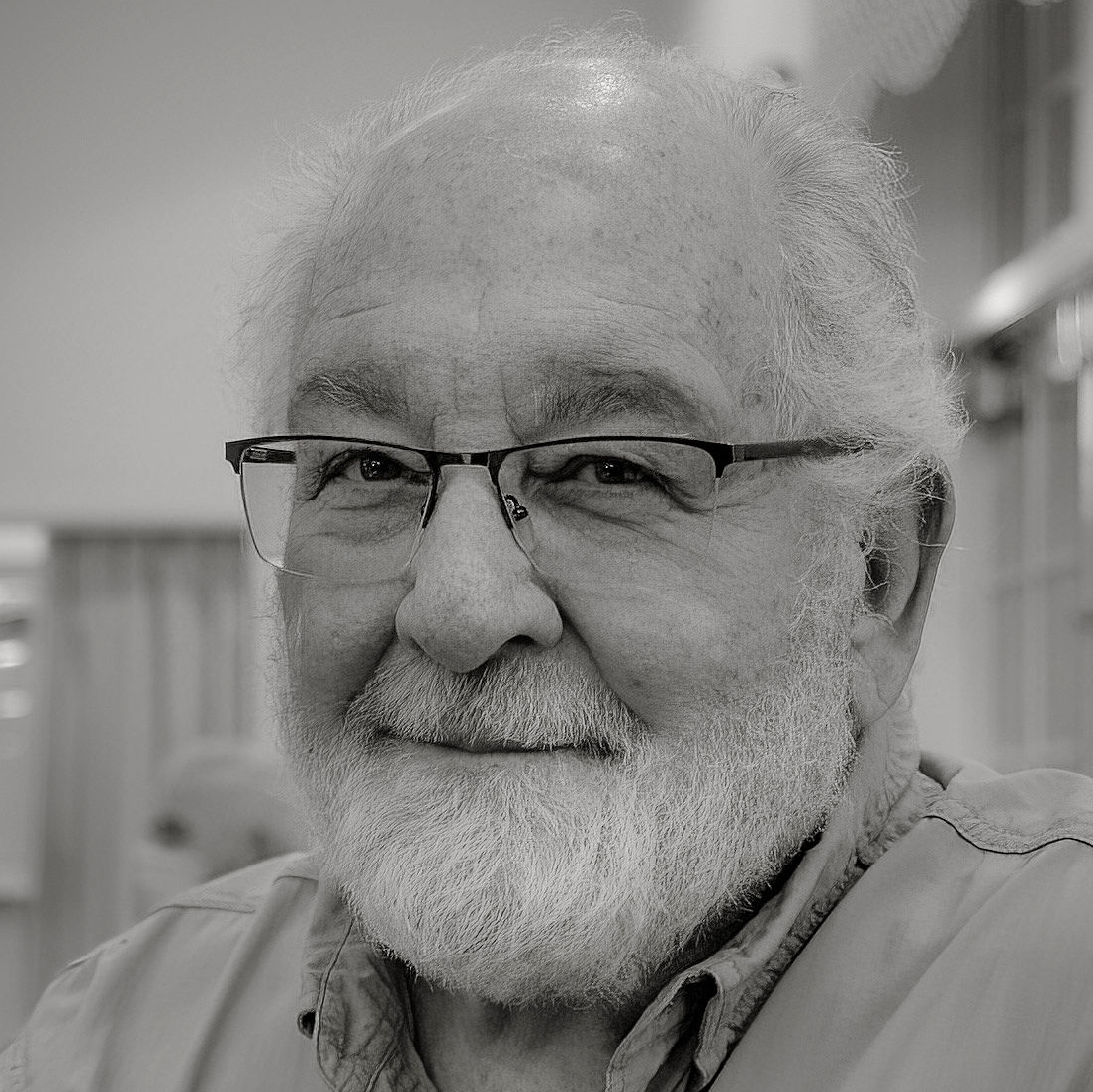
Lance. Thank you for your always valuable comments and suggestions. I do like the added contrast. What I like about this group is that I rarely post an image from which I learn nothing new. What a great group of "truth tellers" to work with. Posted: 01/02/2022 13:48:47
...and this is true...how refreshing, indeed. Has your friend seen the photograph of him?
Posted: 01/02/2022 14:25:09
Posted: 01/02/2022 14:25:09
Yes. I gave him an 8x10 print. Posted: 01/02/2022 21:21:24
Very cool! Posted: 01/03/2022 06:26:03
Kudos to you for having your camera in your hand - just doing that probably allows you to find some interesting shots! I need to do that more.
I really enjoy your image - I like the flat/low key/low contrast appearance - for me that creates a feeling of calm/warmth. I imagine Dale is a warm/friendly person - easy to talk to.
The bright window doesn't bother me - although it's the brightest spot and right at the edge. For me - it's part of the place - perhaps Dale's face is interesting enough that it holds my attention. In my opinion, toning it down slightly as Lance has done keeps the feel of the place - and improves the overall image.
I think Lance's square crop is too tight . . . misses the place and also part of Dale; right down to his shirt pockets and fishing logo - all of which contribute to who he is. Posted: 01/02/2022 09:24:42
Steven. Thanks for your interesst in my image. As for having my camera in hand, that was due to the event I was attending. It was an information event at our clubhouse designed to inform residants of the community what clubs were available for them to participate in. I, and Dale were representing our Photography Club. It just seemed appropriate for me to have a camera in my hand. Posted: 01/02/2022 14:00:41
I agree with everything that Steven said. I would like to sit and talk with Dale, and I do like the toning that Lance did. Great shot. Posted: 01/07/2022 09:15:39
Thank you. Yes, Dale is a great person to be around. Posted: 01/07/2022 09:24:09
Hi Chan,
I really like your portrait of Dale! I agree with the comments about the bright window, and it could be darkened, but I don't think it's a major problem. I especially love how relaxed and natural Dale looks! Great job! Posted: 01/07/2022 10:51:26
I really like your portrait of Dale! I agree with the comments about the bright window, and it could be darkened, but I don't think it's a major problem. I especially love how relaxed and natural Dale looks! Great job! Posted: 01/07/2022 10:51:26
Very good portrait! The overall feel of the image is warmth and draws the viewer to the warm personality displayed by Dale. Personally, I like the crop as is. The background is a natural part of the image and is blurred enough not to be a distraction. The window could be considered too bright, however I agree with others that it is also not a distraction. Very nice photo...well done! Posted: 01/07/2022 16:19:06
Thanks Posted: 01/07/2022 17:56:32