Freddie Kelvin
November 2021 - Watery Halloween
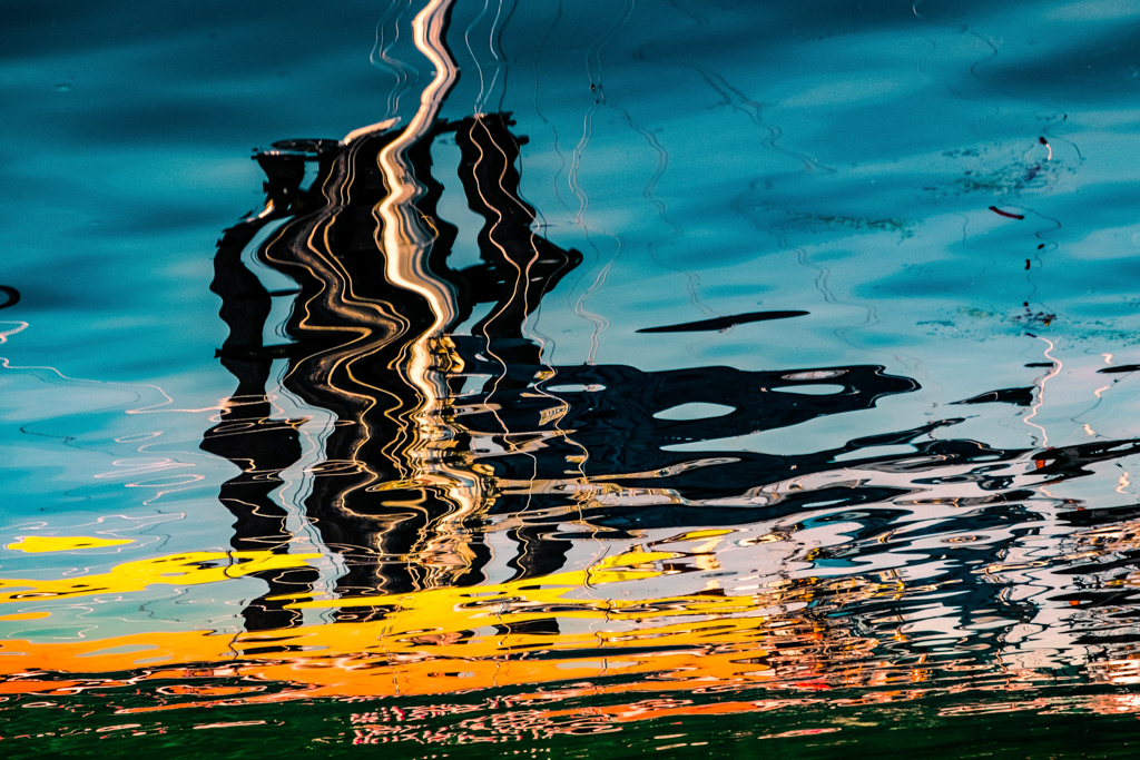
Original
About the Image(s)
The shot was a reflection of a boat in the harbor of Tofino on Vancouver Island, one of my favorite places on the planet!
For editing, I decreased the exposure, increased Dehaze and also temperature (towards orange). I also increased blue and yellow saturation.
Finally, I inverted the image...perhaps giving it a Dali effect.
This round’s discussion is now closed!
5 comments posted
Excellent clarity. I love reflections and this one makes a particularly fine abstract. The colors are perfect for Halloween. The black streak just right of center is reminiscent of a bat. Posted: 11/13/2021 11:14:51
You could go with inkblot on this one too. Striking colors and fun interpretation for Halloween. Posted: 11/14/2021 14:22:20
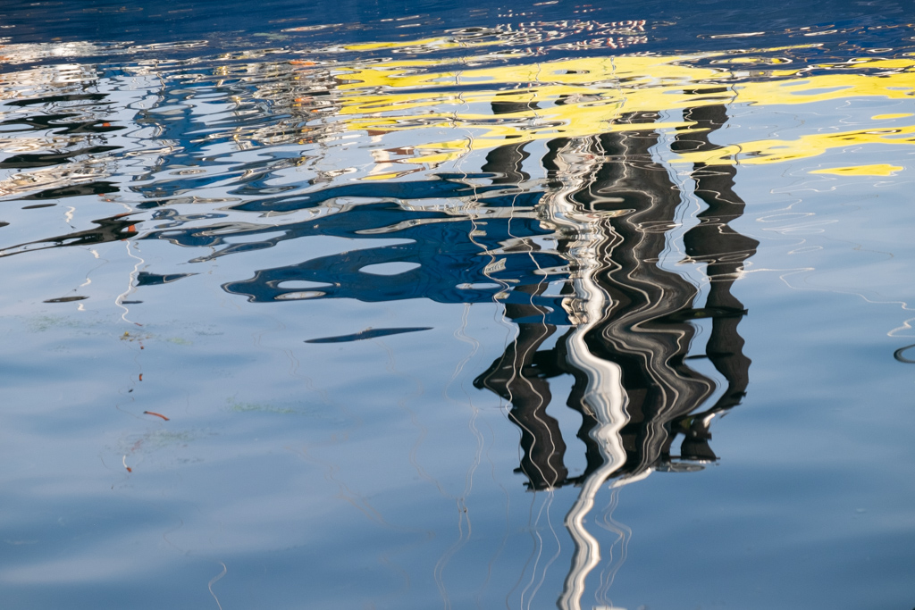
Hi Freddie, Striking color works well in abstract images like this. The yellow-blue contrast amplifies the color. I chose to get more towards a compact design leading from the left. The downward angle lends a dynamic quality or a sinking ship. Karl Posted: 11/15/2021 09:50:20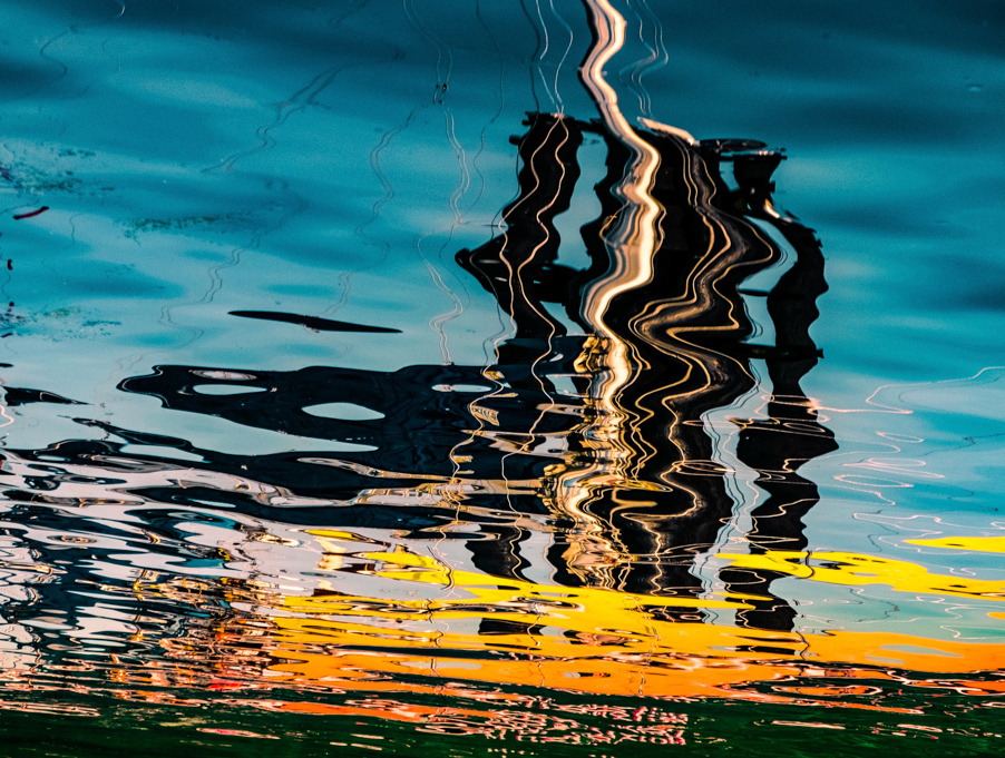
Freddie, Very well done. I like the way you handled the colors. the the colors and luminosity, and the way the lines seem to blend where they should blend, and compliment when they should.
A short time ago I heard the following statement. "I never saw a reflection that I didn't like." Great image. Posted: 11/18/2021 17:52:32
A short time ago I heard the following statement. "I never saw a reflection that I didn't like." Great image. Posted: 11/18/2021 17:52:32
I like your design leading from the left, Karl. After all, that's how we see and read. Thanks for your comments, everyone! Posted: 11/21/2021 22:04:20