Peter Newman

May 2021 - Two Peppers No. 8
About the Image(s)
Nikon D800, Nikkor 105 micro f2.8. .5sec @ f16, ISO 1600. Lighting 2 Litra torch, I attached a diffuser to one of them and the other with a barn door attachment to help direct the light. Plus overhead incandescent room lighting.
This image, like last month's was inspired by Weston. The original, which was part of a series taken with "Pepper No 4." is a mini-green and mini red pepper placed on the same black mirror and converted to mono in PS, by playing with the sliders. I processed it to be sharper, and a bit colder. It has a different look and feeling. I probably used this process because of my mood today. As usual all comments are appreciated, especially constructive negative ones.
This round’s discussion is now closed!
12 comments posted
Peter, what a fine thing to do on a gloomy day. Can you post the original image? The pepper on the left has great potential. The shape and texture are really interesting. The pepper on the right holds much less interest. I would try eliminating it and focusing on the more interesting curvy pepper. Are the black dots on the pepper itself, or light effects. The curvy pepper looks like it might have some very interesting texture that could be enhanced by playing with the light and some focus stacking. I would also try different positions of the pepper as the shadow also looks very interesting. Posted: 05/09/2021 20:06:55
Judith, thanks for your comment. I agree, now that you mention it. The red is not that interesting. Next time I get a bag of minis, I hope for more interesting ones. The best way is to pick them out myself. As soon as I can do so, I will have to look harder. I am working only in monochrome, as my objective is to learn lighting. For this purpose, I think that color is only a distraction from what I am trying to learn, and from the beauty of the shadows and curves.
As you requested I attached a cropped and color corrected original. Posted: 05/09/2021 23:17:46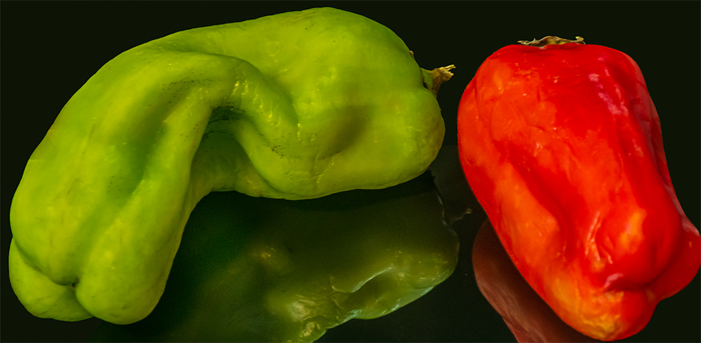
As you requested I attached a cropped and color corrected original. Posted: 05/09/2021 23:17:46
Wrinkles are beautiful. I agree the pepper on the right is more interesting. Why is there a dark triangle on the reflection below the curve of the right pepper? Posted: 05/10/2021 11:53:52
Lauren, The dark triangle is an effect of the lighting.
Posted: 05/12/2021 18:40:53
Posted: 05/12/2021 18:40:53
I would suggest that you lighten the triangle, it doesn't match the pepper and is a bit strange in the reflection. Posted: 05/13/2021 09:59:15
Hi Peter, I would like to see the whole reflection. That would make the image a top 1/3 peppers and bottom 2/3 reflections even if they fade out or into blur. I also like monochrome but feel the sharpening artifacts (black pencil lines) make the image look somewhat fake. Try some images where you are at the pepper's level rather than looking down from the 'God' view. As Weston knew, peppers are can be very interesting. They are cheaper models than humans and take directions better! Karl Posted: 05/12/2021 10:56:19
(Group 32)
You can't beat peppers as models (although to disagree with Karl, they lack ears like corn, so I don't think they take direction well at all), and I think Weston is the master of masters to emulate.
I tried converting to monochrome, playing with the red and green sliders, to lessen the tonal difference between the two peppers. I don't care for the reflection--Weston put his most famous pepper in a large aluminum funnel.
I do like very much that the left pepper especially shows imperfections, also present in Weston's work.
Great subject matter, and seriously done. Posted: 05/15/2021 17:07:50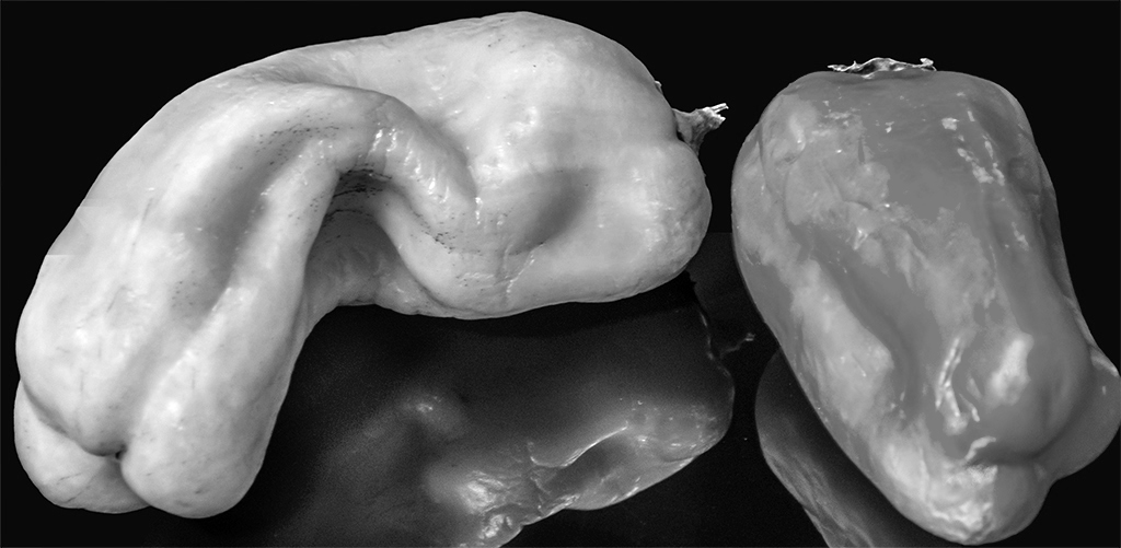
Thank you for your comment. I may play around with peppers in a funnel. By coincidence, about two weeks ago I bought a 5.5" funnel. I never thought of photographing peppers in it. Posted: 05/21/2021 21:35:01
I am torn between the monochrome and the colored version. I may be too simplistic in saying this, but I would prefer more contrast in the monochrome version. The colors in the other version are stunning! Posted: 05/20/2021 21:26:15
I am torn between the monochrome and the colored version. I may be too simplistic in saying this, but I would prefer more contrast in the monochrome version. The colors in the other version are stunning! Posted: 05/20/2021 21:26:19
Freddie, thank you for your comment. It is not my intention to do food photography. I am trying to learn the interplay between lighting, and lines and curves. I think that color would just be a distraction. Posted: 05/21/2021 21:47:11
Although I loved the texture that is so evident in the b & w version, I also really like what Peter did to it. Posted: 05/26/2021 19:12:54