Jim Hagan, MPSA
June 2021 - The Gateway Arch
Original
About the Image(s)
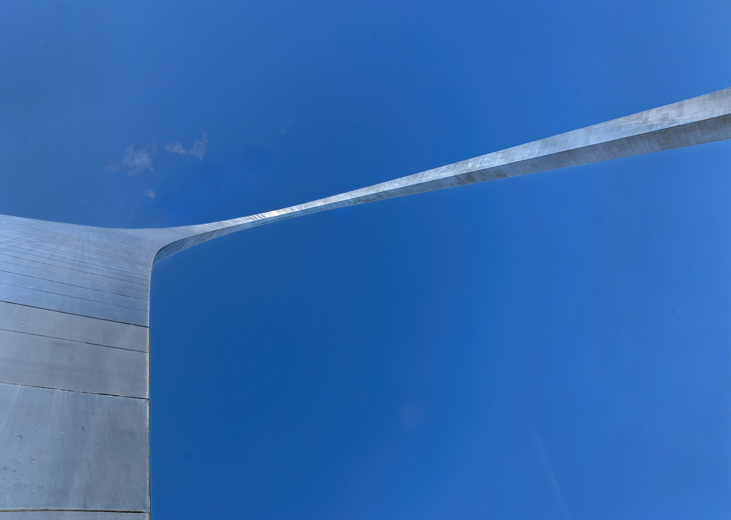
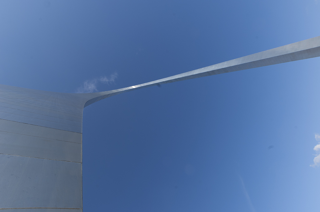
The city of St. Louis has a remarkable 630 foot stainless steel arch called The Gateway Arch. I photographed the arch while close to the base using a wide angle zoom lens at 18mm, 1/250, f/11 and ISO at 200. In Photoshop I removed some dust spots, moved the clouds away from the top of arch, eliminated the clouds on the right side, cropped the left side, burned both edges and brightened the arch.
This round’s discussion is now closed!
5 comments posted
Holy Moly! I had to look and look to see the arch (and I've been there). Strangely enough, it looked like a close up of a few inches of blue metal. What an interesting leading line! I can't wait to hear what everyone else sees! I don't have any comments yet, but I'll circle back. VERY creative! Posted: 06/03/2021 20:45:53
Great shot! I'm a huge fan of this kind of photo, which forces the viewer to stop and think about what they're looking at.. Not sure there's much I'd do with this - might see how it looks if you eliminated the clouds altogether (as they're not so spectacular, as far as clouds go). I love the shifting blue tones in the sky. Beautifully done. Thanks for sharing! Posted: 06/05/2021 17:00:45
Jim,
Excellent image, liked it. well processed. Posted: 06/10/2021 15:45:30
Excellent image, liked it. well processed. Posted: 06/10/2021 15:45:30
I like that you and Mitch were both into abstractions this month. This is a good and not so common angle for this image. It takes a moment to get oriented to what we are seeing.
I kind of feel like the left side of the image/arch is not adding so much either and would consider cropping about halfway in. If you went with a 4x5 format you could do away with a good part of it and IMO still portray an interesting image. Posted: 06/10/2021 23:07:14
I kind of feel like the left side of the image/arch is not adding so much either and would consider cropping about halfway in. If you went with a 4x5 format you could do away with a good part of it and IMO still portray an interesting image. Posted: 06/10/2021 23:07:14
Interesting image Jim, and as Mitch says you have to stop and think about what you are looking at, but I personally like that little bit of cloud that allows us to understand the image.
There is a light 'stroke' in the bottom right third that could be removed to keep the uniformity of the blue.
Have you thought about pushing up the saturation and putting a gradient mask on the saturation layer to fade it away to the left and right, and of course masking off the bridge itself?
Posted: 06/18/2021 11:37:08