Witta Priester

January 2022 - Sunny Isles Beach - Night Skyline
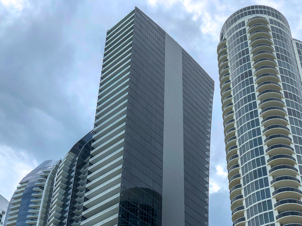
Original

Original 2
About the Image(s)
Having temporarily lost interest in taking photos, I’ve been editing some older ones. These buildings were photographed (with my cell phone) on a trip to Florida in 2019 for my brother’s celebration of life.
As is often the case for me, an idea grows as I look at photos taken at about the same time. The buildings photo was from a beach walk, and the pattern “overlay” photo is a digital double exposure of two photos taken inside the hotel where we stayed.
The initial overlay was modified using the polar coordinates filter in PS. The result was selectively applied to the buildings using a mask. The sky was replaced with one of my sunrise photos.
See the intermediate photo, which shows 4 steps / details along the way to the final image.
Wanting to create a night-time feel, the colors of the composite were changed in Topaz Restyle, and eventually the sun was replaced with a photo of the moon. Since I felt the building were too squat, the final composite was elongated / transformed. Then I moved the moon to a higher position. Along the way there was quite a bit of selective lightening and darkening of the buildings and the sky, both in PS and in LR.
I like the final gold/purple duotone and the idea of the interesting curves that can either be viewed as part of, or projected onto, the buildings. I would like the lighting to seem more realistic (as if lit by the moonlight), but don’t really know how to improve on this. Perhaps you have a suggestion, or you can see a different direction to take with this composite? Ideas and critique most welcome.
This round’s discussion is now closed!
6 comments posted
Great composite! Posted: 01/11/2022 15:32:33
I do know a bit about the tools, so they are rarely in my mind. (At the same time, I do try to learn more and more about them all the time.) Generally, the experimenting that goes on for me is mostly about what images to combine, the color choices, the lighting, and mostly about how to make things come together. Posted: 01/19/2022 19:34:09