Mary Hinsen, BPSA  


October Babies by Mary Hinsen, BPSA

October 2021 - October Babies
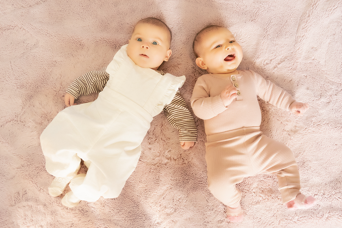
October 2021 - Mary Hinsen, BPSA

Original

About the Image(s)

This month I was privileged to photograph two babies. This image was one that I didn't process with the first bunch, because of the burnt out highlights. However, the family liked this one, so I decided to see what I could do.

I first opened it in Camera Raw to adjust the highlights and whites. It didn't have enough effect, so I thought I might try to work with it and aim for a soft, high key effect.

I then added and masked a LUT at 15% opacity to bring out the eye colour, and added a second LUT to bring out the pinks.

I opened in Photoshop and took it into ColorEfex Pro. I added a slight glow to the babies and a white vignette to the rug.

The parents love it, but I am concerned about how the blown highlights will translate to print. I'd love to hear any ideas and thoughts.


This round’s discussion is now closed!
7 comments posted


Here's a thought: In PS, add a new layer; fill it with a dark beige brown; use color burn blend mode. Select outfit, and mask everything but the white clothing. Then clip a desat adj layer to the color burn layer and totally desat. Adjust the opacity and FILL amounts of the color burn layer. Here's what I got…   Posted: 10/09/2021 16:47:14
Comment Image


Connie Reinhart   Connie Reinhart
What adorable babies! Love the facial expressions. Witta, you came up with a good fix for the whites.   Posted: 10/10/2021 11:44:55


Linda M Medine   Linda M Medine
Beautiful Babies. I feel like the lighting is off a little. The baby on the right, their clothes is blow out. There is Lots of shadows. I changed the color of the babies clothes on the right. Same thing that Witta talked about. I used da radial tool in camera raw around the babies.   Posted: 10/11/2021 22:06:54
Comment Image


Denise McKay   Denise McKay
Isn't it funny how the photographer may not like a photo from the technical standpoint, but the parents love it. They are looking at the expressions and mood of the image only, which is what they really wanted to capture. So you achieved that objective here!

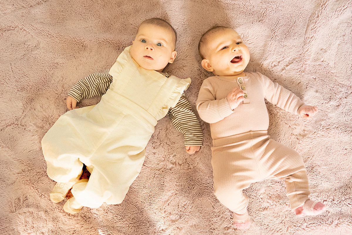
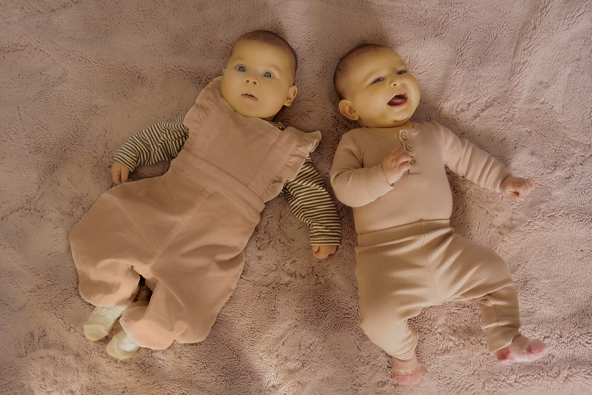
I agree that the lighting is not great for this photo and attempting to leverage the blown out portions for a high key effect doesn't work well here in my opinion. I went in a different direction.

In Lightroom, I used a portrait preset for medium skin tones labeled PM09 to see if it would reduce some of the highlights on the skin. I then used the adjustment brush to reduce the highlights on the crouch area of the baby in the white outfit. I than adjusted the tone curve towards the dark and converted the photo to black and white. I then cropped it to an 8 x 10 format to focus more on the babies and less on the background. I think the overall effect is much more soft and baby-like and could possibly produce a nicer print. You may want to experiment more with a black and white version to see if that helps.
  Posted: 10/12/2021 07:05:42
Comment Image
Mary Hinsen   Mary Hinsen
Thanks Denise, I am experimenting with your suggestions. I like the result you came up with.   Posted: 10/27/2021 16:29:35


Michael Moore   Michael Moore
I'm with the group - these babies are adorable! You just have to love these expressions and it's easy to see why the parents love your image. The lighting is a little problematic but the group has provided some very good suggestions for addressing it.   Posted: 10/14/2021 09:53:59


Georgianne Giese   Georgianne Giese
I preferred the monotone of Denise's version, so I tried taking your original into Topaz BW, Opalotype, Hand Tinted Cream and played with the various sliders until I got most of the hot spots to dim a bit. I also liked the original red tones, so I applied a blue filter on pinkish paper.

This is an adorable image. I can see why the parents liked it. The important part of the image is the children, not the supporting stuff! Love it!   Posted: 10/18/2021 14:58:11
Comment Image