Marti Buckely
August 2022 - Red Tulip
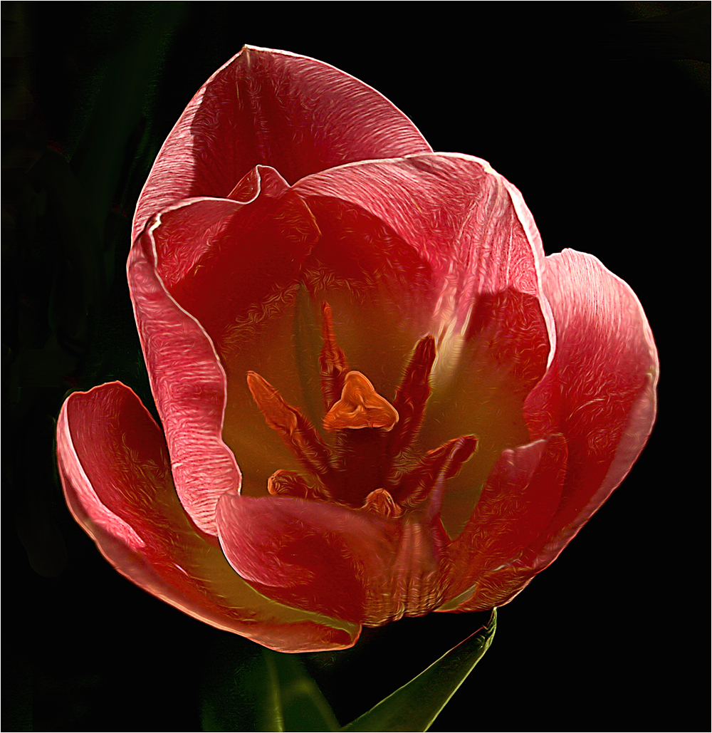
Original
About the Image(s)
The original was shot at 1/90 sec at F8.0 with a 17-40mm at 40mm for the lens. The ISO was 100.
I like to see the insides of flowers. There were distractions in the background so I cloned them out. Also used Topaz Studio to do some other editing but unfortunately don't remember exactly what module was used as this is an older photo.
This round’s discussion is now closed!
9 comments posted
I can see you are out of my league and I can not tell you anything to make this image better. Posted: 08/02/2022 12:31:27
(Groups 22 & 80)
Hi Donna - it's not about leagues...If there is something you like or dislike, feel free to say it. That's the way we learn. It's not just about what's "wrong" with an image. People also learn by what others think is "right" with images. Posted: 08/02/2022 14:26:34
(Groups 45 & 65)
You are very creative in using Topaz Labs' filter to accentuate the details in the tulip. I've never tried using Topaz filters myself even though I own Topaz Studio. If I were to do anything differently, I might try changing the flower's stigma to a bright yellow to add contrast to the image and bring attention to the inside of the flower. I believe the red tulip's stigma is naturally a yellow color. Posted: 08/02/2022 13:13:25
(Groups 22 & 80)
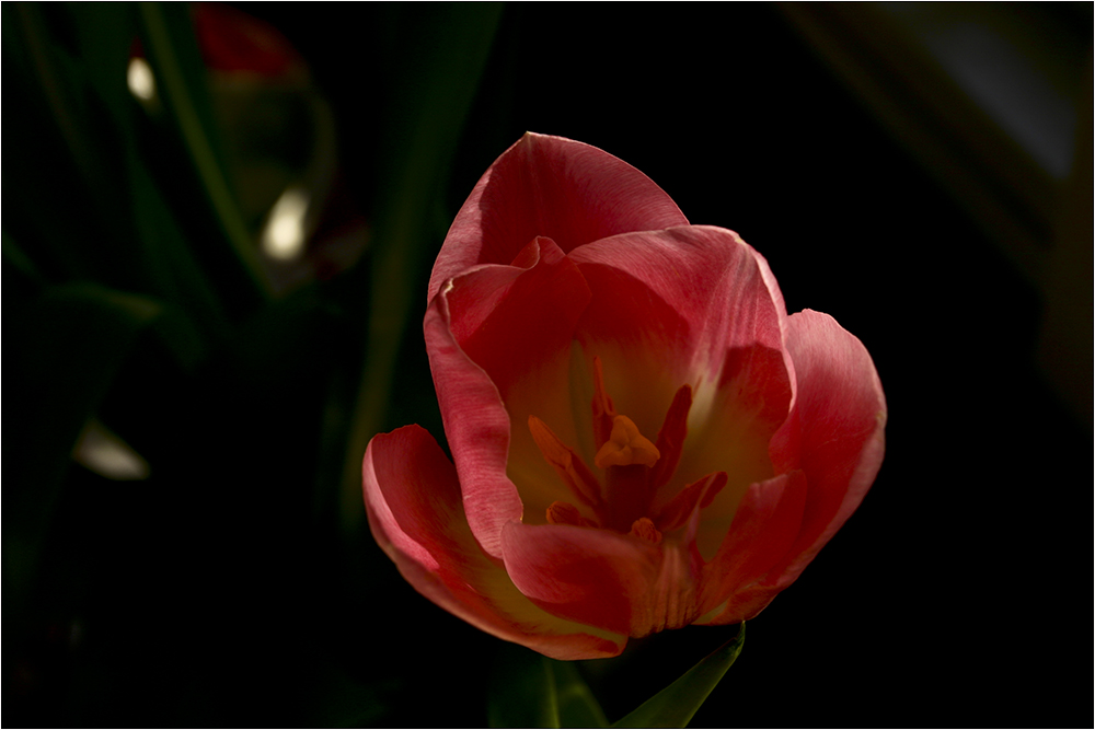
Thanks David - perhaps like this? Posted: 08/02/2022 14:22:06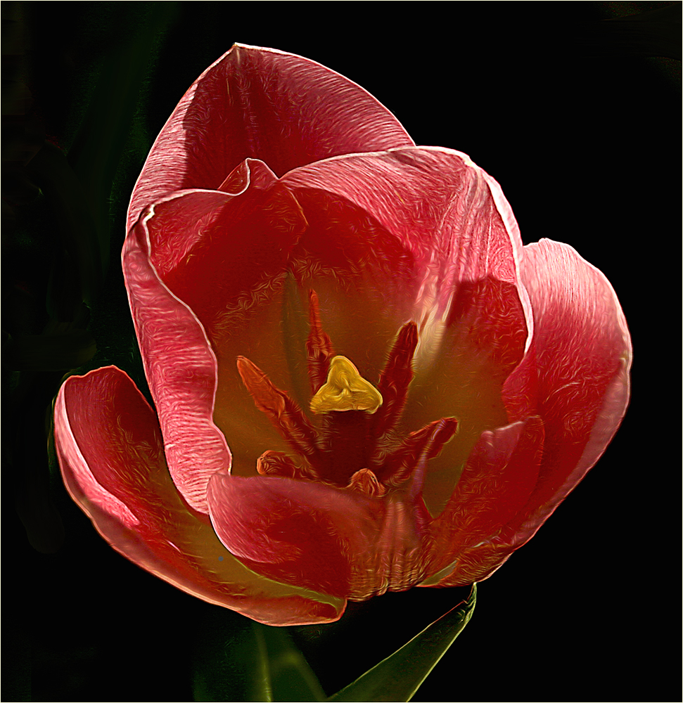
(Groups 45 & 65)
Yes, I think it adds a little more interest to an already interesting image. Posted: 08/02/2022 14:59:22
(Groups 15 & 81)
Marti, I like this image and the framing. David had a good idea, and it pops with the yellow center. I like a gentle flower look, so on a personal preference I find the technique less appealing than if it had a more gentle look. Either way the bottom right green leaf is strong, and I suggest darkening that one down and take clarity down on it, so it is subtle like the leaf on the left. Keep up the good work. Posted: 08/03/2022 22:42:56
(Group 77)
Marti, Love the colors in this flower. With tulips I like a softer look too. I feel like you capture this image in good light. I have a visual feedback. I took the original image and cropped it square, clone out the background to make it black. I painted in a little yellow on the stamen. I darken the green leaves. The front petal is a little soft. With all that being said. I feel you have a lovely image and you did a great job with the more artistic image. Posted: 08/05/2022 11:00:33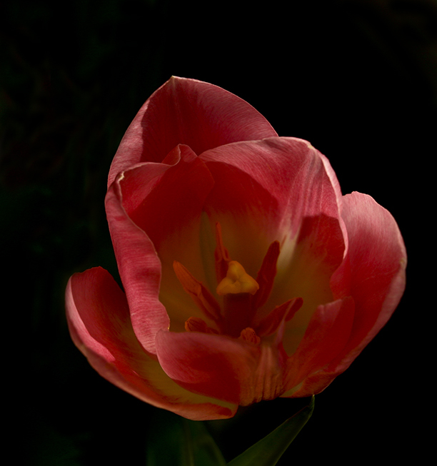
(Groups 22 & 80)
Thanks for your comments, Linda. I sort of feel by taking the stem and leaves out that the flower appears to be floating. I can see the leaves when I select the image but not the small version in the comment box. Posted: 08/05/2022 13:33:28
(Groups 14 & 80)
This is a beautiful tulip and your processing has done an excellent job of bringing out the texture and the interesing shapes of the flower. I would definitely leave in the stem and leaves detail at the bottom to anchor the flower. I also think that brightening the yellow stigma is a helpful improvement. Posted: 08/14/2022 13:41:25