Bill Wright
May 2022 - Bridge Composite
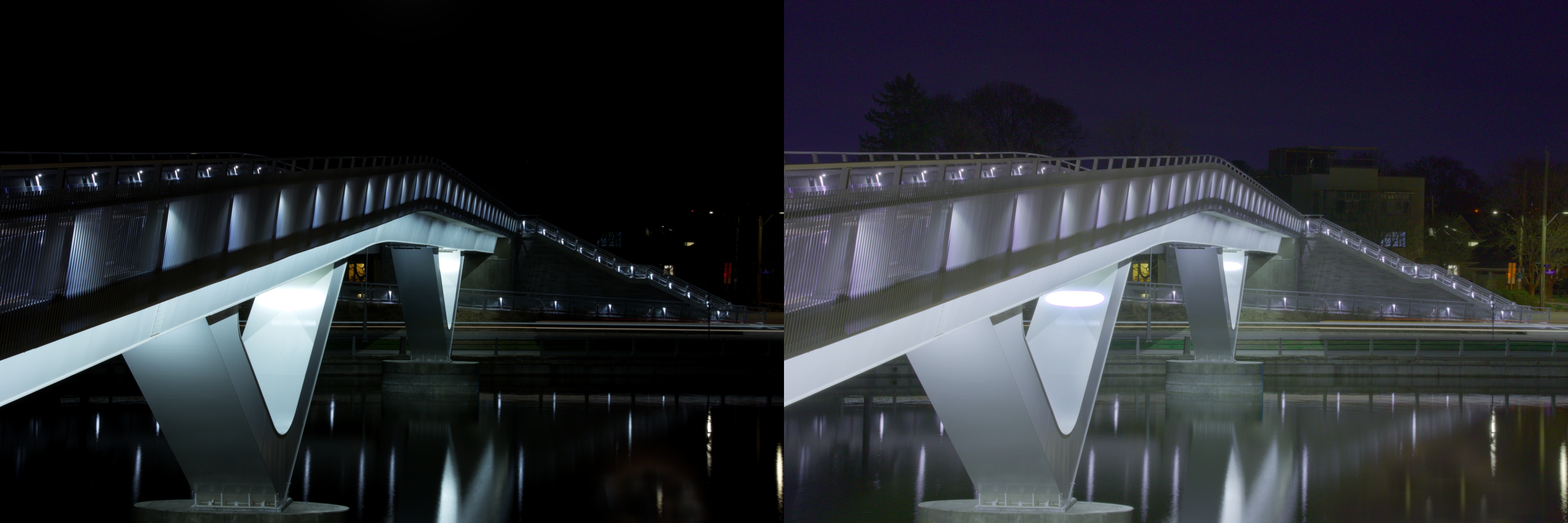
About the Image(s)
I am submitting a composite this month if that is OK.
The photo was part of a night class I am taking. The photo was for 30 seconds at F11, ISO 100 on a tripod. It is a footbridge over the canal here in Ottawa. The reason for two images is that there is a difference of opinion in the class as to whether the darker or lighter is the best presentation of this photo. I would also welcome any other improvements
the group might offer.
This round’s discussion is now closed!
7 comments posted
Bill - Both really well framed and really sharp images. While I like the bridge in the darker image the rest of the photo has little information to add context to it. The lighter image is overall more interesting and pleasing. B Posted: 05/10/2022 14:50:50
Thanks Bruce. I have been partial to the darker image but my instructor demonstrated how he would do it in class and we tended to be split. I am doing a photo book of the class so I guess the easy way out is to print both
Posted: 05/10/2022 15:18:40
Posted: 05/10/2022 15:18:40
Bill, the dark version gives more character to the image, removing all the distracting elements in the background. The image is sharp and I like the way you composed it going from the left of the frame to the right Posted: 05/10/2022 18:07:40
Thanks Isaac. It is quite a long footbridge and that was about the only shot I could get the whole thing in
Posted: 05/10/2022 18:28:54
Posted: 05/10/2022 18:28:54
Bill, thanks for providing both images. I like the composition of the image with strong architectural triangles, verticals and horizontals. Since you asked for feedback- I feel that the darker image offers little or no detail in the upper third of the image. By opening up the background darkness, the viewer would see another layer of background of trees, and buildings thus adding depth or three dimensionality to an otherwise 2 dimension flat photograph. We now have a foreground, middle ground and background. That said the lighter image in my opinion is too much exposed with a purple color cast in the sky. A meeting of the middle of both photos is a good compromise, isn't it always?? Posted: 05/18/2022 06:54:53
Bill, interesting shots and I like the fact that you are asking the group to select their favorite . I share Isaac's view that the darker version has considerably more character and distinction. It's sharpness draws my eye more easily into the image. Posted: 05/28/2022 12:20:40
Thanks all for the comments. Been off for a while as we had a storm with winds of up to 197 Km/h so I have been without power for 9 days. Back full tilt again. Still a little torn as to which way but printed and mounted the darker version. I do see your point Gloria of the foreground, middle and backgrounds. Just before losing power took out a subscription to lightroom and photoshop and will have to see how that goes. Thanks again. Posted: 05/31/2022 18:40:21