Nancy Speaker, QPSA, PPSA
June 2021 - Garden Berries
Original
About the Image(s)
We had two special events this past week. Our Camera club had an outing to our local California Botanical Garden three days after an hour long Zoom session with Guy Tal,, a well-known landscape photographer. Guy believes we need a vision before we photograph a subject and for him it is an emotional experience. He doesn’t just shoot away but will often wait to find something that interests him when he is photographing. Then that vision or even a a new one is enhanced in post-processing. He doesn’t care if his images are accurate or not as he sees his photography as art and is known to use composites in his landscapes.
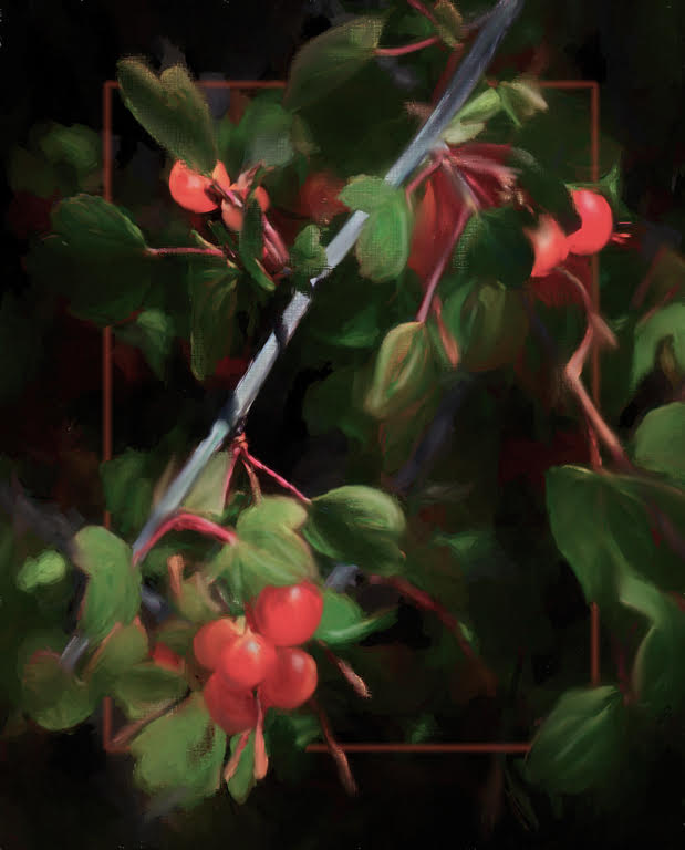
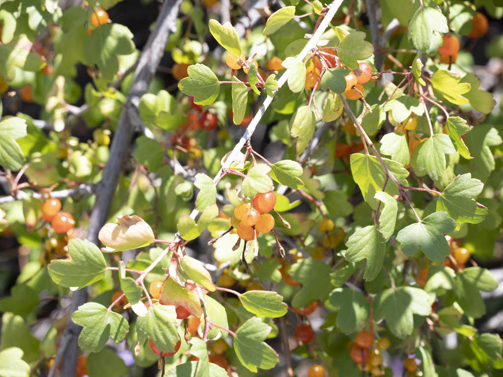
Keeping this all-in mind, I photographed this group of berries, but was attracted to the diagonal branch which caught my attention and I immediately liked the bright section Guy had shared with us that we read from left to right and that diagonals going up from the left to the right are uplifting and filled with energy. The diagonals going from the left upper corner going down to the lower right usually convey a peaceful feeling. Using this, I used the strong rich colors of red and green complements. Thinking I didn’t have much time to paint I took it into Topaz Studio and used a painting preset. When finished, I wasn’t that happy with it so, I went over the Studio preset art-look with my mixer brushes and added the inner border.
Just in case you are new to inner borders: I use inner borders all the time. Here is my process. I use the marque tool and on a new empty layer, draw a rectangle that is appropriate for the image> open select,>Modify>border> enter width to taste 5- 20 pixels> then click edit and fill with color (choose a color from your image) and adjust the opacity. I then I add a mask to the border layer and with a black brush, I remove the parts of the image that I want to appear in front of the border. I zoom into 300% to really see the border and the area I am removing.
This round’s discussion is now closed!
5 comments posted
I would suggest you might apply some texture to the foreground elements, to separate them a bit more from the soft background elements. Posted: 06/08/2021 14:06:41
I liked your helpful explanation about the inner stroke you created. It's faint, but adds a pleasing element to tie things together with its reddish shade. Posted: 06/21/2021 13:35:22