Peggy Nugent

September 2021 - What Next?
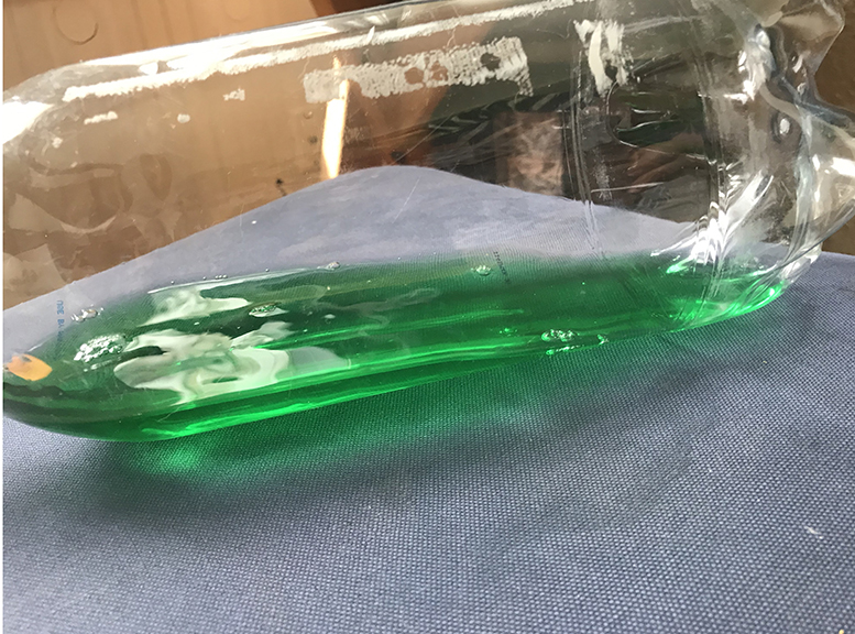
Original
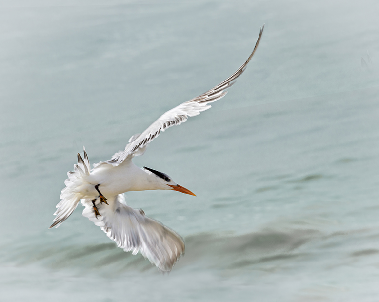
Original 2
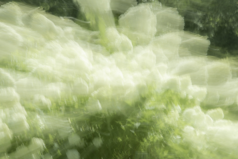
Original 3
About the Image(s)
My intent with this image is to convey a feeling rather than a realistic depiction.
I started with the water, using motion blur and transform=>warp to create the wave. I played with color in the highlights and shadows as well as texture and clarity in Camera Raw to get the color and texture I wanted.
I added the bird in its own layer by doing a simple Subject selection and using the transform to size and orient it.
I only included one original for the clouds and wave foam, but actually there were two, one with more texture than the other. It's a zoom out shot of hydrangea flowers at a slow shutter speed, with a pause at the end. I masked those in, and then put in a layer of clouds for the empty space under the wave.
I played with the colors using a hue/saturation adjustment layer as well as Topaz Restyle and a color lookup adjustment layer.
I know the shape of the wave is not realistic, but I personally prefer it this way, as it feels more threatening to me.
This round’s discussion is now closed!
5 comments posted
in the wave that lead to the seagull. Great composition.
The color at the top of the wave bothers me. Perhaps it should
be the same color as the wave or white to show foam. Posted: 09/10/2021 13:35:48
I love the placement of the bird and the threatening look of the wave.
I think that the cloud is not the most important part of this story so I did a bit of editing to show you what I think would make this story pop.
I used a gradient tool in Photoshop to darken the clouds and then slightly lightened the inside of the wave and enhanced the bird in Camera Raw with a bit more contrast and light. Posted: 09/10/2021 21:01:32
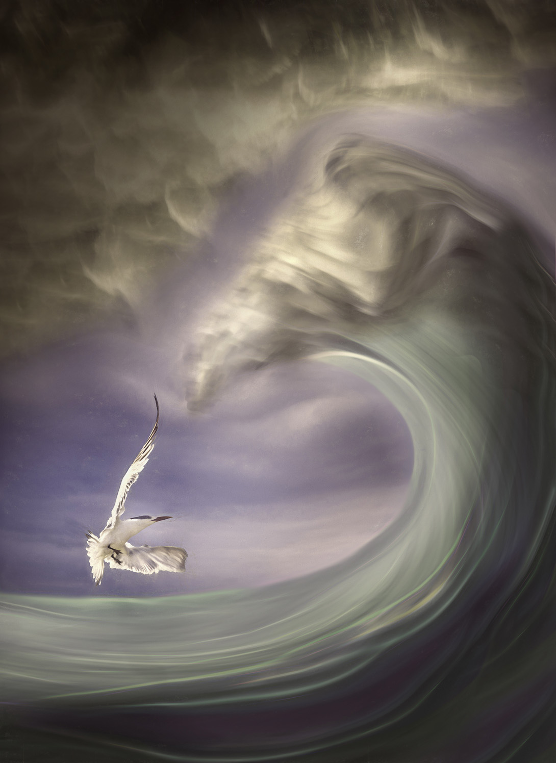
The pastel colours of the wave looks great to me but I find that maybe is not the best match with the palette of the sky
I'm not sure about the cloud, In my opinion it does not add a lot to the image and compete with the main subject that is the wave.
If I were you, I would play with a copy, and try removing the cloud and a square crop with some more work in the crest of the wave introducing a bit more of contrast and drama. Posted: 09/16/2021 00:09:53