Jamie Federick
July 2021 - MAN THE GUNS
Original
About the Image(s)
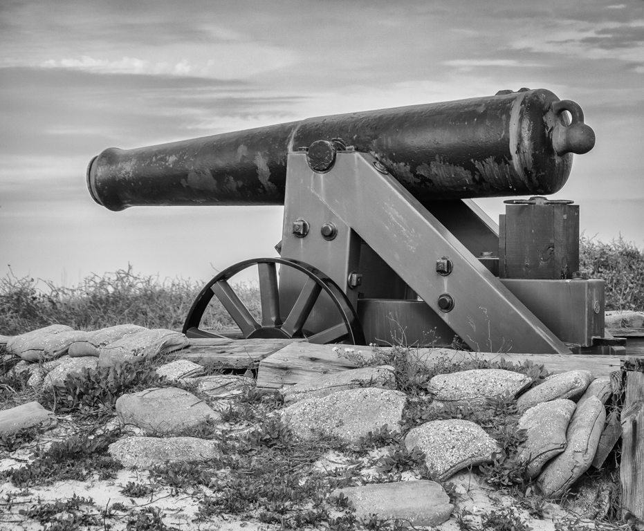
It was taken in Alabama at Fort Morgan and was an original cannon used to guard the entry into Mobile during the war. I first removed the Chromatic Aberration, sharpened it, smoothed the luminosity, reduced the exposure and converted to black and white. I did some editing in Nic Collection called Silver Efex Pro using Full Contrast & Structure. It was taken with my Canon Rebel 6ti at f 6.3, 1/500 sec., ISO 200 and 55mm.
This round’s discussion is now closed!
13 comments posted
I like the image, but found it a bit flat. So I opened Topaz Studio 2 and combed through their "cool contrast" clicked on it and came up with the attached. One click did the trick although there are sliders in every Topaz product to make fine adjustments. Posted: 07/04/2021 20:29:16
Thanks Bev. I can not really see much difference in this image but it might be my iPad! Thanks for your comments. Posted: 07/06/2021 10:02:14
I definitely like your rendition better than the original, especially the rocks and sky. Bev's version is also good. I can't say the image excites me but your explanation is good and it is very well done. I will show my lack of knowledge about history by asking "which war?" because all I know is that it was a long time ago. Posted: 07/05/2021 09:07:19
It was first the war of 1812 and then later in the Civil War. Posted: 07/06/2021 09:57:04
Thanks for broadening my history knowledge. Posted: 07/06/2021 10:02:30
Jamie, I like your editing of the image. It seems to emphasize the textures. The sky is also more interesting. The one thing I don't like is the changes to the cannon itself. To me the original looks dark and old, which is what I would have expected. In the edited version, to me the supports and wheels almost look like fairly new stainless steel, which feels out of place. I looked at the original again, and maybe the supports etc are all newer. Posted: 07/05/2021 10:59:26
Thank you for your comments. Posted: 07/06/2021 09:57:44
Thanks for the bit of history about the image. I also like the monochrome better than the colour version. Good to hear you are using Silver Efex Pro. I am also starting to use the Nik Collection. I am wondering if a person in the image might have added a bit more to the story? Posted: 07/05/2021 17:56:01
Thank you for your comments. I never would have thought of putting a person in it. Posted: 07/06/2021 09:59:32
I also like the monochrome treatment and suggest more contrast. It seems a bit flat as Beverly stated. Posted: 07/05/2021 22:12:57
Thanks Lloyd…I will try to make more contrast. Posted: 07/06/2021 10:00:21
(Group 38)
A really nice historical documentation of a cannon. Too me you cropped it just right and your focus and exposure are spot on. I think the texture of rocks and clouds help keep my eyes around the cannon. To my eyes your choice of monochrome was appropriate. In my opinion a little stronger vignette would be nice to isolate the primary subject a bit more. Well done. Posted: 07/09/2021 14:36:14
Thank you so much for your kind words Kurtis! Means a lot to me! Posted: 07/09/2021 17:41:41