Vinod Kulkarni
April 2021 - Untitled
About the Image(s)
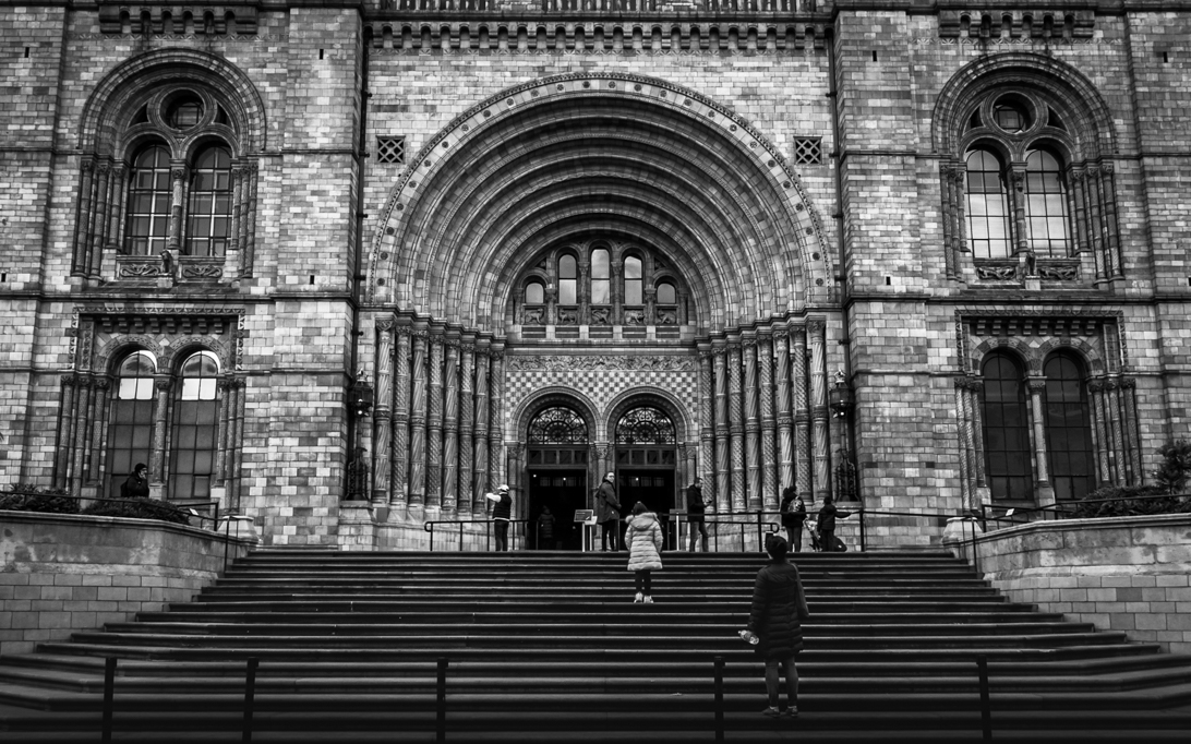
This is the close-up shot of the entrance of the National Museum in London. My aim was to include the patterns in the frame along with few people who were moving in and out of the museum to add a bit of drama. Given the colors in the frame were not adding value to the story, I decided to convert it into Monochrome and I really liked the way the grey scales were being shown between the patterns.
Shot in the afternoon, shot at 1/40, f/10, ISO 200, @10mm focal length"
This round’s discussion is now closed!
11 comments posted
To my eye this image has a very nice balance. I generally try to stay away from a centered main subject in an image, however I do like the sense of balance and believe that you made a good choice in centering the main doors on the museum. In addition the manner in which you framed the doors and the front of the museum allows for your intent - the traffic into and out of the museum. I also like the sense of depth of the entry way and your contrast setting enhances (for me) that sense of depth.
My only thought (nitpicking) is that if you had waited just a little longer the person on the lower steps would have been a little further up the stairs and you could have cropped the poles at the bottom of the image out. Still they are dark enough that, at least as I see it, they do not pose a real issue or take away from the overall majesty of the front of the museum with the people.
A really nice image Vinod, thank you very much for sharing it with us. Posted: 04/02/2021 19:56:30
Thank you for your feedback Ed and I am glad you liked the photo. I certainly think your feedback makes sense and will keep that in mind when I am in front of a similar composition Posted: 04/24/2021 05:06:57
Hi Vinod a good shot of a very attractive building I agree with Edd and would make a few changes I would alter the perspective to fix the converging verticals also there are a few bright areas that draw my eye away from the focal point, I have added a rough edit to show what I mean. Posted: 04/06/2021 03:20:19
Very valid points and thanks for sharing these. I have seen this photo for soo many times but never caught these brighter sections of the frame. Thanks again Colin Posted: 04/24/2021 05:07:53
I think you have chose a good subject and the composition has some very good aspects and some which I personally would alter. I would crop both sides to some point in the brick walls. I suggest you experiment with the contrast setting. Perhaps if the light tones were a bit brighter there would be more of a sense of depth without darkening the shadows and losing detail. I think the placement of the nearest person is spot on. The placement takes advantage of the dynamism of near-far composition. I think this photo as much to like and deserves a bit more work Posted: 04/06/2021 13:57:05
Thanks Albert and though I have been working on monochrome photos I still have a lot of room to play with the grey scales and on the editing front. Will surely work on the contrast and other aspects. Posted: 04/24/2021 05:09:19
Hi Vinod, I love the placement and posture of the nearest person, too! It looks like she has stopped still for a moment to take in the impressive entrance. It is like seeing the stairs and the entrance through her eyes, and in a way, I think she makes the image special. Lightening the shadows would bring her into view better, too. If you are ready to touch the authenticity, you might consider removing the poles? Posted: 04/07/2021 08:35:37
Thanks Kirsti, very valid points and removing poles is fine as to me it does not impact the main parts of the frame. Will try it out. Posted: 04/24/2021 05:11:02
Hi Vinod,
I enjoyed our image as I have been there many times, and you made me really notice the detail of the bricks so I appreciate that. I agree with Colin and about the vertical lines. The poles do not bother me. Thanks for an interesting image. Posted: 04/14/2021 20:29:50
I enjoyed our image as I have been there many times, and you made me really notice the detail of the bricks so I appreciate that. I agree with Colin and about the vertical lines. The poles do not bother me. Thanks for an interesting image. Posted: 04/14/2021 20:29:50
Thanks Jen, valuable feedback and will surely look into them Posted: 04/24/2021 05:12:00
(Groups 72 & 91)
You have chosen a good subject here for mono conversion Vinod. It has so much detail, texture and shades. Unless you are up at stupid hours, there will always be people around here, so just have to time your shot to only have people which don't detract. Again you have done well here.
I also feel you need to correct the converging vertices - this sort of balanced architectural shot needs to look right. One always looses width in doing this- for this reason I've started shooting this sort of scene wider than I want. Posted: 04/30/2021 10:45:55
I also feel you need to correct the converging vertices - this sort of balanced architectural shot needs to look right. One always looses width in doing this- for this reason I've started shooting this sort of scene wider than I want. Posted: 04/30/2021 10:45:55