Arne Skinlo
September 2021 - Natural Pyramid
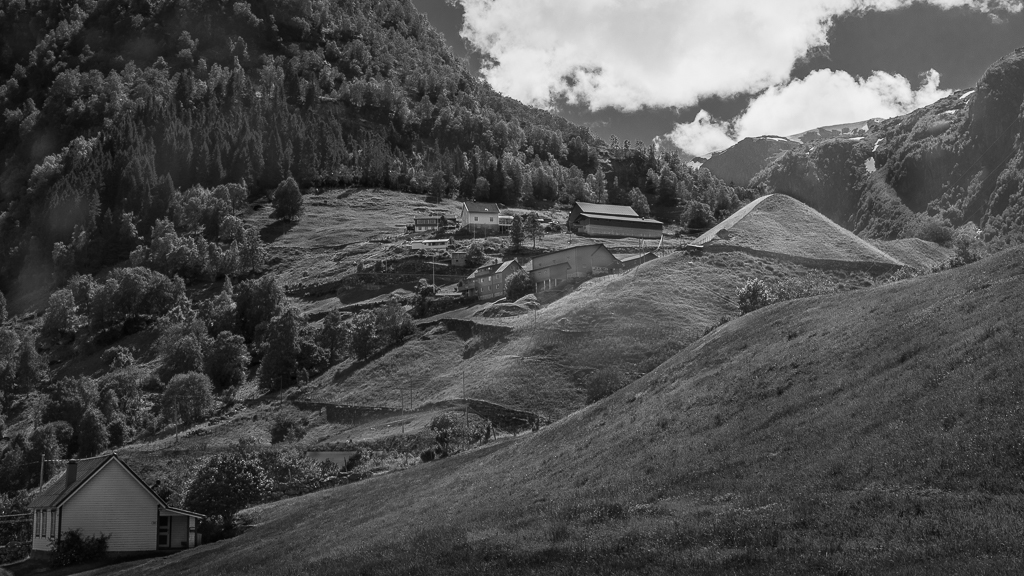
About the Image(s)
This month I would like to try a BW version again. I have issued several pictures from this area before, but it is so special that I try one more. It is taken last summer and as you can see, the fields are still maintained and people are living here, running their farms. In Photoshop I divided the picture into 4 different masks and worked with them separately in order to create depth.
Camera: Canon 5D mark 4 with Canon 24-27 mm lens at 35 mm
Settings: ISO 200, 1/200 sec, f/16
Handheld
This round’s discussion is now closed!
6 comments posted
I like the composition of this image - the diagonal lines leading up the hill to the pyramid, the inclusion of the house on the lower left which to me is a start of a story for this location. However, I think it would have been better in color instead of B/W. There are too many tones of the same level which makes the image look very flat to me. I would consider upping the contrast and dodging and burning parts of the image - lightening the houses and pyramid and darkening other parts. A friend suggested an approach to determine B/W or color. Pretend color is a volume control - low volume means probably B/W but high volume means the color makes the image so stay with color. Posted: 09/10/2021 11:49:22
The brightest part of the photo is the clouds. I would suggest you darken them a little bit and lighten up the buildings so the viewers eye is drawn to them. I believe you need more contrast to allow the viewer to distinguish between the hills, mountains, etc. Good composition, but lacks someything. Posted: 09/12/2021 16:59:15
The details of the photo is impressive. Is the house at lower left quarter necessary? Posted: 09/14/2021 01:56:27
This image has a lot of potential. I love the pyramid! The image does seem rather flat to me though and the clouds, since they are brighter that the rest of the image are drawing my eye. I think you should darken the clouds and try to create more contrast in the ground, particularly around the pyramid shape, since that is clearly the subject. Posted: 09/14/2021 15:58:12
For me there is too kuch going on in this image that is hard to understand. I am first drawn to the white clouds, as they are the brightest part, and then left to discover the rest on my own. While I enjoy the rising diagonal lines that drive the composition the image is far to flat for my tastes. you have such a master's touch with your ability to dodge and burn that perhaps you coud work some magic with this image. Alternatively, perhaps increasing contrast would help. Posted: 09/16/2021 12:04:20
There's a lot to look at in this beautiful location but I don't think b/w does it justice. The beauty of the mountains, rolling hills, and homes gives the image a sense of place however for me there's not a wide enough range of grays or contrast to give it a sense of depth. I would love to see what it looks like in color. I like Michael's tip for determining B/W vs color. Posted: 09/21/2021 18:50:27