Diana Magor, MPSA, APSA  


Elena by Diana Magor, MPSA, APSA

May 2023 - Elena

May 2023 - Diana Magor, MPSA, APSA

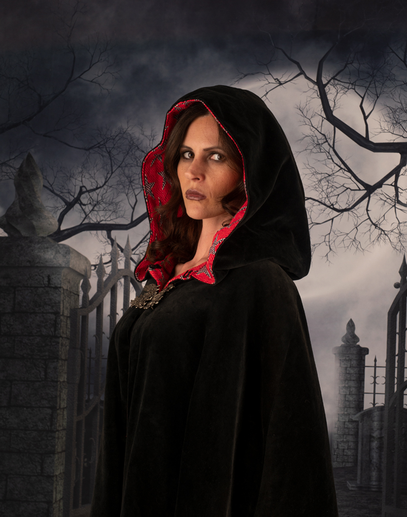
Original

May 2023 - Diana Magor, MPSA, APSA

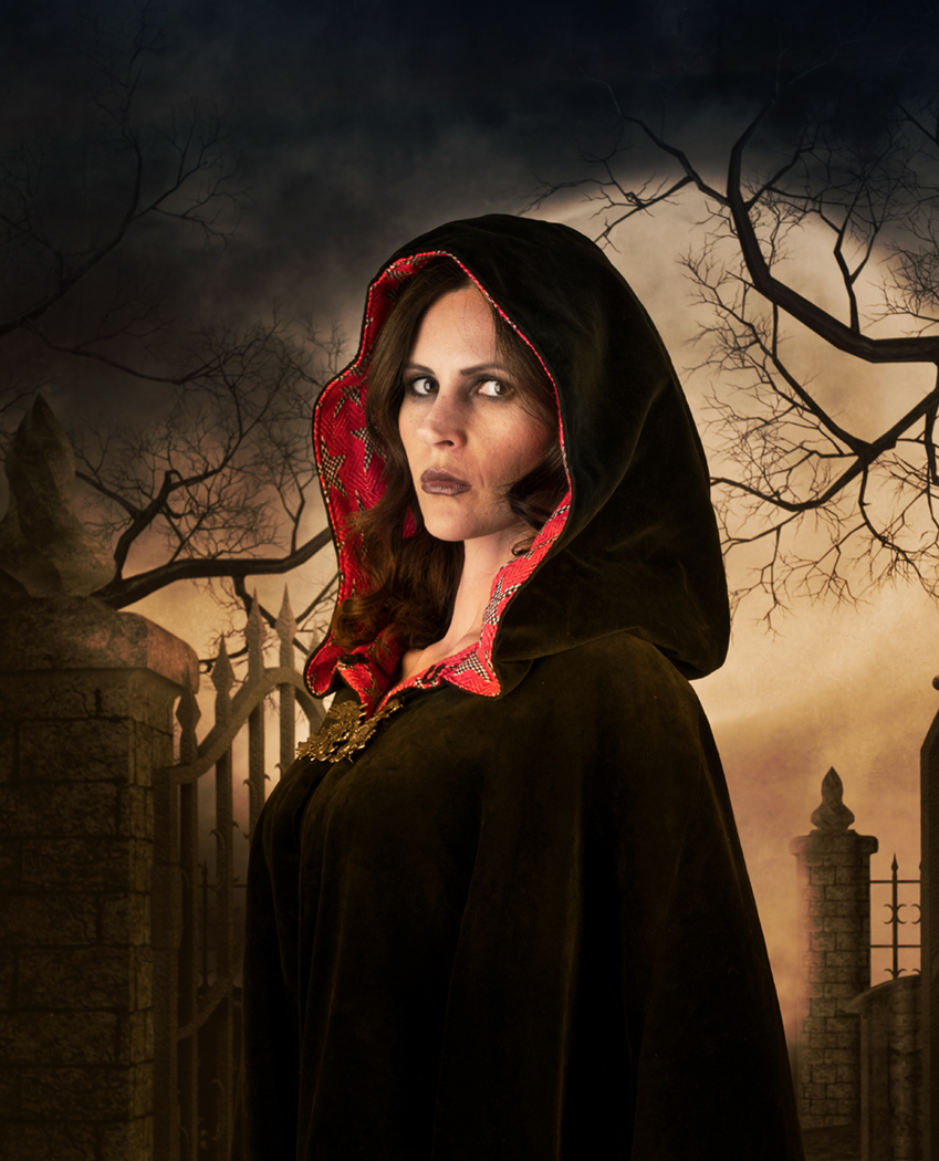
Original 2

About the Image(s)

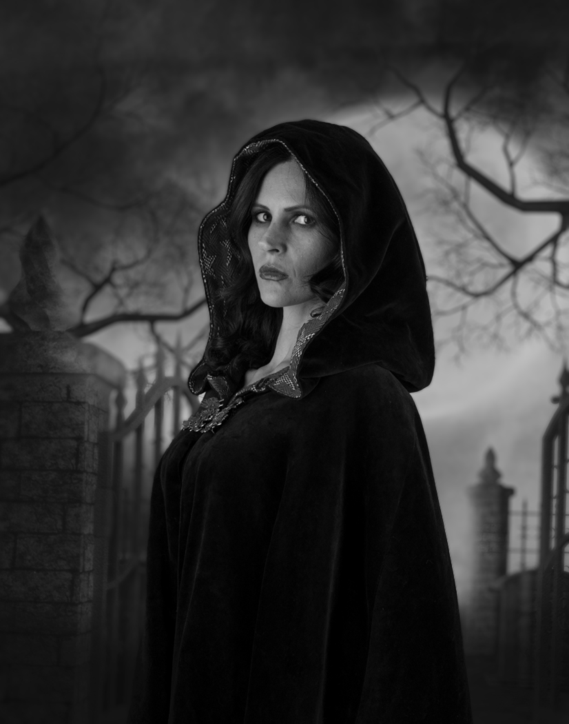
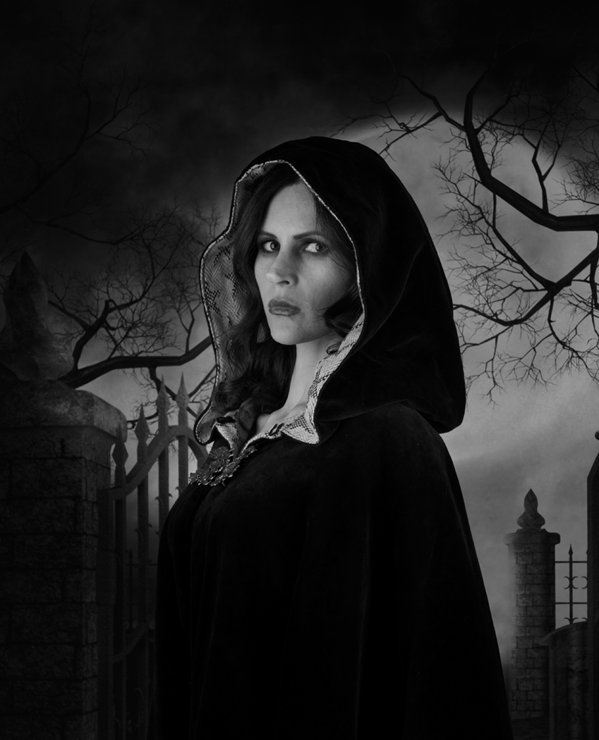
We had an invitation to take some photos of Elena in a studio created in a garage, so it is quite narrow and just about long enough. These were taster sessions to help new people to try out portraiture, using someone else’s softbox lights and backdrops. Elena has done quite a lot of modelling so can vary her poses. It’s just up to each of us to ask for special poses if we want or take some props suitable for that session. The backdrop is a Gothic one and she dressed in black and had a red lined cape. She used heavy, dark makeup as well. We only get about 5 minutes to take the pictures so it’s a bit rushed. This was the best one I took but when I showed it to my family, their immediate comment was that she just looked as if she was standing in front of a backdrop! So I decided to play. I added a texture to the whole picture and then removed it from her face. Then I used Nik two colour filter to create a moodier feeling, again reducing the opacity over her. I also reduced the red ness of the whole area. I’ve increased the brightness and tried to use the neural filters in Ps to soften her skin tones, but not very successfully. Then converted to mono to try to tie the model and the backdrop together
So does the mono work? Or does she still look as if it is just a studio portrait with backdrop?


This round’s discussion is now closed!
10 comments posted


Stephen Levitas   Stephen Levitas
Looks like Jane Noir instead of Jane Eyre. All three images look pretty good to me. Perhaps you as the photographer are overthinking it. It does not look like an obvious backdrop to me.
I prefer the slightly brighter background in the original, although your finished image has a fine gloomy overall effect.
I have never shot a model, and certainly not a professional one. Some such shots, including this one, are very impressive.   Posted: 05/01/2023 22:52:31


Diana Magor   Diana Magor
Good- I was hoping for a gloomy effect -a sort of slightly dangerous look -someone you wouldn't want to meet on a dark night! However I wondered if I'd gone too black around her especially at the bottom.   Posted: 05/02/2023 04:06:11


Wes Odell   Wes Odell
Gloomy, Gothic, et al.... And a model who knew how to pose for the objective. The backdrop (as per Stephen) looks real to me, but that is influenced by the costume and expression of the model. Not too black at the bottom, IMO.
  Posted: 05/02/2023 06:14:34


Somdutt Prasad   Somdutt Prasad
I think you have achieved your objective well. I have never shot a professional model though. In the original I could feel that the model was in front of a backdrop. But your mono conversion, has a feeling of mystery and a touch of the sinister! Very nice   Posted: 05/11/2023 21:35:27


Tom McCreary   Tom McCreary
You have a very moody and sinister image. The model was great at her pose. I like the color in the original better than original 2, as the color does not look natural and also changes the mood. I selected the model, inverted the selection and blurred the background. Then I lessened the blur on the near gate area, as a camera would have captured the area. The tree branches in the far background are more blurred. To me, that makes the backdrop look more natural. I did not darken the bottom as much.   Posted: 05/13/2023 08:32:32
Comment Image
Diana Magor   Diana Magor
Thanks, I didn't think about blurring the background and I think it does help.   Posted: 05/13/2023 08:49:15


Ian Chantler   Ian Chantler
(Groups 4 & 31)
Hi Diana
The original works for me but the split colour and mono conversion really adds to it love both,the lighting on the face is perfect not overdone like Stephen you backdrop looks pretty convincing to me,love to have been at that shoot you really did make the most of it.   Posted: 05/18/2023 13:24:48
Diana Magor   Diana Magor
Thanks Ian. I do think the mono conversion is the best but I also quite like the split toning.   Posted: 05/18/2023 14:04:09


Jennifer Doerrie   Jennifer Doerrie
These images seem to me to be a good study in how color and tone affect the overall mood. I agree with Tom that I prefer the original color image over the "original 2", as the strong and warm lighting seems contrary to the concepts of "sinister" or "gloomy". The monochrome conversion was a good idea to help convey the more sinister feeling, and the partial blurring of the background does help keep my attention more on Elena rather than looking at all the interesting things around her. She does seem quite centered in the frame to me, but changing that also would eliminate the fence behind her, which does help add to the scene. I'm not coming up with any cropping ideas I like better than what you've done here. I possibly might darken the neck and right edge of the cloak a bit more in the monochrome image to enhance the gloomy look.   Posted: 05/22/2023 23:15:28
Diana Magor   Diana Magor
I haven't tried using it yet in any Internationals but I intend to, having incorporated your various suggestions.   Posted: 05/23/2023 05:48:32