Kym Houston
June 2022 - Magritte?
About the Image(s)
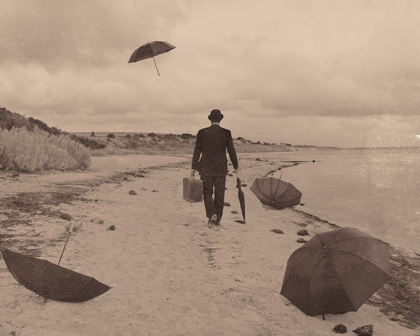
My image is inspired by Dali and Magritte and I have made it sepia to reflect that era. The image is a composite with some of the umbrellas added in. The main shot on the beach was shot as one image. I added an old paper grunge look to it again to give the feeling of aged and worn.
This round’s discussion is now closed!
18 comments posted
I like the grunge on the right side, but overall it fits the vintage you're establishing. nice composition and all.
Posted: 06/07/2022 09:25:11
Posted: 06/07/2022 09:25:11
Thank you Wes Posted: 06/09/2022 18:33:20
I think it does very well as a tribute to Magritte. How clever to get the original so close to his work. Was this a relative who posed or a model? I think the addition of the umbrellas is good and I like the sepia effect, but I'm not keen on the grunge as it just looks like you've added it to the photo to me. I understand the concept, but if you are going to add damage , then maybe it needs more on all four sides and make that more obvious. Congratulations on the overall effect. Posted: 06/10/2022 04:11:54
Thank you Diana it is a photographer friend that posed for me, I even got him to stand in the water for some. The grunge effect is in exposure software and only does the one side. Normally I would add my own texture but I went with that one for this image. Posted: 06/13/2022 20:00:35
A very interesting image and does reflect the style of Magritte. I do like the umbrellas, the composition and the background choice. However, I'm not a fan of the strong sepia tone, nor the grunge as I think both are a bit too strong. But that is my personal taste. Your creativity is always a pleasure to view. Posted: 06/12/2022 06:31:06
Thank you Lynne Posted: 06/13/2022 20:01:06
An interesting image with the man in a suit at the beach and the umbrellas. Good composition. I am not a fan of the grunge on the right side, and on my monitor the sepia is too strong. Posted: 06/13/2022 15:17:12
Thank you Tom Posted: 06/13/2022 20:01:25
This is striking, and a good quote of Magritte.
I really like the overall composition. A lot of effort here to get your friend/model in place and add the extra umbrella.
I also don't care for the grunge, not the strong sepia.
Magritte played a lot with surreal lighting effects. Can you try that here, for example, darkening the beach scene, but rendering the figure as if in bright light. Or maybe having the upper umbrella casting a soft spotlight downward from out of it onto the man. Posted: 06/17/2022 13:51:25
Hi Stephen I actually messed around with the color version for a creative image and it looks good with the blue sky and added extras. Posted: 06/27/2022 19:58:24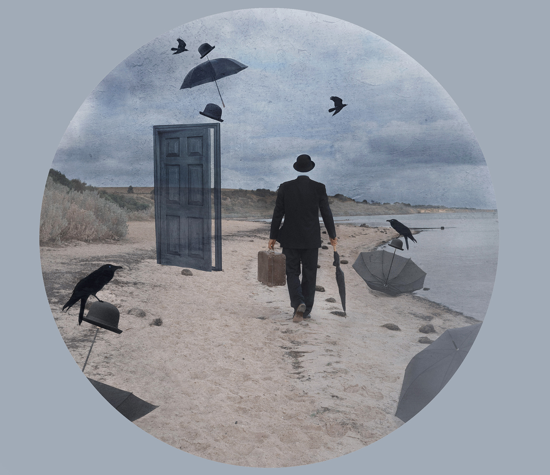
SO COOOOOL!!! Posted: 06/27/2022 21:11:55
Thank you. I love doing this style of art. Posted: 06/27/2022 21:13:44
Now that appeals to me even more. The additions are great though maybe the crow on the far left is a bit near the edge. It is surreal altogether and like you I love doing this sort of stuff-it really makes other people wonder what goes on in your head! Posted: 06/28/2022 04:00:52
Very nice creative image. Posted: 06/30/2022 09:38:08
This is an interesting idea, and I like the composition, although I probably would have moved the left umbrella just a bit more to the right to avoid it being so near the edge of the frame. To me, the grunge effect is too heavy on the right side of the image, although perhaps it is just the bright white spot that pulls my eye away from the subject. While I know you intentionally used the sepia to create an old photo effect, I believe this also would be effective in black and white.
Posted: 06/27/2022 00:39:54
Posted: 06/27/2022 00:39:54
thank you my original intent was to use the image for a composition and enter in creative sections. I was only at the start of the edit when I put this one up in the group. I have changed around to color and have put photo in Stepens reply.
Posted: 06/27/2022 20:00:25
Posted: 06/27/2022 20:00:25
I agree with Jennifer, having looked at the left hand umbrella -it is a bit close to the edge. Have you tried this in black and white as she suggests? Posted: 06/27/2022 04:16:12
I havent tried in black and white as yet but will do in the near future. I made it color for a recent conp though. I have attached above. Posted: 06/27/2022 20:01:50