Wes Odell
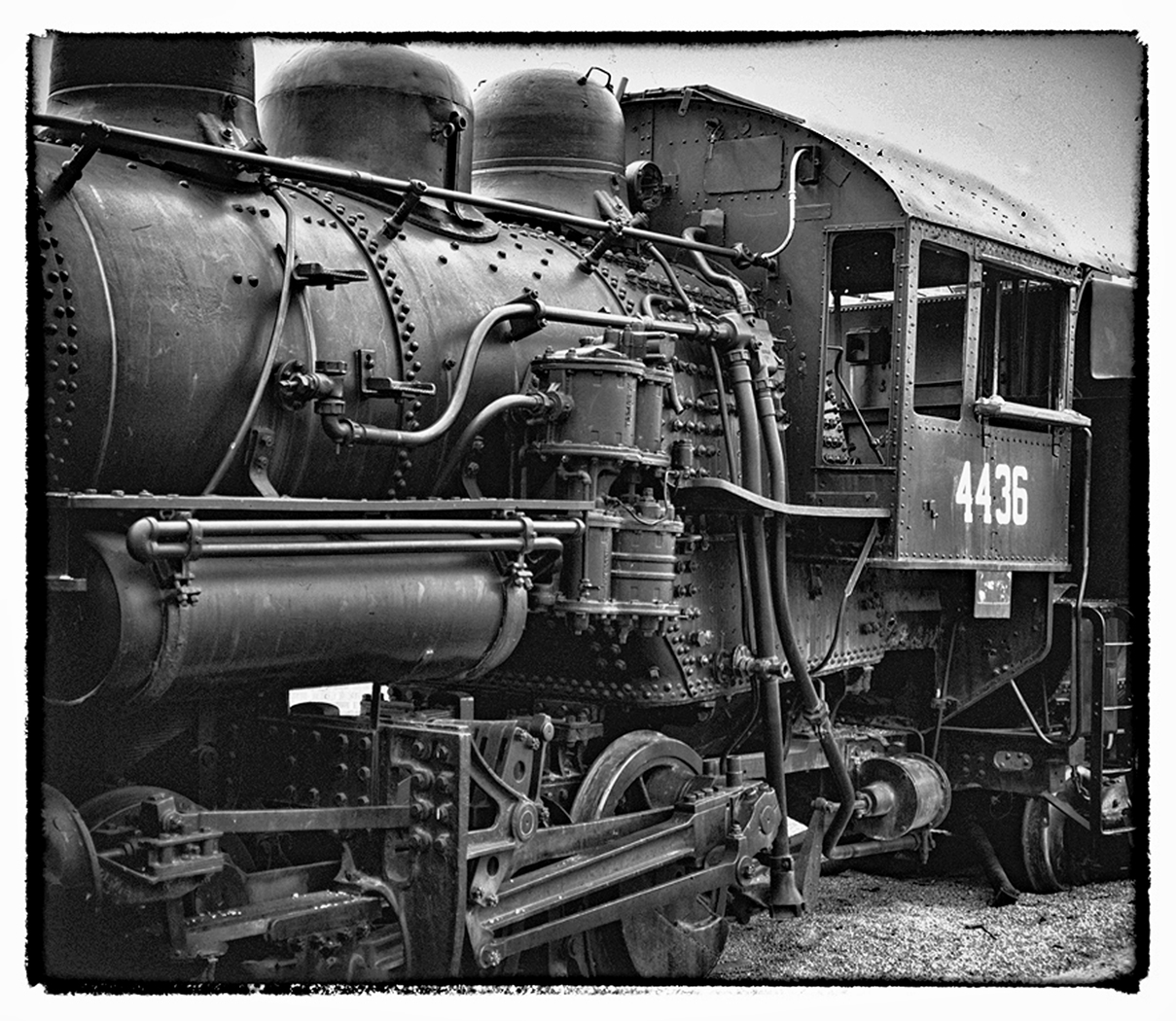
September 2021 - Locomotive panorama
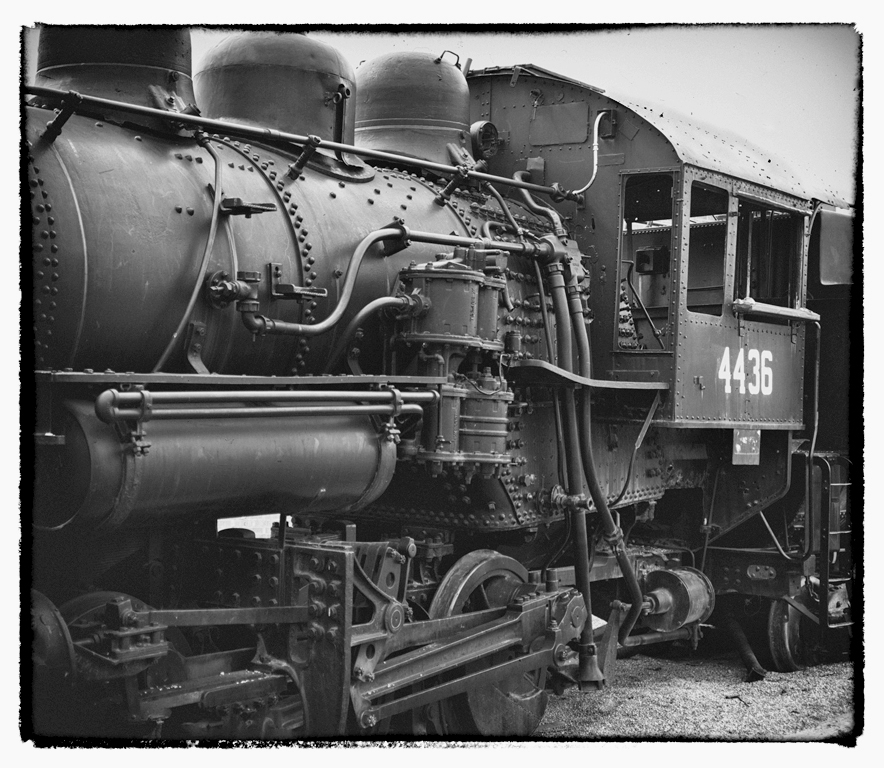
Original
About the Image(s)
Taken at the RR Museum in Ogden Utah, which was once a RR Hub in the West, the "color" version just didn't work, so I'm not showing the "before." I did some conversions in Nik, and these two are the ones I like best. I had to create the top
of the Engineer's Station bit by bit because it was lost in the Dynamic Range.
Comments?
This round’s discussion is now closed!
11 comments posted
I really like the way you have edited this image, it suits the subject and era. Old steam trains are fun to take creative pics of. Posted: 09/04/2021 18:55:24
thanks.....w Posted: 09/04/2021 19:18:19
I considered titling this as " A study in Zones 0, 1 and 2....... And I thought showing just a portion of the steam engine would be more revealing in detail and interest
Posted: 09/04/2021 19:17:57
Posted: 09/04/2021 19:17:57
I like the main image better, as it seems to have more contrast than the "original". You did a good job of recreating the top. You have good composition with all of the lines bringing the eye to the numbers that seems to be the brightest thing in the image. The border helps the image. Posted: 09/06/2021 15:00:23
thanks. And teh border is right out of Nik Silver Efex
Posted: 09/06/2021 16:18:41
Posted: 09/06/2021 16:18:41
Yes, although surprising to me, showing only a portion of the engine works very well. Posted: 09/07/2021 18:29:51
Thanks . It wasn't really planned, it was just a tight fit between the Loco and the others, so that' s what I got. And got lucky because I too think it works. Posted: 09/07/2021 19:08:40
Although it probably would not have occurred to me to try it this way, I agree that I think your tight framing of this locomotive is effective. Did you try any of the Nik Silver Effects settings to increase contrast/detail? I took the liberty of playing with your image a bit and decided I liked the High Structure (both smooth and harsh worked okay) and Fine Art settings best. I recommend brightening the upper right corner to help mask the noise there, but perhaps you want to keep it to help create the "old photo" feeling. Posted: 09/22/2021 22:29:21
Yes, I did use Nik..... The original image was too low key and to show the detail and lighten it, I used some Nik pre-sets, can't recall which ones I settled on (Bad on me). I often use one of the Fine Art settings. But, since all photo editors essentially have the same basic modifications, (albeit there are many permutations to the combinations and the individual settings therein) I always come back to Brightness/Contrast as one of my major tools. It's a "keep it simple" idea. And since my early photography was in a wet darkroom with so few editing tools such as we have today, I learned to use and therefore, "think of editing in terms of dodging and burning" (but in the computer I do it in a non-destructive way with Layers and then brush paint at various "opacity" settings..) I've also learned to do "Air Brushing" when colors are involved and critical. i.e., one can't darken (burn) an area with no pixels, and sometimes I just need to add a little more color or soften the color as in a portrait. And, finally, yes I like noise in vintage type photos, but because in the digital era noise has such a disrepute I try not to overdo it. Posted: 09/23/2021 01:47:43
I really thinks this works. The tight framing is very good as there would have been distracting elements around the loco otherwise. I thought the contrast was about right, though I wasn't so keen on the noise in the sky. The border works here as well and would probably look good if you printed this. I found my eye drawn along the pipes on the side and then finish on the numbers so this is good composition -leading lines, good detail and a clear pathway through the picture. Posted: 09/25/2021 05:15:11
Thanks for all the comments. I haven't yet entered this in a competition, but will soon.
I've been printing on Baryta papers recently, but the Red River Paper Company (Dallas TX) came out with another Fine Art Paper that "wow's" them all. It's called Palo Duro Softgloss Rag. (Since this is Texas, Red River uses the names of rivers in Texas for its families of papers.) (310 gsm weight, 16.5 mil thickness, and 100% Cotton Rag.) recommended printing set at Semi Gloss.) Their website is www.redriverpaper.com Posted: 09/25/2021 14:51:50
I've been printing on Baryta papers recently, but the Red River Paper Company (Dallas TX) came out with another Fine Art Paper that "wow's" them all. It's called Palo Duro Softgloss Rag. (Since this is Texas, Red River uses the names of rivers in Texas for its families of papers.) (310 gsm weight, 16.5 mil thickness, and 100% Cotton Rag.) recommended printing set at Semi Gloss.) Their website is www.redriverpaper.com Posted: 09/25/2021 14:51:50