Gunter Haibach

July 2021 - Bridge Reflection
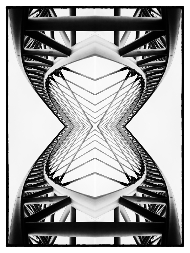
Original
About the Image(s)
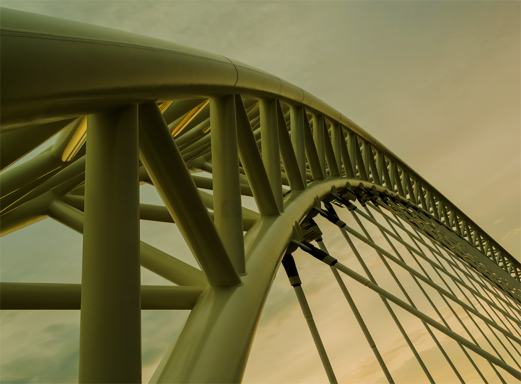
This original was shot with my Olympus E-M1, at f8, 1/125, ISO640, 19mm focal length. Post processing in ARC, PS Elements, NIK Silver Effects.
I thought this image was a good choice for a 'Mirror Image' look.
I converted it into B&W and flipped it horizontally and vertically.
I think the shapes and lines are quite interesting, as are the B&W tones. The symmetry is also interesting to view.
Would very much appreciate your comments and suggestions.
This round’s discussion is now closed!
11 comments posted
(Group 32)
I also like doing mirroring, and I think you chose a good subject. You did a good job with the contrast.
My only suggestion (if I had done this one) would be to eliminate the horizontal center line, since you did not have a vertical one. Posted: 07/02/2021 22:59:20
My only suggestion (if I had done this one) would be to eliminate the horizontal center line, since you did not have a vertical one. Posted: 07/02/2021 22:59:20
Thanks for your comments. I actually added the horizontal line - my reasoning, I did not want to confuse people with the idea that this is a geometric image. I wanted
a hint of a horizon, to reinforce that this is a reality (bridge)-based image.
I do a fair number of "Altered Reality" images, but I also like to ensure that there is a basis of reality still at play - most of the time.
Thanks again, Gunter
Posted: 07/03/2021 14:42:43
a hint of a horizon, to reinforce that this is a reality (bridge)-based image.
I do a fair number of "Altered Reality" images, but I also like to ensure that there is a basis of reality still at play - most of the time.
Thanks again, Gunter
Posted: 07/03/2021 14:42:43
(Group 32)
Oh, that is a good idea. I see what you are aiming at. Well done. Posted: 07/03/2021 15:38:17
The leading lines and the black and white treatment certainly create an immediately striking image. However the more I look, I keep wanting something more - my eye is lead into the centre of the image but is not held there because of the strong structural content around it. The reflective technique works really well. Posted: 07/05/2021 03:35:09
Thanks, Tim, for your thoughtful reply. I agree with you, this image does draw your eyes into the lightest area, which is dead centre - and once they're there, there really is not much to see. I see the centre point not as the destination, but the start of the exploration of this structure, and have the eyes travel outward to the edges. For me, the most interesting aspect of this picture are the sides. But as you know, setting expectations as to how the viewer will react to an image, is often a losing proposition. And that's why there is vanilla and chocolate icecream! Posted: 07/05/2021 08:14:55
This is very cool. The lines are great. Love it. I feel like the whole image is too bright. I darkened the whole thing a bit and also upped the contrast slightly. Also I felt like since the lines of the image are so clean that the border should also be a clean line. Posted: 07/09/2021 15:44:21
Hi Karen
Thanks for critiquing my picture - I agree with you 100% - I was so focused on the white background, I did not pay enough attention to the contrast. Your version is a big improvement - lesson learned, hopefully.
Posted: 07/10/2021 14:12:47
Thanks for critiquing my picture - I agree with you 100% - I was so focused on the white background, I did not pay enough attention to the contrast. Your version is a big improvement - lesson learned, hopefully.
Posted: 07/10/2021 14:12:47
An excellent image Gunter. I'm from the swing of BW that the image should have some black and Karen's rendition brings out more black from your dynamic composition. Karen's edit of your border looks much better on white, but when PSA places it on the black web page her border is lost so I would stick with your border for black mats and Karen for White mats. Posted: 07/10/2021 09:57:57
I like the double flip and the tonal range. This would do well in my Monochrome group. Very nice execution of a good idea. Posted: 07/15/2021 13:30:06
I love the graphic element in your image. I think Karen's frame works well. Since the center is white, I tried to make it into a high key image to see how that worked. Monochrome is a good choice for the image based on the original Posted: 07/15/2021 20:03:42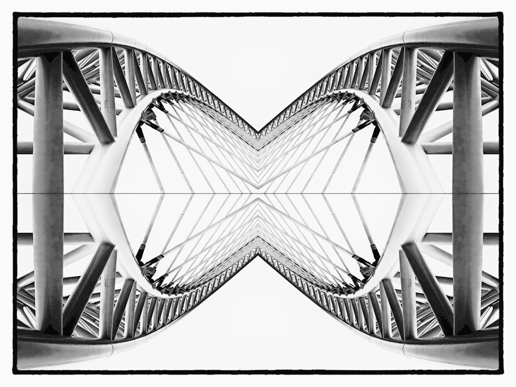
(Group 22)
I also love mirror designs and this one is one of the best. It also works well as a vertical. I would also like to see it with a smaller center. Posted: 07/16/2021 09:43:52