Hazel Price
June 2022 - Helebore Circle

Original
About the Image(s)
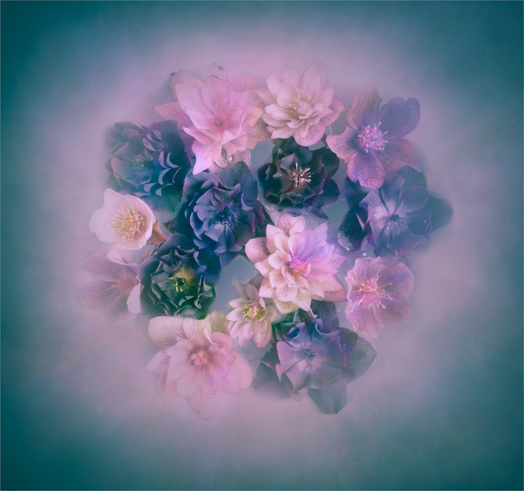
Here is my image for June. As you know I am fond of photographing flowers. I had some called Helebores in the garden which are quite photogenic but always droop down so are difficult to photograph. A friend suggested that I pick the blooms and float them on water so I did this and came up with the attached image. I used a texture over the images and brushed away most of it from the flowers. The biggest problem was cloning out the bits of water between the flowers. I have sent two versions of the image. One has a lot more texture left on it which makes it more muted and dreamy looking. I prefer this but think that the judges would be critical that it is not sharp. I wonder what the group think abouit it?
This round’s discussion is now closed!
8 comments posted
(Groups 3 & 18)
Hazel,
Very appealing, good angle. The sharper image is more pleasing to me, maybe because the flowers really stand out. Great placement in the frame. Looking at your original, I think the reason I like it better is that white burst around it which its it off from the background more that you final produce. Nice work, in any case. Posted: 06/09/2022 18:37:46
Very appealing, good angle. The sharper image is more pleasing to me, maybe because the flowers really stand out. Great placement in the frame. Looking at your original, I think the reason I like it better is that white burst around it which its it off from the background more that you final produce. Nice work, in any case. Posted: 06/09/2022 18:37:46
(Group 41)
Thankyou for your comment Joan. I think you are right as he flowers do stand out more on the first image. Looking at them again I think the colours are better too. Posted: 06/10/2022 05:01:42
Hi. Very nice. I have found that this type of image, with blurred backgrounds, do very well in competitions. The blurring helps isolate the subject. Did you use a texture, the smudge tool, or some other method? Posted: 06/13/2022 22:56:08
(Group 41)
Yes Skip I used two textures. One of them was a burst.I also used a brush to add some splodges of the pinky colour on the one that Joan has labelled the Original.
Posted: 06/14/2022 03:37:46
Posted: 06/14/2022 03:37:46
(Group 41)
Hazel, Many of us would pick a bunch of flowers, stick it in a vase and photograph it in situ but not you. Your choice to float the flowers in water is masterly and one that I have not seen before. Normally, I am a fan of soft-focus, low opacity and anything blurred but this hasn't quite worked for me. I love your Original but it seems that you have lost some of the romance and magic in the transition to your submitted image. Overall, I love the blurred background and the colour palette which works well. However, I wanted to see slightly more sharpness in the central part of the bunch of flowers, which you have in the Original. Posted: 06/21/2022 04:03:15
(Group 41)
Thanks for your comments Brian. In actual fact I sent in two versions of the same image not an 'original and final version. The one labelled Original has had more work done on it with textures but I was experimenting a bit with a variety of colours and leaving the blue one a bit more blurry. I just wondered which was the most successful. I think everyone's comments have been in favour of the one with the sharpness in the flowers.. so thanks for reinforcing that. Posted: 06/21/2022 09:37:13
Mike Fernandez
15 flowers, unconventional, but very elegant. The color seems to blend well.
The blend of the texture gave a soft pint tone to the flowers, well done.
Just to be picky there are 2 1/2 dots in the top flowers. I would tossed them.
Posted: 06/21/2022 19:00:38
The blend of the texture gave a soft pint tone to the flowers, well done.
Just to be picky there are 2 1/2 dots in the top flowers. I would tossed them.
Posted: 06/21/2022 19:00:38
(Group 41)
Awww thanks Mike. I see them. I will go toss them now. Posted: 06/22/2022 03:22:16