Fred Giese
October 2021 - TOO MUCH TOO FAST
Original
About the Image(s)
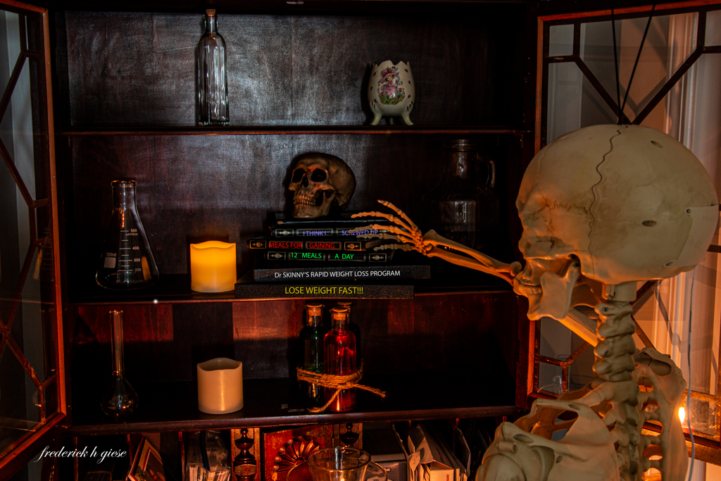
Story: I recently purchased a skeleton for Halloween. After getting it home, my mind started reeling with all the fun possibilities for photographing this thing in the future. I then went to the store and by the time I got back, my wife had put a dress on it and it was waving to people from our porch. Seeing it that way made me think of all the crazy Lose weight fast diets that are out there and thus the image. Plus, it’s in time for Halloween.
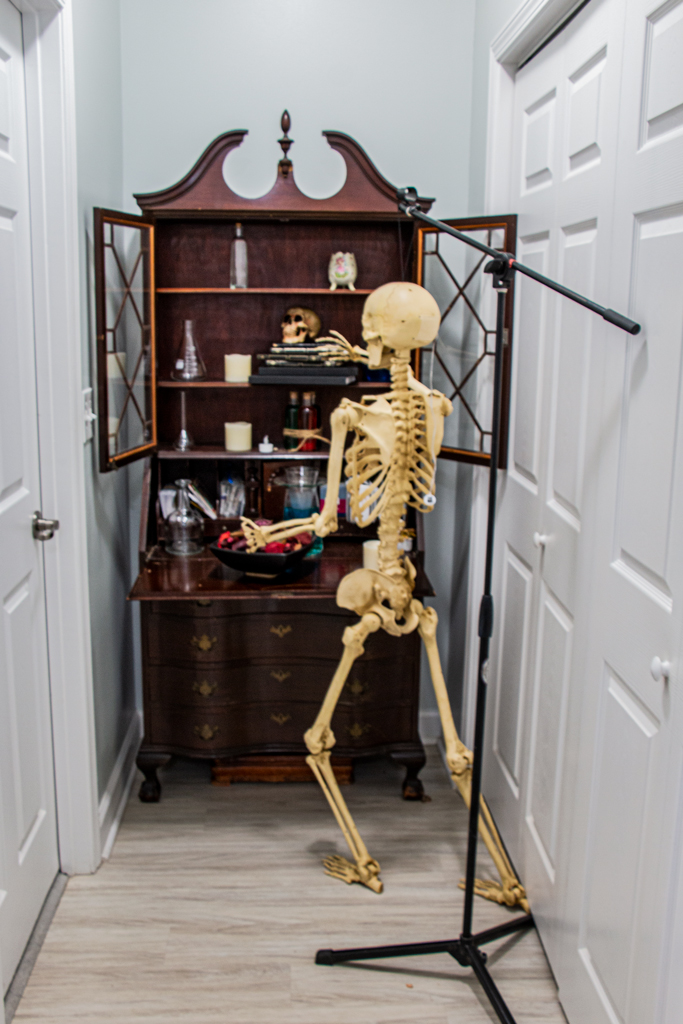
How I did it: This is really a straight shot except for using the “text tool” to put in the titles of the books. It was shot in low light only using the candles and a small amount of ambient light coming from behind the camera. Canon 70D on a tripod 27mm focal length at f/11 ISO 100 for 30 seconds. I tried both Horizontal and Vertical but horizontal won out, showing more of the story of the titles on the books. I have included a snapshot of the setup in normal light.
This round’s discussion is now closed!
3 comments posted
At first I thought the hand was reaching for the skull, so I gyess I'd move it to the top shelf.
While I like the image overall, the bright reflection on the bookcase needs to be darkened to eliminate the distraction.
It #ounc like your wife is very creative too. Posted: 10/05/2021 18:12:59
(Group 79)