Andrew Hersom, APSA, EPSA, EFIAP
May 2022 - Point Pinos Lighthouse
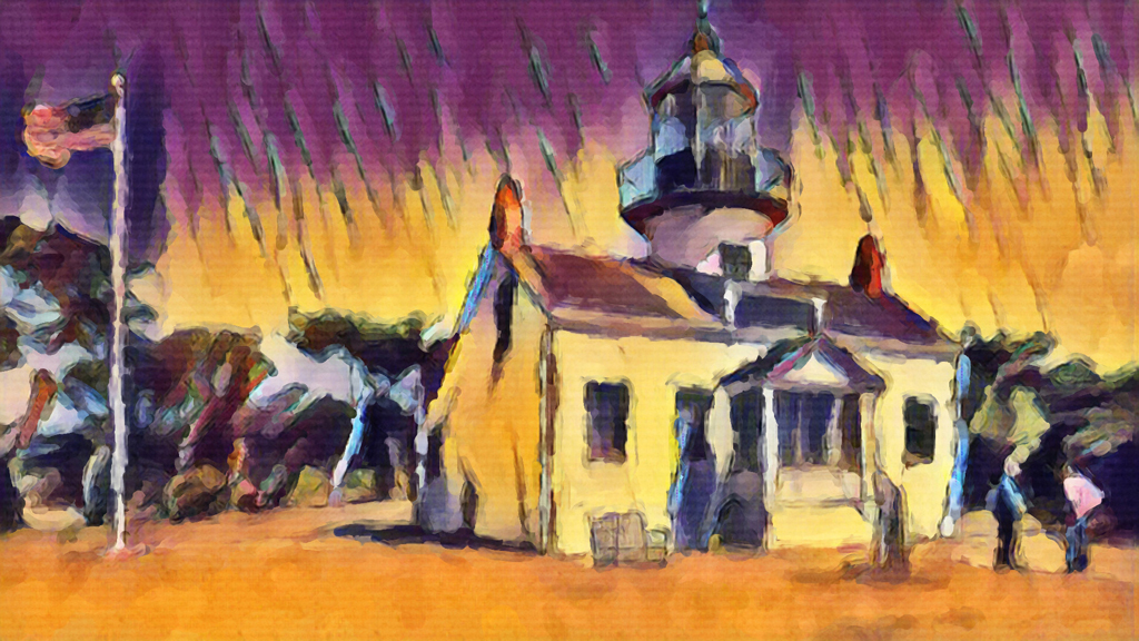
Original

Original 2
About the Image(s)
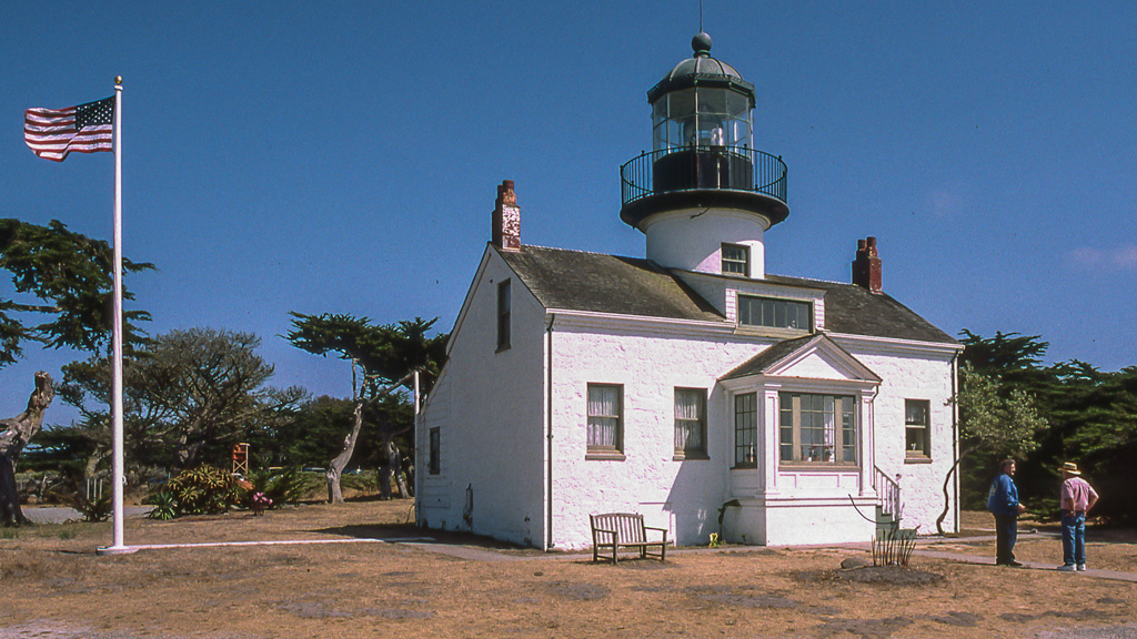
The original was a scanned slide taken a long time ago now, of Point Pinos Lighthouse near Pebble Beach in California; maybe OK as a travel pic. I have been playing with Corel Painter Essentials v7 recently and ran the image through the "AI Bold Watercolour" option as an experiment. Very strange effect, not sure I like it TBH. The "Watercolour sketch" in the same programme is quite different. What do you think?
This round’s discussion is now closed!
10 comments posted
(Groups 21 & 34)
I think that the transformation works a treat. The colours are eye-catching. The man on the far right's shirt is taking my eye away from the main scene and I think it would help to tone it down. Do we really need the flag and flagpole? The flag points out of the frame, and the pole is a bit bright. I suggest cropping the left hand side, which actually seems to give a better composition in my opinion. Posted: 05/04/2022 02:50:19
The more I look at the image the more I like it. I wonder if you could remove the "cloud" above each of the 2 men's head. I did not realize they were people until I looked at the original image. I feel if they were more distinct it might give them a questioning appearance. I also agree with Mike about cropping out the flag. Posted: 05/09/2022 08:16:03
(Group 40)
Any Better? Posted: 05/09/2022 08:51:24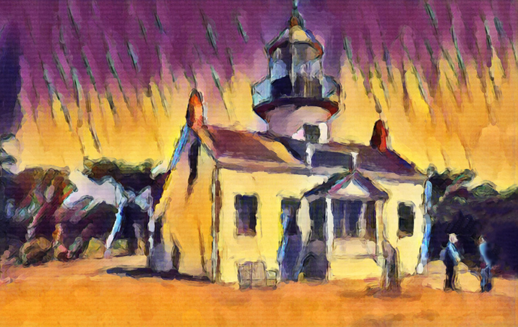
(Groups 21 & 34)
Yes Posted: 05/12/2022 08:47:36
This image reminds me of The Fauves, which are my favorite artist group. Lots of bold, fiery colors. I enjoy the energy in this photo. I feel that it's much improved over the orginal. Posted: 05/10/2022 13:33:24
This image reminds me of The Fauves, which are my favorite artist group. Lots of bold, fiery colors. I enjoy the energy in this photo. I feel that it's much improved over the orginal. Posted: 05/10/2022 13:33:26
(Group 40)
I must stop being so beastly Posted: 05/15/2022 10:59:02
Nice one! Posted: 05/15/2022 14:17:44
I agree that the flag doesnt add much so your revision is just great ! Quite a piece of artwork! Posted: 05/10/2022 15:20:03
Late entering my ten pennorth. I found the image very vivid and others have already offered the changes I may have suggested.
your revised version is certainly an improvement and worth a shot in a creative section. Posted: 05/12/2022 14:59:22
your revised version is certainly an improvement and worth a shot in a creative section. Posted: 05/12/2022 14:59:22