Karen Davis
May 2022 - Albuquerque Angles
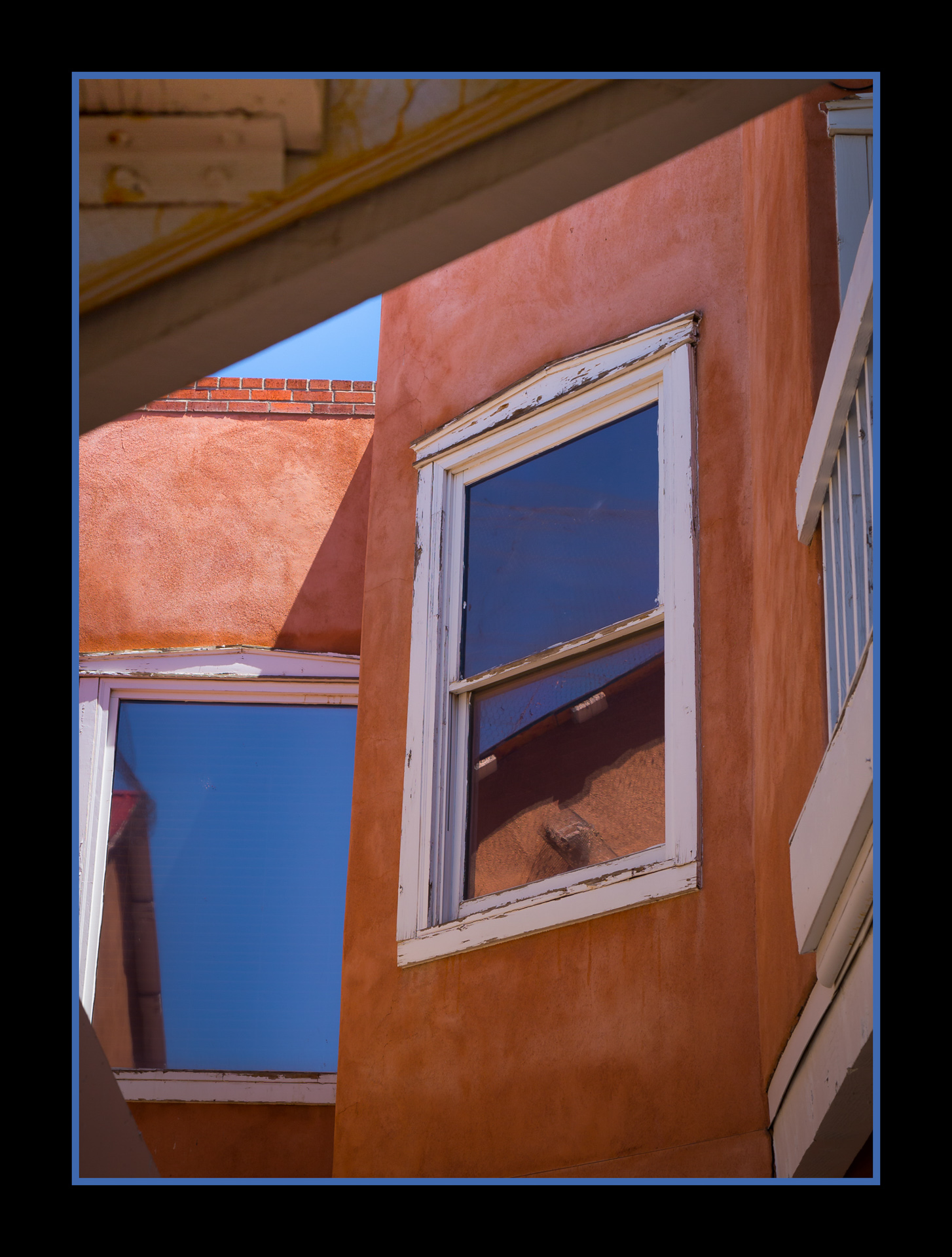
About the Image(s)
On a trip to Albuquerque in 2017, I was taken with the architecture in this colorful city. Rather than just shooting the buildings, I wanted to show something different, by capturing portions of buildings, windows, doors, etc. to illustrate some of the unique colors and angles.
Camera: Canon EOS 6D
Lens: EF24-105mm
Shutter Speed: 1/320 sec
F-Stop: f / 6.3
ISO: 100
This round’s discussion is now closed!
10 comments posted
Hi Karen well seen image very strong geometric influences capturing many triangular elements.
Tonal balance of the colours is strong and the framing of the image draws my eye immediately to the window element which is well-positioned just off center.
While I like the image as it is I'm not too sure that I would not crop out the handrailing and associated top white section of that, on image right. To me it adds another element which I don't think is necessary having said that to me it is not a major distraction just a thought process I would go through.
Well seen and captured thanks for sharing Posted: 05/08/2022 19:14:52
Good points - I will re-crop before I submit this to our club for evaluation.
Thank you!
Karen Posted: 05/15/2022 20:22:40
Thank you!
Karen Posted: 05/15/2022 20:22:40
Hi Karen,
An interesting architectural image. It has very nice color and lots of triangles. I think the reflections in the windows add to the composition.
Best regards,
Greg Posted: 05/09/2022 20:15:24
An interesting architectural image. It has very nice color and lots of triangles. I think the reflections in the windows add to the composition.
Best regards,
Greg Posted: 05/09/2022 20:15:24
Thanks, Greg, for noticing the triangles!
Thank you!
Karen Posted: 05/15/2022 20:24:12
Thank you!
Karen Posted: 05/15/2022 20:24:12
Hi Karen - I am struck by the colors - the clay walls contrasted with a bare, but brilliant clear blue sky and offset with the shabby-chic feel of the white trim. The geometric angles were well seen and captured. I agree with cropping out the banister to the seam in the wall. That will simplify the image, bring more focus to the abstract angles created by your composition, and help keep the viewer's eye in the image. Thanks for sharing - Posted: 05/13/2022 22:39:54
Good points - I will definitely try a different crop!
Thank you!
Karen Posted: 05/15/2022 20:24:51
Thank you!
Karen Posted: 05/15/2022 20:24:51
I am a definite fan of architectural detail compositions, and you have done an excellent job of bringing together this composition. The contrasting colors of blue and terra cotta add to the interest of the composition as well. I agree that removing the bannister on the right might simplify the image and add to its graphic quality. One other idea would be to use the transform skew tool to make the verticals vertical which is often a benefit with architectural compositions. I love Albuquerque and its architecture! Posted: 05/15/2022 17:28:00
It's almost unanimous - the bannister has to go!
Thank you!
Karen Posted: 05/15/2022 20:26:10
Thank you!
Karen Posted: 05/15/2022 20:26:10
Hi Karen,
Greetings my friend.
The present edition that you have shared has new genre for me.
Previously I saw this kind of images but didn't find it so interesting. But after seeing your version and reading the critics and compare them with other available architectural shots; I realize this is something I should try sometimes. A good share and enjoyed the frame of almost abstract frame.
Thanks for sharing.
Cheers.
Kamal. Posted: 05/16/2022 16:01:35
(Group 46)
Hi Karen, Wow, a beautiful image! I like the composition and colors, it looks like an abstract image. If it were mine, I would keep the composition as it is, and only erase two small rectangles on the top right corner to make the whole image consistent. Thanks for sharing! Posted: 05/16/2022 17:05:23