Charissa Lansing
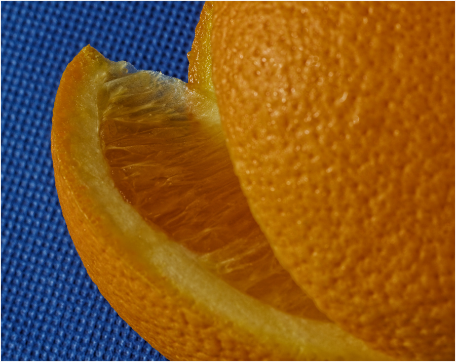
October 2021 - Slice of orange
About the Image(s)
My goal was to highlight textures and use complimentary colors in a simple still life arrangement.
Using natural window light and a tripod this image was shot with a Canon Rebel Xsi (Macro 100mm: 2.5 sec, f/13, ISO 100 plus circular polarizer).
This round’s discussion is now closed!
8 comments posted
Hi, Charissa.
I like this image a lot! The two color presentation works well. Interesting the way you arranged the slice on the left. It gives a focus point to keep your attention.
The slice is very sharp with good detail. The rest of the orange is a bit less sharp but if it were to be darkened a bit that would be less noticeable.
Again, I really like it!
Janet Posted: 10/08/2021 17:14:50
Thank you. I'll explore darkening the part that is less sharp. Posted: 10/16/2021 19:11:45
(Group 65)
Hi Charissa,
I like the idea and the image. This could make a great winter project with different fruit using different arrangements. I agree I would like to see more detail in the orange. For my eye, I feel there's too much detail in the blue background and it competes with the subject. I would suggest using a neutral background.
I don't know if you auto focus or manual focus. I like to manual focus which allows how much and where my image is sharp. I would guess the focus point in this image was the tip of the orange wedge. In a shot like this you need to remember the DOF is approximately 50% behind and 50% in front of the focus point. This is important so not to waste any DOF. In this case I would focus on the tip of the orange wedge then move the focus point towards me or nearer so not to waste DOF on the blue background and have more of the orange skin sharp. I would also consider using a smaller aperture such as 18 or 22.
.
Posted: 10/15/2021 20:07:31
Thank you for sharing this perspective.
I chose the blue background because I wanted to compose the image using complimentary colors and thought that the orange color would really pop against the blue.
I typically use manual focus and directed it to the tip of the orange wedge, which I chose to be the area of interest.
I thought about the rounded area of the orange as the foreground in my image and the blue mat as the background, but wanted to communicate information about differences in textures.
Your comments were helpful because they made me realize that the defined textures in the 'background' were competing and drawing attention away from the orange wedge. I had tried to capture this image using a smaller aperture but my 'background' appeared too, prominent. In hindsight, I think a smaller aperture would have worked with a smooth background or to have positioned the background at an increased distance from the subject and to have positioned the camera lens at an increased distance from the set up. Thanks again! Posted: 10/16/2021 19:29:28
(Group 65)
I agree that a smooth background would be better. I feel a neutral off white or tan would work well.
I hope you understand what I said about bringing the point of focus toward you using manual focus. By putting the focus point on the tip of the orange wedge you lost half of your DOF to the background, that's why the background is so sharp.
If you bring your point of focus forward now the point of the wedge is sharp and more of the orange is sharp. You are using all the DOF on the subject and not the background. Remember half of the DOF is on the near side of the focus point and half of the DOF is on the far side of the point of focus. In landscape photography it's about 1/3 in front and 2/3 behind the point of focus. Posted: 10/16/2021 20:24:13
Thanks, Dick! This is helpful. Posted: 10/16/2021 22:06:51
I think the idea of the blue background works but perhaps a smooth background which does not compete with the main subject as personally I love the color choices. Posted: 10/16/2021 20:46:11
Hi Charissa,
It was a great idea to make this photo with the two colors. The challenge you have here is that the orange has a spheric shape which means that getting every part of it sharp is nearly impossible, compared with a flat subject.
I have mixed feeling regarding whether or not to use a smaller aperture. I would consider 2 options: The first one is to have the blue background out of focus so as to soften the patterns of that background and focus more in a point in between the tip of the orange and the foreground in focus. The second option is to have only the tip of the orange wedge in focus and everything else around to be out of focus. It would mean using an aperture of f/5.6 or even less, as long as the detail of that orange slice detached from the rest of the fruit is sharp.
Having the rest of the photo completely out of focus would not bother me. It would bring attention only to the area in focus.
Posted: 10/18/2021 16:40:48