Michael Hrankowski

December 2021 - Rocks in Still Water
Original
About the Image(s)
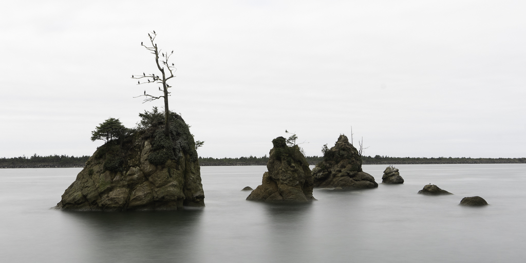
We went with some friends in October down to the Oregon Coast. We were staying in Manzanita and decided to take a drive farther south. As we were passing through Garibaldi on our way to Tillamook we stopped so I could photograph these amazing sea stacks. I only found out later that they are quite iconic and are called The Three Graces.
I created an HDR rendering and did some heavy editing in Photoshop to remove the background shoreline and blur the clouds so they would blend gradually with the water.
I've submitted the monochrome version to Group 99. I would love to know which version y'all like better.
Camera Settings: 10-stop ND filter; 30 sec; f/16; ISO 100; 23mm (31mm FFE)
This round’s discussion is now closed!
8 comments posted
Michael,
Very nice image! You should be happy to have stopped to capture this scene on your way. The rocks are sharp, with different details, shapes, and sizes that created an interesting layout.
Your use of ND filter and slow speed have rendered a silky water, and your post processing to remove the shoreline is the right choice.
In my personal opinion, I like the color version more, just because the B&W needs strong lines and patterns to stand out. Well done! Posted: 12/07/2021 00:32:01
Michael, the rocks and the solitary tree make a compelling scene. I took a photo of a similar rock grouping close to Wheeler, Oregon. The weathered rocks and vastness of the water create a dramatic look. In my opinion, the color image is more successful than the b & w version. The b & w needs stronger contrast and drama in the sky and / or water and a more definite line between sky and water (so the islands aren't floating). The colors of the islands and subtle blue of the background work well together. Nicely done! Posted: 12/08/2021 10:00:25
Hello Michael,
I am enjoying your Three Graces photograph. I like the minimal scene with no distractions; it helps me focus on the rocks and birds on the tree. I appreciate your hard work with the PS edits; you have improved the original image greatly.
For me, I would prefer to see a bit of the horizon in the background. I say this because I expect that there would be a horizon, so my eye is searching for one but only seeing it ever so faintly. Your idea to remove the horizon is interesting, but I think you lose depth in removing it from the photograph. Can you see what I mean? The only other concern I have is the balance of light. The light on the rocks is bright, but the water and sky have a flat lighting effect.
I hope this is helpful.
LT Posted: 12/08/2021 20:24:19
Good observation about the light balance. Lance mentioned the same thing in his comments in Group 99. This is someplace I'd love to return to and photograph under different lighting conditions and times of day. Unfortunately, it's a five hour drive to get to the location from my house and the weather down there is notoriously difficult to predict. Curious if you see the monochrome version any differently from the color version? Thanks for your comments. Posted: 12/09/2021 10:00:14
Hi Michael,
I have not forgotten about your B&W version. I was going to comment on it in group 99. I have a photo of 3 pears in Group 62; you should stop by and check it out!
I share your passion, Michael, for learning more about light. I also realize beautiful landscapes are not always easy to return to when a curious editing idea comes up after returning home. But no worries, you can always practice with this image in the meantime.
I have followed a photographer named Yuri - Fine Art Photography on YouTube for a long time. He could take a photo and recreate it in Lightroom with dodging and burning edits. Here's a link check him out: https://www.youtube.com/watch?v=N0NJdwlySzE
Have you also checked out Karl Taylor? He is more of a portrait photographer but a master of light non-the-less.
Also, the more you learn about image evaluation the more you will see when the balance is out of alignment or when something is in need of adjustment. It just takes time, practice, and most of all Patience. Just keep it in perspective because opinions are subjective.
Continue to work on it and don't stop till you get it right; then repeat the process!
Best regards,
LuAnn Posted: 12/09/2021 10:49:43
Thanks for your words. You had mentioned Yuri to me some time ago and he's amazing. Unfortunately the last time I checked he seems to have ceased doing his video tutorials. I will have to go back again and revisit the video you reference. Since there has been more than a 35 year gap in my photography journey, I realize I have a lot of catching up to do with regard to creative vision, composition, technical, editing and printing. One of the main ways (if not THE main way) I got really good at dentistry was the fact I was always open to being mentored and I learned early on never to fe defensive when receiving feedback. I'm approaching photography with the same attitude. Posted: 12/09/2021 11:14:41
Hi Michael, I like your image of the Three Graces....both the color and the mono image. I think both versions give a different story of the scene. I like the perspective from which you took the photo as the eye moves from each Grace. In both versions, for my taste, a bit more demarcation of the horizon would add to the image so that the sky was more apparent and apart from the water. I have not tried using a ND filter and this gives me incentive to do so! Also, I read the comments in Group 99 with interest. I am in Group 50 challenging myself with some mono work as well. Posted: 12/09/2021 12:51:56
(Group 85)
Great capture Michael, glad you were able to stop and make this photo. I like how the horizon line is blurred, and I really like how you blurred the clouds and the water, but I'm wondering if they were to be the same color, it would make it really abstract. Excellent work. Posted: 12/15/2021 08:18:14