Shirley Pohlman
June 2021 - PINK DOGWOOD
Original
About the Image(s)
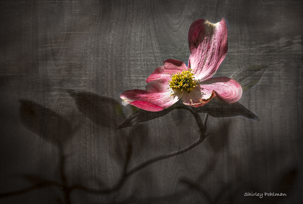
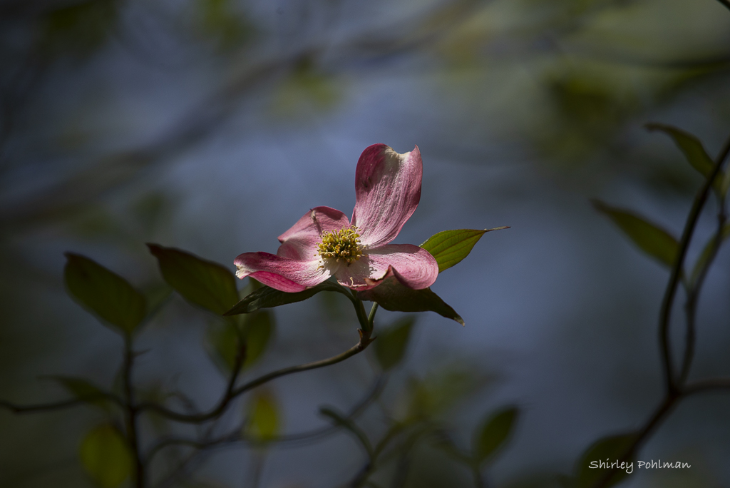
Pink dogwood in my yardâ”about spent. Shot handheld with Nikon D610, 200-500 lens at 500mm, manual priority, 1/1000 sec, f/5.6, 2/3 EV, ISO 500. Since the lens is VERY heavy hand-held and was windy, I had to get a quick shot. Lightroom adjustments and cropping. Topaz filter to add wooden background and masking flower only. Removed insect in Photoshop. Vignette in Lightroom.
This round’s discussion is now closed!
8 comments posted
Shirley, I love the wood background. It appears "fence-like", but then notice the wood grain through the transluscent leaves. Leaving the blossom opaque really sets it off from the background.
The amount of empty space in the upper LH corner might be used similarly to the lower RH corner to avoid criticism.
I REALLY like this. Well done! Posted: 06/01/2021 20:57:00
The amount of empty space in the upper LH corner might be used similarly to the lower RH corner to avoid criticism.
I REALLY like this. Well done! Posted: 06/01/2021 20:57:00
Are you suggesting to add more shadows of the leaves in the upper left? Posted: 06/02/2021 17:42:27
The flower is so sharp.Color is so beautiful.I like the waves on the petals of flower and the light is great. Posted: 06/02/2021 18:40:17
Personally, Shirley, I think I like the original color scheme better than the gray background. With a similar crop and a bit of cleanup in the top LH corner, I think the blue compliments the pink better and feels more natural to me. I know what you mean about that lens. It is extremely heavy!
Posted: 06/06/2021 12:45:54
Posted: 06/06/2021 12:45:54
I think you present an effective and creative way of portraying the pink dogwood on gray and would not change it. I would add some negative space at the top. Posted: 06/06/2021 18:56:10
This is very nice, Shirley! I do think that changing the background was a good choice, and the wood grain does not subtract from the simplicity of the blossom. Would there have been a way to get the grain of the background running ths same way as the grain texture in the top petal? Not necessary at all but it might make a fun variation! Posted: 06/08/2021 10:07:18
(Groups 3 & 83)
Hi Shirley. What a lovely flower portrait - nicely composed and cropped. The Topaz filter is creative and gives a very different look from your original. If it were my choice, I would have also masked out the three main leaves surrounding the flower so the filter only applied to the other, out of focus leaves and remaining background. Regarding your original, I love how the cool tones of the bokeh contrast with the hot pink of the flower. As with my own work, I often can't decide which version of a photograph I like more, and that's where I am with your two versions. Both of your images have merit. Both are well done. Posted: 06/10/2021 00:06:49
A striking image. I like the treatment of the background and the inclusion of the "leafy shadows" on the left-hand side. This gives the image some balance.
Well done. Posted: 06/14/2021 20:20:39
Well done. Posted: 06/14/2021 20:20:39