Emily Kawasaki
April 2021 - Diverging Paths
Original
About the Image(s)
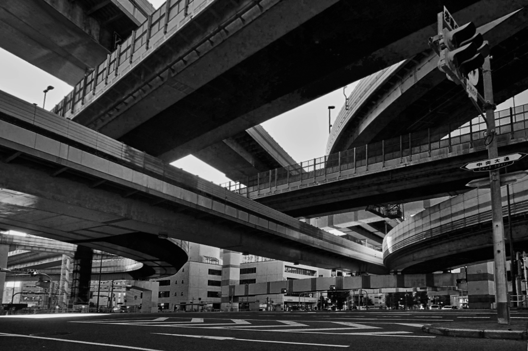
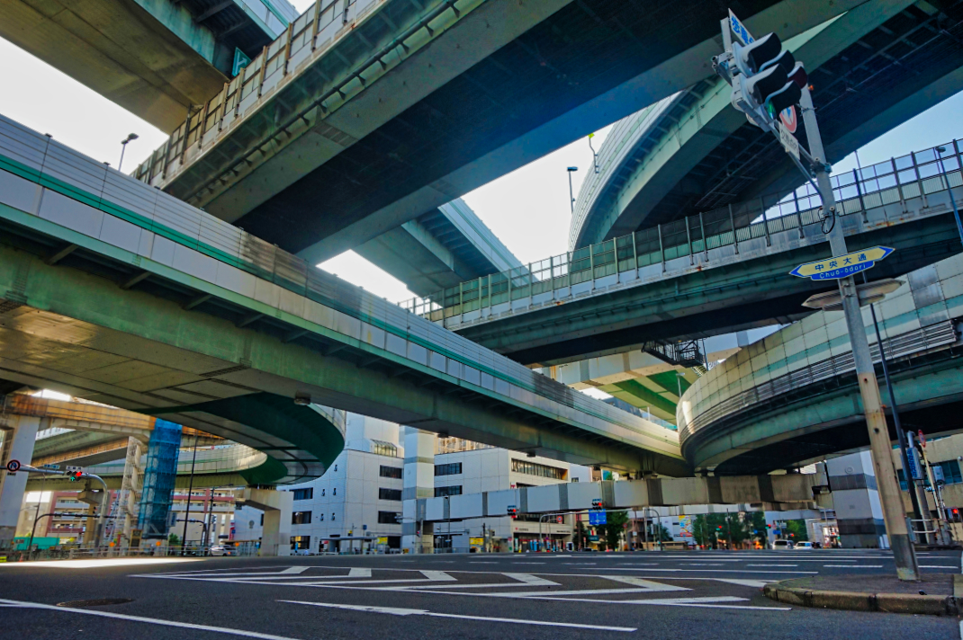
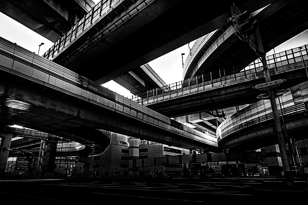
This photo was taken at the intersection of Chuo-odori and Shinnaniwa-suji in Awaza-ku, Osaka-shi, Japan. The image was taken on July 2, 2018 at 4:12 p.m. JST. It shows Chuo-odori and the Hanshin Expressway that runs across/above the city streets. The photo was taken with my Sony a5000 and 16-50mm OSS Lens. The ISO is 320, exposure time is 1/250 sec., the f stop is 8, and the focal length is 16mm. Post-processing edits in Luminar 4 were a decrease in highlights and increase in AI enhance, medium details, and large details.
I took this photo on a very bright afternoon. The metal frames and support of the elevated highway are quite dirty from all of the traffic below. So, the colors aren't very vibrant. I edited the photo in color and then also converted it to a b&w. I am curious to hear what others in the group think, and which version (or any other suggested edits) seems to work better.
This round’s discussion is now closed!
12 comments posted
(Group 79)
My attention is most drawn to the confusion of lines (pun?) formed by the train tubes - and then to the contrast within that convergence between the straight and the curved tubes. This excitement seems to reflect the frenetic motion of the vehicles passing within them.
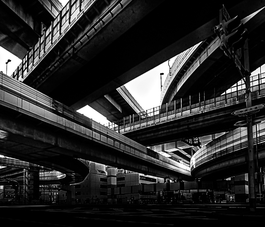
I did try a perspective warp - to straighten the verticals and was initially pleased with the product (since the image became about the weight of the upper track looming on top of us). But my son disputed its worth and said that the road markings became compressed and the pole on the right became just a pole - rather than a perspective marker as seen in your image. So he and I both now prefer your version to mine. Posted: 04/09/2021 20:36:14
I definitely avoided going near saturation or vibrancy in post-editing because I didn't want to make it look brighter/cleaner (because I would know that's not how it really looks, and that would bother me).
I also tried playing a bit with the perspective, at least in terms of getting the road straight horizontally. I noticed that even if one thing gets straightening, then something else will look off-kilter. It is an unusual intersection to photograph for exactly the reasons you mentioned - but a fun challenge. Posted: 04/09/2021 21:36:03
I think it would be interesting to see this same image shot at night. I'm guessing there is enough city light to still see the structures, but the night shot would eliminate the bright sky. It would also be interesting to see a longer or multiple exposure capturing traffic moving through the scene on the street. That might add to the sense of urban chaos.
Well done to pull such an interesting image out of the complexity such an urban setting. Posted: 04/12/2021 19:47:27
I love the intersecting lines of the bridges. Really interesting image and I enjoy looking at all the elements of the image.
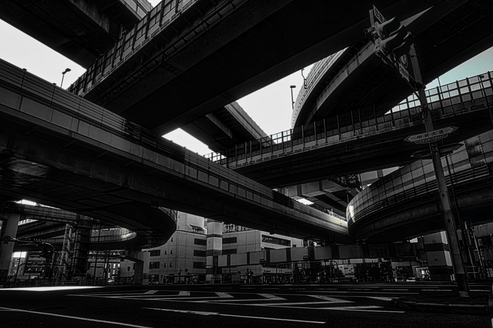
I find the blue and red color under the bridge draws my eye to the distracting street level background. For this reason I like the idea of black and white. I would darken the street level and highlight the bridges. Dan had a great idea about cloning out the street light. I too tried straightening the tilt due to the wide angle lens but liked it better without. Posted: 04/17/2021 15:21:13
(Group 87)
Regarding your question about the color or black & white version, I personally prefer the black & white. The tonal contrast is excellent as are the details of the various structures. Very well done. Posted: 04/19/2021 15:39:32
(Group 32)
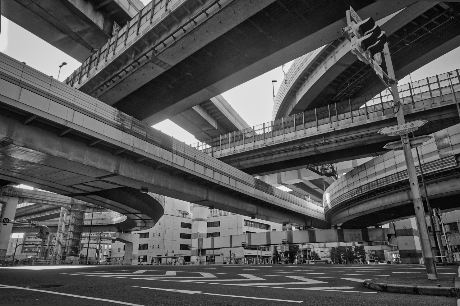
I saw your group's discussion about your interesting image, about straightening and b/w conversion.
Here is my suggestion for straightening. I used "skew" in PS, which allows pulling each side out individually to taste. I did more on the right. I left a little lean--my preference.
As to b/w conversion, I used the "vivid landscape" preset, then adjusted brightness and contrast to taste.
How do you like this? Posted: 04/27/2021 13:26:09