Robert Atkins

April 2021 - To the Sea
About the Image(s)
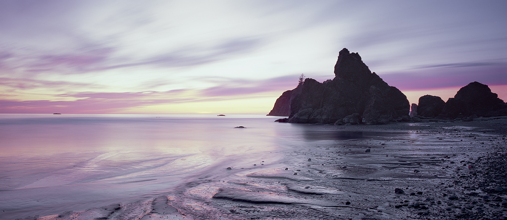
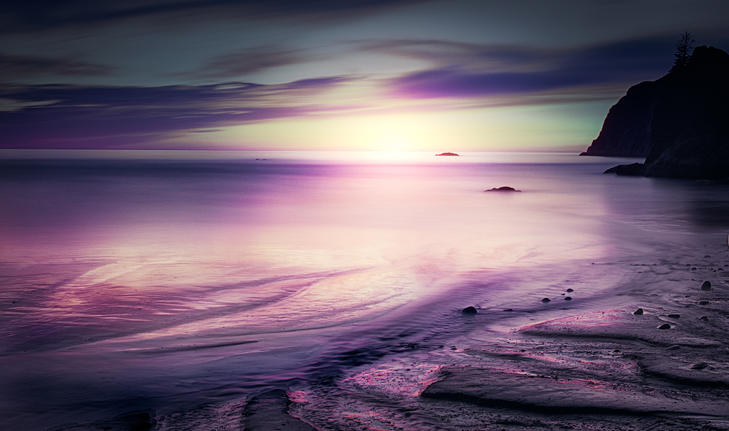
This image was taken at Ruby Beach on the Washington State coast right at sunset. It was a long exposure of a several minutes which started with the sun just still up and ended with it down beyond the horizon. The long exposure yielded some amazing colors - colors mixing as they changed with the setting sun. It is shot on 4x5 film (Velvia 100) which amazingly seemed to handle the dynamic range pretty well. Again, the changing light seemed to have something to do with that.
I've chosen to leave the soft colors and feel which the film captured - I've even pulled a little magenta saturation out of the image - and I've lightened it slightly too. The scene for me has a sort of ethereal sense which I've tried to preserve. Other than those corrections and some lightening of the sea stack to pull a bit more out of the shadows, I've done very little. Let me know what folks think of the more pastel rendering as well as the composition generally.
This round’s discussion is now closed!
14 comments posted
(Group 79)
I tried lightening the rock further - but when I was finished I realized that I had practically matched your image ... so I think you were correct. Personally I would shave off a sliver on the right to stop that next rock leading one out of the image - and a sliver from the bottom: so that the transition between the smooth and the shore is cut at a quarter rather than at the corner which I think adds emphasis the oval of light in the water. Posted: 04/07/2021 08:43:28
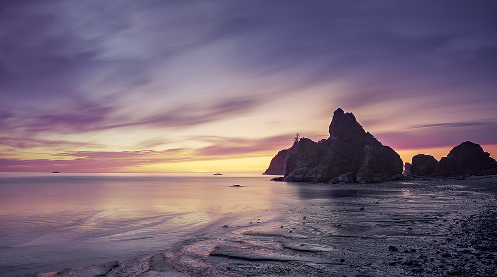
On the left side, your comment made me take a closer look and realize there is a pointed shape in the water flow, and I'm chopping off the point, so I feel I should go wider there and include the whole thing (as in the image below).
Then I tried your idea of cropping more on the bottom. Anywhere near a quarter it seems to lose the sweeping feeling I get when the shore line goes closer to the corner. The version below is a compromise where I've backed off a little from the corner. Again, I'm probably not seeing things right, so I'd be glad to have you take a crack at where you would cut it.
I'm not a particular lover of panos, but it seems that is where this is headed. Posted: 04/08/2021 16:37:11
(Group 79)
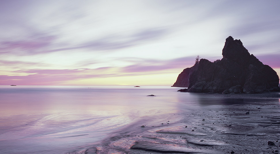
I love the colors and the foreground detail. Cropping is always such a personal preference. If you include the right half of the image the main stack is on the rule of thirds line however it may include some distracting elements in the bottom right hand corner. You as the artist will have to decide if it is too distracting. My main constructive criticism would be that by lightening the image you may have washed it out too much. I think the sky has become too grey. I have attached a version that shows more color in the sky and enhanced the yellow sunset. As well I show a crop that puts the main stack in the rule of thirds without it being panoramic. This is probably where I would go and then try to minimize the distracting elements especially in the bottom right corner.
This is an awesome image with beautiful colors.
Posted: 04/17/2021 14:46:53
I'm seeing through the comments made here so far that there's a struggle in making this a truly captivating photograph. If I'm sensing this consensus correctly, I would agree. Besides the ethereal look, as a viewer, I don't think that's enough to carry the image. With that said, I realize my photography is more punchy and at times lacks subtlety. I am always against others trying to impose their vision on someone else's art. So, I'm interested in what you were trying to say or project through your photo.
Cheryl's rendition provides for more drama, but you loose that pastel look that I think you were after. This might be the direction you want to go and just needed a fresh set of eyes to send you on your way. You came across a beautiful scene, Robert. You have the talent to make this image come alive. Posted: 04/18/2021 15:02:44
Again, thanks for the thoughts. If you had an opinion on the attached version, I'd be interested. I will keep playing around. Posted: 04/18/2021 18:04:20
With your latest version, you have taken your photo in a different direction. Although the added foreground is interesting (emphasizing a leading line to the sea stacks), it creates a very busy lower half that conflicts with the calming upper half. Cheryl's version still seems closer to what I think you were after. What really feels awkward is more the composition, not the color. It's the sea stacks, partly because they fall out of frame. I might try removing the far-right section to see if that works. You have the perfect amount of detail there. The stacks are on the back side of your light source, so being in shadow, you presented that accurately.
Think about merging your originally presented image with Cheryl's. I think somewhere in there is the photograph you are looking for. Please show us what you come up with. Posted: 04/19/2021 08:33:40
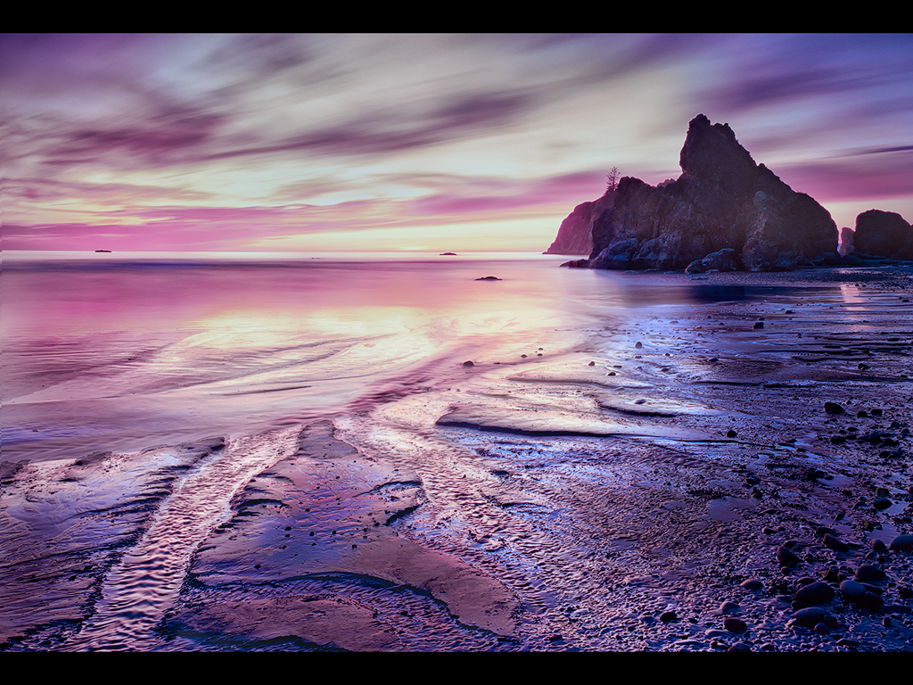
But I also realized that the "subject" for me is not the sea stacks but the light, particularly the "pools" of light in the foreground. So I decided to go a different direction. I cropped in on that, and I also did some work to bring in the sun on the horizon to make that a distant focal point. In this crop, the sea stack becomes a framing element on the right side. I've tried to match that on the left by darkening the left / upper left, which was already somewhat darker. What I am hoping is that in this composition the light guides the eye from the foreground pool of light to the sun in the background, using the shoreline and then sea stack to hold us in the image on the right side. I would normally argue the sea stack on the edge of the frame is a bad idea, but again here it is not the subject but more of a frame. I don't know though - do you think that works?
After that it was just a matter of bringing the contrast and colors to more where I usually put them - hopefully tastefully. I'd be very interested in what you think of this version. Posted: 04/23/2021 17:10:37
(Group 87)