Emily Kawasaki
September 2020 - Lake Neatahwanta
About the Image(s)
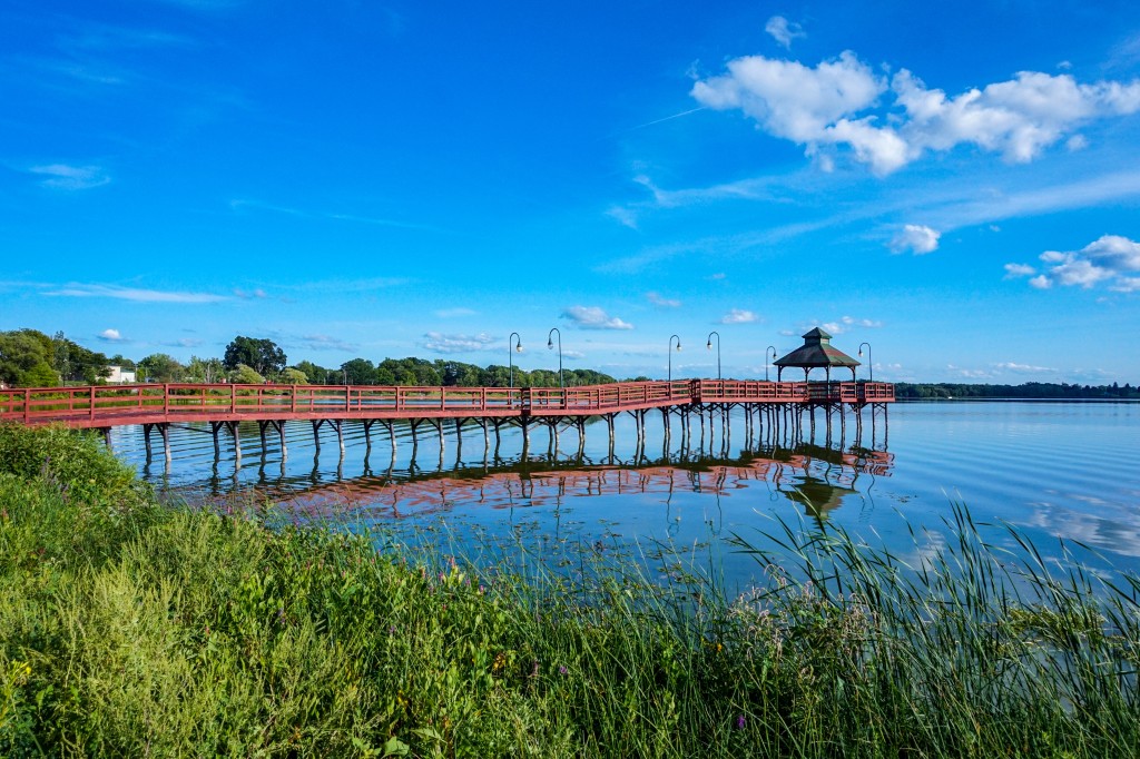
This image was taken on SEP 6, 2020 at 4:04 pm ET. The photo was taken at Lake Neatahwanta in Fulton, NY. It shows the grass and edge of the lake in the foreground, the pier extending over the lake from the left of the frame in the mid-ground, and sky and trees in the background. The photo was taken with my SONY ILCE-5000 camera. The ISO is 500, the exposure time is 1/1000 sec, the f stop is 9, and the focal length is 16. Post-processing in Lightroom with minor adjustments to the highlights, clarity, dehaze, saturation, and vibrance.
This round’s discussion is now closed!
15 comments posted
Hi Emily, You have captured Lake Neatahwanta wonderfully. Your photo makes me want to be there and paddle around that shoreline in a kayak.
Blue is calming color. I admire how you used the opposite color on the pier to counter the calm in order to make a little tension. You add to that tension with a fast shutter speed so the ripples on the lake water break up the reflection. It's a pleasing quality. I might suggest you crop off a bit of the lower frame. This will put your horizon line closer to the lower third. Posted: 09/10/2020 09:10:58
Blue is calming color. I admire how you used the opposite color on the pier to counter the calm in order to make a little tension. You add to that tension with a fast shutter speed so the ripples on the lake water break up the reflection. It's a pleasing quality. I might suggest you crop off a bit of the lower frame. This will put your horizon line closer to the lower third. Posted: 09/10/2020 09:10:58
Thanks for the suggestions Dan. I will definitely have to see if I can get more shots there using a faster shutter speed. I also like the image cropped as well. The 16:9 ratio really lines up the pier/horizon line to the thirds perfectly. Posted: 09/10/2020 09:43:19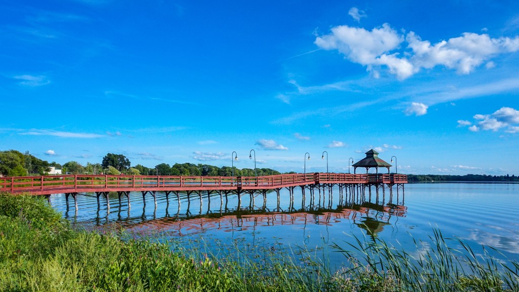
Here's a slight variation of the cropping. Posted: 09/10/2020 09:44:37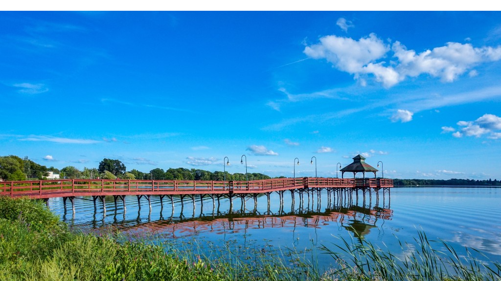
(Group 79)
Emily
I love the ripples - they are so smooth. Nice location - I wish you could have climbed a tree (a really tall tree) to avoid the coincidence of the land with the pier - but without that tree I think aligning them directly as you did was the right choice.
In my area - there is an annual billboard competition (I've never won) which calls for something like a 4:1 ratio. That would be my preferred option here as it focuses on the water and pier - and emphasis on its length. Posted: 09/13/2020 11:41:35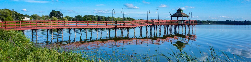
Hi Gerard, thank you for your suggestion. Yes, I wish there were some tall trees to climb to get a higher view of lake. Thanks also for the info about the 4:1 ratio - I will try that out in some of my future images of beaches or deserts/mountains in the Southwest. Would the 4:1 ratio be classified as "panorama/panoramic" or something along those lines? Posted: 09/14/2020 08:30:40
Among your crops I would vote for the 16:9 one. I think it leaves enough of the grass to anchor the foreground, and I like the pier right on the thirds line with lots of negative space above. Nice image! Posted: 09/12/2020 11:24:05
Thank you Robert! I agree - the thirds works really well with this image. Posted: 09/14/2020 08:31:24
Hi Emily
I really like this image. Blue is a calming color and the reflection and ripples in the water look really nice.
I like the 16x9 crop as well. I would use the gradient filter in lightroom and angle it just to catch the grass in the bottom left corner. Then I would decrease exposure about 0.40 just so it's not so bright drawing the viewers eye there.
As well the blues although a very nice color seem a little over saturated to me giving it an little of an un-natural look.
Love the location! I'd be going back if I could for a sunrise or sunset!. Posted: 09/15/2020 23:47:16
Thank you Cheryl. Yes, I definitely hope to go back for sunset (I live a few hours away from the lake, so sunrise is a tough time to get there). I tried some of your editing suggestions. I'm working with the free version of Lightroom, so the gradient filter option isn't available. But, I played with the original image (cropped, increase clarity, increase dehaze slightly, reduce color noise, increase contrast slightly). Here's the revised image. It was really bright and blue out that day, so there's not an easy way for me to mute the blue without muting all the other colors (red pier, green grass). Posted: 09/16/2020 09:57:36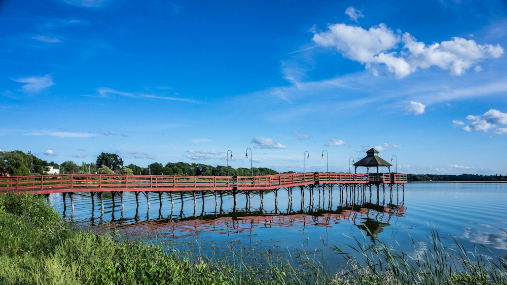
(Group 87)
Hi Emily - very nice capture of the lake and pier. Excellent overall composition. I like the sky as well with the good cloud structure. Also, nice use of foreground, having something to balance the photo! Like the other comments, I also like the 16:9 crop the best. The only things I mention to consider is the blue sky and water appear a little over saturated to me. Perhaps explore drawing the saturation of the blues back a little in LR. Also, while in LR, possibly lower the brightness of the foreground grass a little as well, especially the bright spots. Well done, very nice image! Posted: 09/21/2020 10:47:51
Thank you Dale. That's helpful advice. I played with the colors in LR a bit. The red doesn't 'pop' as much, but the blue is less saturated. I am curious to get others opinions on it. Posted: 09/21/2020 11:03:04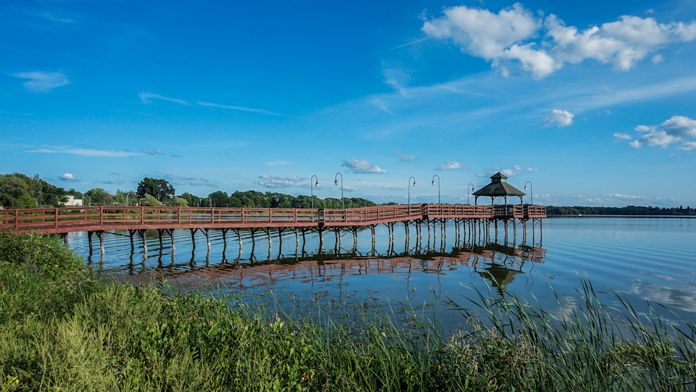
(Group 87)
I like this...the blues are in my opinion more pleasing. You can work in the individual red & orange color channel in LR to bring out the pier if desired. Posted: 09/21/2020 12:17:09
Thank you. I agree. It also challenging to work on LR on my mobile app compared to seeing it on my PC, as the screen brightness isn't quite the same. I edited the image in Adobe Photo Express on my PC. Please let me know what you think. Posted: 09/21/2020 13:04:12
(Group 87)
This is excellent! I like this version. The blues are right and the color balance of the pier is very good. Nice work! Posted: 09/21/2020 13:30:57
Thank you! Posted: 09/21/2020 14:03:57