Gerard Blair
About the Image(s)
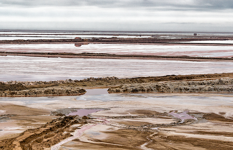
Salt flats in Namibia
f/5.6 1/800 ISO 100 70mm - Canon EOS Rebel SL1 - Canon EF70-300mm f/4-5.6 IS USM
This is part question, part rant - many images upon which I receive comments (in other contexts) are said to lack a
clear subject - or to have a subject lost by distractions. I wrestle with this in that paintings that I admire are often hyper-complex with layers and surprises that can be found only after close inspection. Often it is the details in the corner that excite the most comment. Take a Jan Steen's disfunctional household - the best bit is normally the cat drinking wine under the table.
So here is a land.sea -scape - I see interest in the lines of the foreground (irregular though still leading ) complemented by the lines in the mid-ground which are straight and diagonal (crossing). Is the picture flawed because it lacks a subject? Does it lack a subject? Does the little house and its reflection add an interest or distraction? Since the eye does not rest, do we look away or can we embrace the whole?
Your thoughts please (?)
This round’s discussion is now closed!
4 comments posted
As I see it, the current trend in photography is "simplicity". Compositions with lots of negative space and no distractions is one of many ways to define this trend. It also means the main subject or point of interest is often understated. This allows the viewer freedom of interpretation.
With that said, your photo, is not necessarily simple, but it doesn't have that dominate center of interest. That's not bad at all. As you said in your description, there's lots of fun surprises in your image. I really like that. Every imagemaker wants people to keep returning to their picture to have a closer look.
To me, your image is about lines, triangles in particular (which is also trendy). The lines serve nicely zig-zagging their way across and up the frame until my eyes reach those small cabins just below the horizon. That's the nice surprise in your shot. I feel it makes the viewer appreciate your image more. I wish I had that kind of sensibility. It shows that you have respect for your viewer by not having your main subject scream at them.
I also like the story presented in your photo. In a way, it's a bleek, stark environment. It's such a large area with those small looking cabins. Existence there seems hard.
Keep going with this theme. You'll hear criticism about it, but take it with a grain of salt. I feel you're on to something great. Posted: 09/05/2020 09:25:16
Behind a lot of those questions though is the fundamental issue of what we want in our photography vs. what others want (where here "others" are judges, the mass of other photographers, etc). We've all probably had the experience of an image we really hold particularly dear receiving poor scores or other lack of praise in the eyes of others. The dilemma when that happens is sorting out whether the masses are right or not. By that I mean, are there "things wrong" with our image that we would see if we were not so biased about our own image, or is the issue that it is "different" and doesn't conform to the current trends or thoughts of the masses in the photography community. As an example, in my local photo club, it is pretty impossible to receive top scores on an image unless the saturation is pushed to 11 (or you shoot a portrait of a bird - but that is a different rant). Try to do a subtle landscape with soft colors and it is almost sure to score poorly.
The easy thing to say is to ignore the critics, stick to your guns, and do the images you want. But again the difficulty is sorting out when you should be improving things in your images vs. just conforming. And there is no hard line between the two. It helps when the criticism is specific (vs. just a bad score), but even then things are not clear. Take the criticism you mention receiving about not having a clear subject - who says an image has to have a clear subject? Well, pretty much everyone, which is the problem. Is not having a clear subject "something wrong" or is it just not following the mass trend.
I think you can probably sense that I share some of your frustration. I think the photography community encourages creativity only so long as it stays within pretty narrow bounds. And certain sub communities can be even more narrow minded in those bounds. I'd love to hear others thoughts on this challenge. I think sorting out when to listen to the masses vs. not becomes a little easier as one gains more experience. The only other thought I'd add is to keep coming back to an image. If it brings me joy to look at an image, in a way that I want to keep looking at it and exploring it, and if I still feel that way a month later, and six months later, then I conclude it is compelling to me. It might break rules, and it might not win contests, but I try to be ok with that, realizing that I am my own tough judge and that the image somehow moves me. Posted: 09/12/2020 09:37:43
(Group 87)
