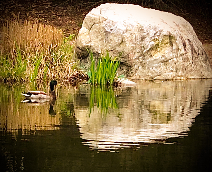
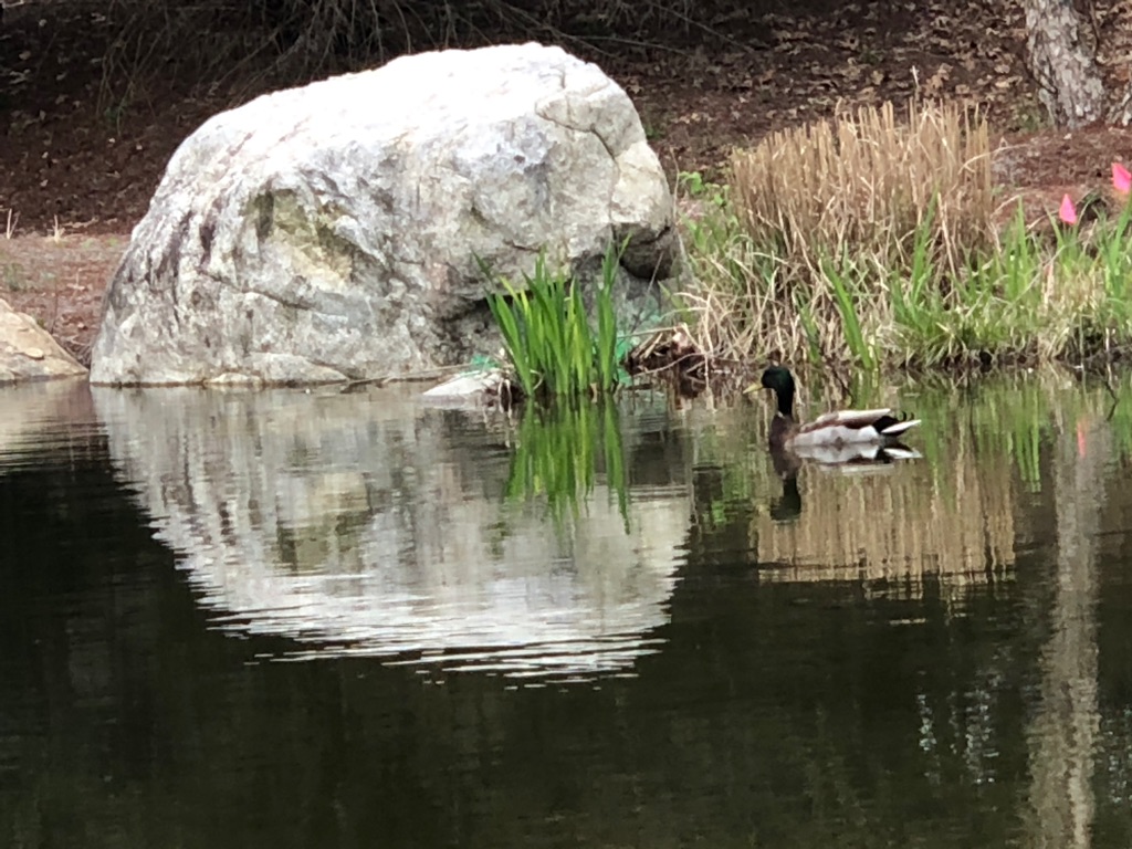
Shot in late March on my iPhone (f/2.4, f/2.4, 1/60s, 6mm, ISO16). During the first stir-crazy month of hanging around the house to avoid the virus, we took a short drive to a dam where I shot this peaceful scene. With this, I am trying a different free app for resizing: "Resize It". I am also using Adobe PS Express this time. I adjusted the slanty horizon slightly and cropped off the out-of-focus orangy flowers that didn't seem to add much. What I was attempting to do in the final presentation was first, to flip the image, so the duck would be swimming toward the rock, rather than away, to sharpen slightly (in the downsized image, it seems more harshly sharp than I intended), and finally, to give it more of an autumn tone. Funny thing, PS Express BASIC setting of "Summer" was more the right shade than "fall" was. I moved the slider to about 55-60% strength. I set White Balance shade to about 85%. Also, I used BORDERS >Basic> Vignette-Black to eliminate brighter areas around the edges.
This round’s discussion is now closed! 8 comments posted
Kieu-Hanh Vu
I think that flipping the image horizontally is the best choice since we have the tendency to look from left to right. The autumn tone also makes the image more beautiful. I'd prefer to darken the top of the rock more since it's a bit too bright there. Posted: 10/05/2020 15:56:55
Pat Centeno
Seeing it on the computer screen, I'd have to agree that the top of the rock needs burning down darker. On the cell-phone, though, I'm not entirely sure which tool could isolate that area and give me the desired effect. (Really, it didn't look that overly-bright when I was working on it on the small screen.) Posted: 10/17/2020 12:10:16
A very pleasing adjustment to the whole appearance of the image.
It would be good if you could lighten the shadows a bit on the duck itself. At the moment it is almost one with the background. Posted: 10/05/2020 17:23:51
A very peaceful scene! Your edits greatly improved the image, especially warming it up. I agree that highlights on the top of the rock need to be reduced. Also, the neck and head of the duck need to stand out more from the background, so I'd work on improvements there. I Snapseed, you can try using the Selective tool which does wonders! Posted: 10/07/2020 15:00:30
Ruth Holt
I agree with all the above. Thanks for telling us about "Resize It"... this has been a problem for me. Posted: 10/08/2020 10:32:14
Pat Centeno
You're welcome, Ruth. I hope it helps us both in future work. Posted: 10/17/2020 12:07:23
Nice shot. I agree with Phillipa's suggestion about the shadows, and I also might adjust the contrast a wee bit. That rock is a very nice element! Posted: 10/09/2020 10:17:43
Tom Pickering
(Groups 0 & 53)
Taken as a whole, this is a very nice scene. The duck is an element of the whole and doesn't have enough weight to become the subject. As it stands, the rock is the main focus because of how bright it is and how it dominates the image. The top half of the rock needs to be burned (as well as the bottom of the reflection) so that it is less glaring and, as mentioned, it seems to be a bit too sharp, something that can be remedied with a slight lowering of the contrast. Posted: 10/21/2020 16:58:18