Jane Luo
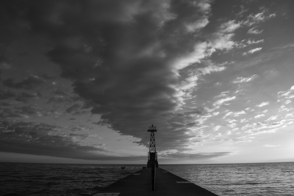
February 2019 - Before the Storm (1/60s, f16)
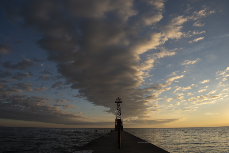
Original
About the Image(s)
This lighthouse was taken in the morning with interesting cloud formation. I'm trying to make the look of the cloud strong and scary, or feel like before the storm. But I'm having problem to make adjustment to the blue sky while I try to darken the cloud.
This round’s discussion is now closed!
27 comments posted
Jane
You gave us a challenging image to look at. There are so many ways to interpret and edit it.
For this landscape and your story of the impending storm, I wondered if a different crop, rather than symmetrical might work. The crop I tried, puts the stand on a 1/3 crash point. However, I think I prefer your symmetrical crop with the lines converging.
I also wanted to see more detail on the dock and separation between the dock on the left and water. (I did not want to fall into the water. This is the sailor in me.) When, I increased the exposure on this area, the post and the moorage designation were attention grabbers. However, the landscape in the background became more apparent. Immediately I saw something in the water on the left side and wondered what it was. I have had too many days watching for obstacles to avoid in the water.
I liked the contrast between the sky on the left and the right which shows the storm moving in.
Therefore, I tried a few changes on your image. See if any of it works for you. I removed the middle pole and the left bottom moorage marker so the tower could be seen, put more exposure on the tower, centred a Color Efex point light centre on the tower to brighten it. This also darkened the exterior of the image. I then with patch and clone and in the combing on the lower left side of the dock. I added Color Efex detail filter (just a little bit) to bring out the textures. The result is there is more detail in the clouds and the shimmer on the water on the right is increased.
With this kind of sky, I would be anchored or tied to the dock. Where was this image taken? Posted: 02/12/2019 10:40:33
Thanks Judy! I like to read your comments. Thanks for those good tips, I need to think about it and try on. I also thought about another option is to darken the blue sky, light up the white cloud and bring in more texture. Not sure how that'll look like. :) Posted: 02/12/2019 23:24:59
(Groups 20 & 79)
Hi Jane. Storms make for dramatic images. Your image is no exception. I am one of those people who has to fight an urge to tinker. In the case of your image, While I tinkered, i am not clear on whether I improved it. I saturated and lightened the blue and orange, and cut back the luminosity contrast to increase the tonal range in the clouds. Brightened the mid range in levels. I also changed the crop, and applied a levels layer to get a little more pop in the image. With images that are dark around the d=edges, I am in the habit of putting a thin white border around the image, so a judge can easily tell were the image ends. Posted: 02/13/2019 17:40:45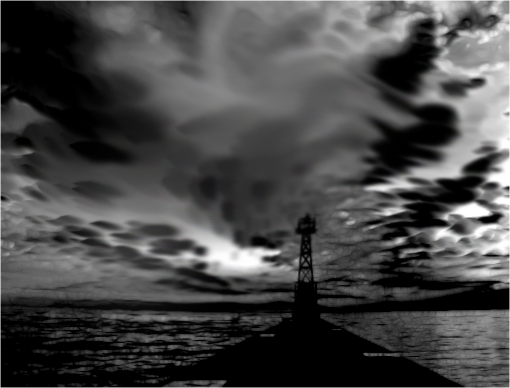
Jane
I forgot to attach my version.
In my version, I pretended I was standing on the dock looking out so I removed the post. Posted: 02/13/2019 20:59:19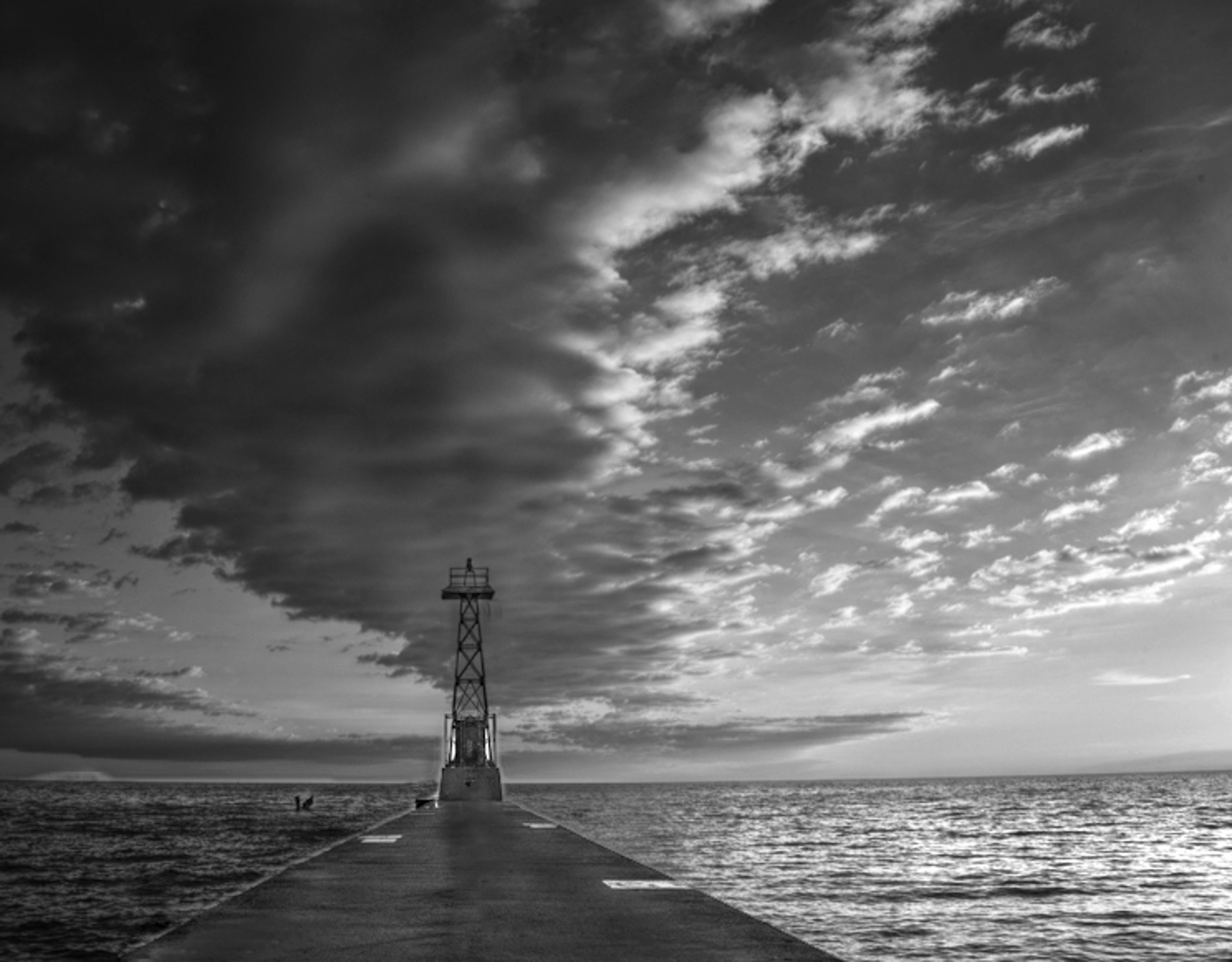
I forgot to attach my version.
In my version, I pretended I was standing on the dock looking out so I removed the post. Posted: 02/13/2019 20:59:19
Thanks Judy for the demo. It's much better w/o those poles. I like the texture that you extracted from the cloud above to make the sky more 3D. I need to try that too. Posted: 02/18/2019 11:01:08
Hi Peter, I just opened up your image. Wow! So dramatic! I love it. I'm not sure if you got it from my image or created your own based on the concept. lol I could not map any cloud back to the original. Only things I can tell are the lighthouse and the pier. How could you make the cloud and sky so dramatic? :) I like the texture that you added on. Now from your graph, I can see how much can do to this image. Thank you! I definitely should make a version like this for this years Halloween greeting card. lol Posted: 02/18/2019 10:56:03
Thanks for this powerful image. Firstly, I favour leaving the lighthouse in the centre of the image as it 'points' to the cloud street in the sky. The sky, by the way, I believe is excellent and expresses sunrise well. However, I would agree with Peter that the pier (dock) could be lighter and the removal of the post strengthens the image.
Posted: 02/14/2019 02:50:17
Posted: 02/14/2019 02:50:17
Hello Jane, I understand that you want more drama to your heaven. The original image should be forced in Camera Raw, working that blue sky with luminosity so that turning it black and white you can dramatize the cloud without affecting the blue of the sky. Working with layers of adjustments on your image already converted to black and white, I've given it some more drama, which I understood was what you were looking for. They are layers of selective correction working the tones separately and another one working them together. Posted: 02/15/2019 17:52:35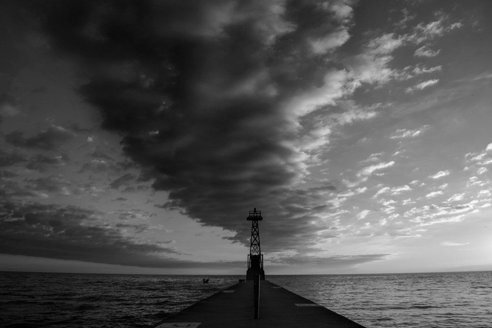
Thank you very much Judy, Peter, Charles and Jose! It's very helpful! I put all your ideas together and redo the photo. Jose, thanks for bring up the luminosity. I did not know how to use it before. Judy, I remembered you have asked about how people convert to B/W. I think from somewhere I read the best is to start from the ACR(Adobe Camera Raw). Don't use any Nik or LR(LightRoom) or Satuation etc. The reason for that is that ACR keeps most of the details of your image. I changed my workflow to ACR lately, but usually just got a flat image. Thanks Jose to show me the new toy. :) Hmm, I think I still like Jose's demo better. Please let me know how you guys think about this modified image. Does anyone know tricks to make the light beams? :) Posted: 02/17/2019 01:27:02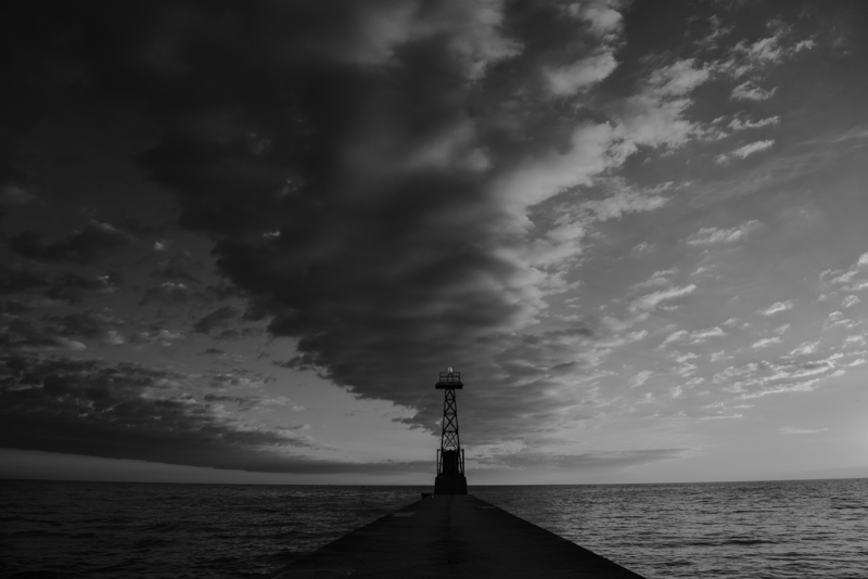
Jane
I have had to consider what is the best workflow. I start in LR and just do the basic global adjustments i.e. set white and black point, shadows, highlights, and exposure. I do not touch contrast or saturation. Sometimes I move dehaze if I think there will be a major problem with the sky.
To assess whether an image might convert well to monochrome, I use the monochrome option but use edit undo to go back to the color version. I do not use LR's BW color sliders. A camera club member told me that when I use Nik, I can take the image directly from LR to Nik without making any adjustments because I can make the adjustments in Nik. I also read somewhere that it was better to use the PS BW adjustment layer. Given that for this image, I wanted to try using multiple BW adjustment layers with masks, PS was the route of choice.
For my Nik version, I did not use presets. Instead I worked, through the brightness, contrast, structure, sections, then chose a main overall filter, and then worked with the individual color sliders. I did experiment with the film type and noted that this automatically applies a curves adjustment and moves the color sliders. I can go back and readjust them to override. I like with Nik, how I can set control points or choose a frame/style for more character.
My understanding is that the global adjustments in LR or the same as CR. Since I use LR as a library organizational tool, I do global edits in LR. However, it is easy for me to send the image from LR to PS editing as a smart object. Then I can edit in CR, using CR as a filter.
I prefer your symmetrical crop because it creates a more sweeping line. I also like the middle cloud darkened underneath because that is how the cloud appears before the storm.
You added the flashing light on top of the observation tower. Was it there before?
Posted: 02/18/2019 07:43:33
(Groups 20 & 79)
Jane, I did a quick Google search photoshop light beams. The results turned out a bunch of u-Tube videos. Posted: 02/19/2019 20:06:49
(Groups 20 & 79)
Jane, I did a quick Google search photoshop light beams. The results turned out a bunch of u-Tube videos. Posted: 02/19/2019 21:26:07
I redo the masks again and added light beams to it. What do you think? Posted: 02/18/2019 00:40:19
The site seems repeating itself yesterday. I'm reloading the image. Posted: 02/18/2019 10:37:17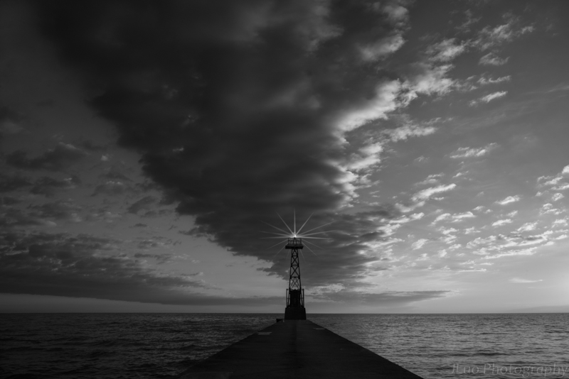
Thanks Graham. You brought up a topic that bothers me too. Should I keep the lighthouse at center or a golden ratio? I have another cropping I would post it too. It's closed to Peter's crop. Please share all of you view to see which one is better. Posted: 02/18/2019 11:27:29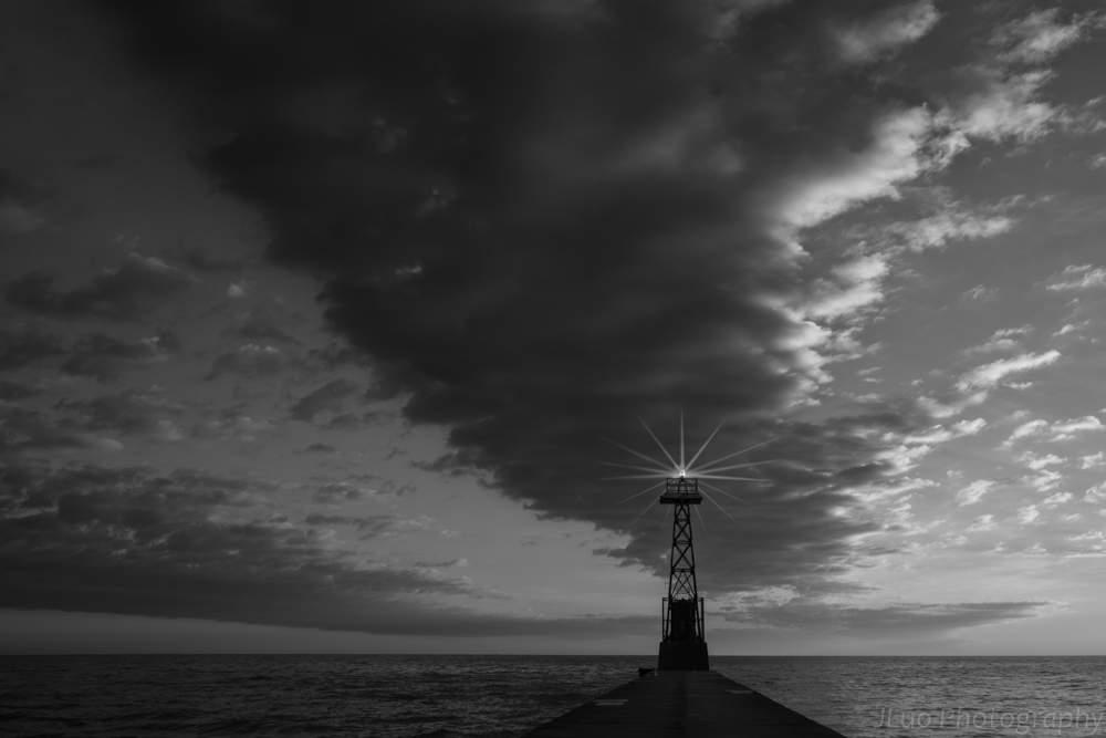
Hi Judy, thanks for the in depth discussion of the workflow. You taught me something new. I never pay attention to NIK can be used in this way as I only used their filters, and actually only certain types of filters. :) I used LR too. As you do, I import/review photos in LR, then find the one that I like. I use some of the LR tools to preview the image, (I used to modify on LR first but now I skip this step), then use LR to PS and bring up the original image on ACR (in PS) to do cleanup, basic modification and b/w conversion. I'm not sure if that's the optimal approach, but somewhere I read that modifying the image in ACR is less damage to the image. Other tools actually would affect to the image including LR, I think.
I'm interesting in the topic of using LR to manage photos too. I have used LR for a long time but I never really establish a good management system. I used it more like an file explorer. I store my images based on shooting date, when I find a good one to process, I saved the post processing file back to the same directory and put the image into a collection. I realize my problems. 1st is that I need to maintain a long list of collections based on the purpose of the collection, also the trouble is I could not find my image sometimes quickly when I need to. 2nd, once I change my original file directories, I'm in trouble to locate the post processing files. I'm not sure how other people do their file management and would like to get some tips.
BTW, the light on the lighthouse is from PS, so does the beams too. Posted: 02/18/2019 11:55:49
Jane
My local library has access to Lynda.com for free. This site has videos on how to use the Nik collection. Ben Long on Foundations of Photography Black and White has a section on how to use Nik vs PS. Tim Grey explains the different Nik components i.e. Silver Effex.
In LR, perhaps you might want to consider keywording images and referencing by keyword, or keyword string to select an image to reduce the number of collections. Tim Grey has videos on Lynda.com on how to clean up your mess in LR. I also find Nick Orwig's explanations simple.
I have heard an opposite viewpoint about whether to use LR or PS. Someone advised me to do my basic edits in LR because LR is non-destructive and to use PS for the things LR cannot do. If one does take an image from LR into PS, then one should take it in as a smart object i.e. LR>edit in PS as a smart object. I also read that once the image goes back from PS into LR as a TIFF file, that making modifications on the TIFF file are not as effective as if they were done in PS. Therefore, once I edit in PS, in general, I stop tweeking in LR after sending the file back into LR unless it is an adjustment for printing an image.
The other important thing I learned was that the dodge, burn, saturation tool in PS is much better than the exposure/highlight brush in LR because it provides more options i.e. burn (highlights, shadows, or midtones).
For monochrome, I prefer using the PS dodge,burn tool because I can do it on a separate layer and do not have to backtrack in the LR history to figure out where I did things.
With your light, you are guiding the boaters home. It would flash on and off.
Posted: 02/18/2019 12:47:09
Hi Judy, thanks for the quick response! I'll take a look Grey and Orwig's videos. I need that. :) I found keyword seems can only be used while importing the files LR, not after post processing, maybe I need to review the LR to see how much I don't know. :) Guess I used masks and filters a lot, including Nik and TK's, maybe that's why I rely on PS, but the big file size kills me. I use less and less dodge and burns now as I noticed it brings in noise or lost details. I tend to use TK's masks and make adjustment on using curve control which is more accurate to the region I like to apply control to. But for this b/w image, I feel hard to work with TK, so I used selection tool instead. Anyway, so many tools I make myself dizzy. Maybe you should stay with what you like now to make life easy, don't learn from me. :D
OK, I got my final version and plan to print it out to join my club competition next month.
Thanks all for the great help! :) Posted: 02/18/2019 14:59:58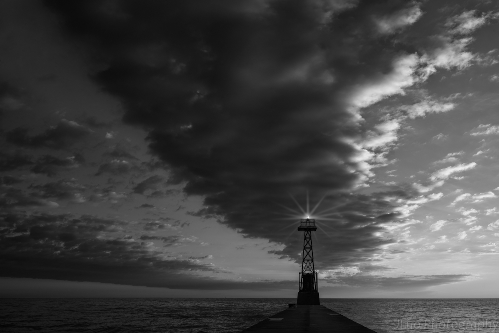
OK, I got my final version and plan to print it out to join my club competition next month.
Thanks all for the great help! :) Posted: 02/18/2019 14:59:58
(Groups 20 & 79)
Hi Jane, i am flattered that you like my crop. Do you think the sparkle light enhances your image. To my eye the starburst creates a conflict in mood. I can understand the star as representing a good outcome from the storm. Posted: 02/19/2019 20:01:15
Hi Jane, for some time, Adobe provided LR, ACR and Brigde with the same work engine. So to use one or the other is a matter of taste or comfort with the environment. At the level of editing, the difference is that in LR you work on a thumbnail of the image and what you do is registered in that thumbnail and in ACR you work on the image and what you do, it is registered in an XMP file on your hard disk. At the organizational level, both LR and Brigde, work the same, image keywords, collec- tions, smart collections. The difference is that Brigde works directly on your hard drive (directories) and LR creates a virtual catalog, the first time you open it, with what you import from your hard drive. If you then move folders, delete, add etc, outside of LR, when you re-open LR the program will not know what you've done with the folders and files, if you do not tell them. So if you work with LR I recommend that all folder movements, deletion etc do it directly from your library module, so that LR always knows where everything is. In Bridge, as you directly work on the directories of the hard drive, you will always see everything, as it really is. The concept of virtual catalog of LR is what more it costs to understand my students Posted: 02/24/2019 08:02:18
I sprained my ankle yesterday on the ice and can't go anywhere today which gives me more time to work on this board. lol Posted: 02/18/2019 15:04:48
Jane
I can add keywords to the original file at anytime in LR. One solution is put in the keyword(s), find the image number, then select it. Then you have the file number. Then go to the library, find, put in the file number and all the files with the same number appear i.e. 8116, 8116edit.tiff etc. Select the one you want.
The important thing is to develop keywords that are meaningful, and provide a quick way to sort. Posted: 02/18/2019 17:06:53
Thanks Judy! It's nice to know. I'll try it next time. Posted: 02/21/2019 00:28:31
(Groups 20 & 79)
Hi Jane, I am sorry to hear about your ankle. Of course, that you were sent a lemon, you have a great chance to make lemonade. ;-)
Posted: 02/19/2019 19:53:13
Posted: 02/19/2019 19:53:13
Haha! Peter, you make me laughing. :) Thanks! Posted: 02/21/2019 00:28:59
Hi Jane,
I can not add anything because I think all possible proposals are given. From all I like the origin most.
Dirk Posted: 02/20/2019 01:57:21
I can not add anything because I think all possible proposals are given. From all I like the origin most.
Dirk Posted: 02/20/2019 01:57:21
Thanks Dirk, welcome back!
I guess you like the original nature color. :) I would think the b/w adds more dramatic effect on it. Now I need to consider the mood that Peter brought up about the light beams. Maybe be I could rename the image to something not before storm, or on the other hand, make the whole image sad and heavy. lol Posted: 02/21/2019 00:32:10
I guess you like the original nature color. :) I would think the b/w adds more dramatic effect on it. Now I need to consider the mood that Peter brought up about the light beams. Maybe be I could rename the image to something not before storm, or on the other hand, make the whole image sad and heavy. lol Posted: 02/21/2019 00:32:10