Carol Sheppard

October 2020 - Comfortable Companions
Original
About the Image(s)
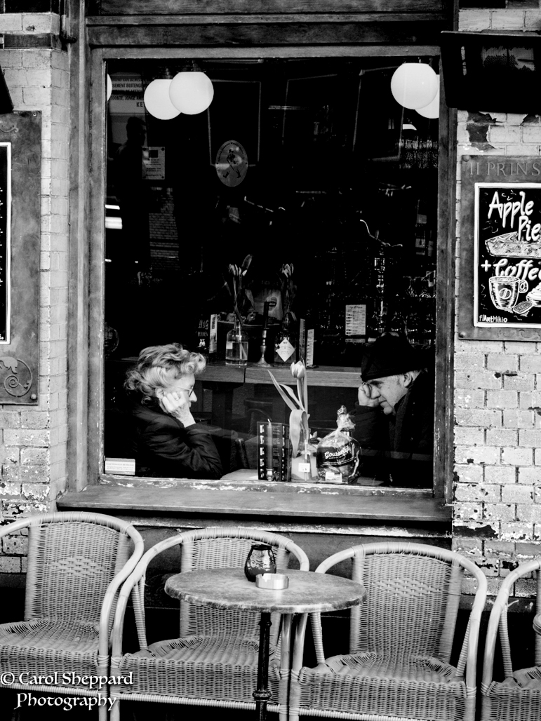
I submitted two versions, one in color and the other in Black and White. I couldn't decide what to do with this. I like the man and woman in deep conversation in the window, but there are so many distracting elements. I'm curious to hear what others think.
The settings were: ISO1600, 50mm, handheld, f6.3 and 1/40. I was actually set to take a photo of something else and just caught this brief moment behind me.
This round’s discussion is now closed!
10 comments posted
I like the story in this photo and how you framed it. I think the B&W version is more appealing. The strong colors in the color version are a distraction to me. In the B&W version, that distraction doesn't exist and my eye is drawn to the people.
I would look at reducing the luminance in the lightbulbs but be careful to not make them unnaturally gray. Also think about reducing the luminance on the bottom and sides so that the people are slightly brighter than the surrounding area.
Well seen scene.
Posted: 10/02/2020 17:36:02
I would look at reducing the luminance in the lightbulbs but be careful to not make them unnaturally gray. Also think about reducing the luminance on the bottom and sides so that the people are slightly brighter than the surrounding area.
Well seen scene.
Posted: 10/02/2020 17:36:02
(Group 95)
I actually do have a version where I did just that! And I did like it, but I have a hard time looking at heavy vignetting. Posted: 10/04/2020 17:47:24
I don't like "heavy" vignetting either. Try using the graduated linear adjustment tool so the vignetting falls off where you want to fall off. Then brighten the man's face ever so slightly so he's just a touch brighter than the right wall. Posted: 10/04/2020 18:52:25
I like the strong relationship shown in the two figures, the sameness of their gestures, the way they are looking intently at each other. The heavy coats and three tulips tell me that it is early spring, too early to be sitting outside.
I prefer the B&W version; it takes care of one problem of the image for me; the red of the window frame pulls my eye away from the main subject. (I do like the blue table against the orange of the wicker chairs, I miss that nice set of colors.) That said, when converting to B&W, I suggest that you darken the reds so that the bricks are darker and don't pull at my eye and develops some nice lighting on the couple that really pulls me into them. Darkening the bricks is not really a vignette that fades into the image, but a natural looking darker shade of bricks.
For me, the signs at side of the image do not add context, are a bit of a distraction, and could be cropped out. This would also allow you to crop out the bright lights at the top of the image. I also suggest that the contrast be reduced in the room behind the couple mostly so that it does not look like such a dark hole there.
With these changes, I think you have a wonderful image with some nice tonality. Posted: 10/05/2020 17:59:21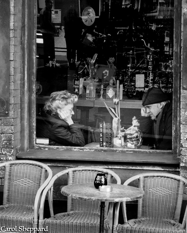
(Group 95)
Thank you for your very specific suggestions; I will try them!! Posted: 10/06/2020 18:25:01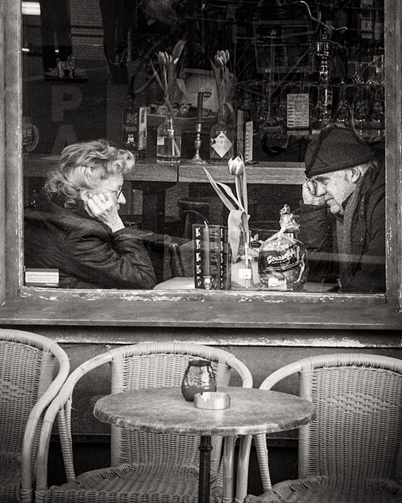
(Group 95)
What I did is change the BW setting in Silver Efex, then crop, do selective white, exposure and shadows adjustments, and tried to brush out the lightness in the window. Thoughts? Posted: 10/06/2020 18:45:52
I think the changes you made make this a stronger image. The changes brought more attention to the couple to help convey what you wanted to show. I like that you filled in the background a little more. Posted: 10/07/2020 22:10:12
I was going to say that I liked the color version as it seemed to frame the couple better but your revisions of the black and white do it so much better that I have changed my opinion. It now really focuses on the couple and their interaction. I like the revision a lot. Posted: 10/10/2020 16:20:54
When I first looked at this image right after you posted it, my thought was that it had a lot of potential. And from looking at how you've now edited it, I think that was correct. I knew it needed some work, and I think the advice you got was just right for what needed to be done. I really like the image as you've redone it. You have the couple highlighted with details from the background brought out, which keeps me interested in the image. And I like how the chairs in the foreground give the image additional depth. Well done! Posted: 10/10/2020 16:53:51
I think your last image is definitely the best one. I'm immediately drawn to the couple and there's not much to distract me. Posted: 10/19/2020 13:53:43