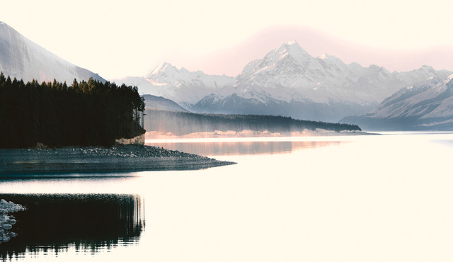
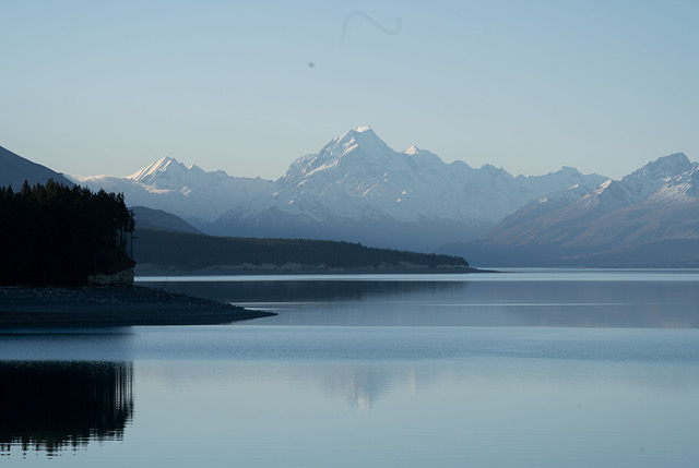
This month is an image of Mt Cook, our highest mountain and the area in front of it, Lake Pukaki. It always makes a lovely photograph as the weather in the area has many moods. This day it was quite pleasant, but needed a little experimentation in post processing :-)
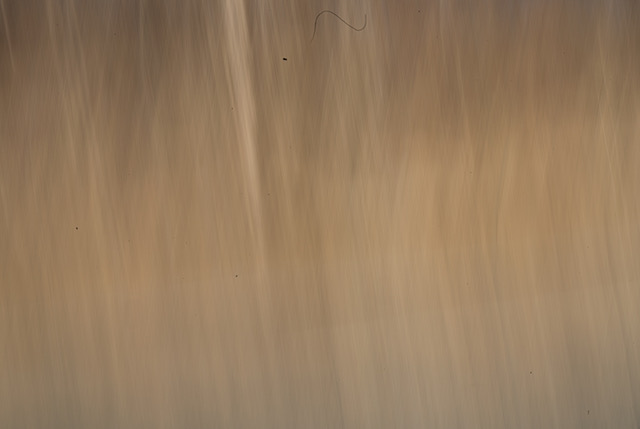
At the same time, I also took some movement photos of tussocks which cover the lower slopes so it seemed like an idea to marry the two. The final image is the result of the tussock layer being applied to the original Mt Cook image and a blending mode being used. (I can’t remember which one, I’m sorry) I did the usual adjustments first…curves, clean up, cropping etc. The original photo was not quite the same as the one supplied, but I have filed it and it seems to have got itself lost in my rather disorganised system! It was very similar….just a little longer on the left.
ISO 100
f/13.00
Sony A7111
Lens 100-400mm
This round’s discussion is now closed! 6 comments posted
Hi Valerie,
What a great idea! The composited image is much more interesting. I like the warmth it adds to the image and how the mountains look even more majestic. I didn't know what a tussock was so I had to look it up--learned a new word! I really liked the detail of the reflection of the top of the mountain in the water and the gradations of the water in the original picture. I wish those water texture details were preserved in the composite image. The mountain is absolutely gorgeous, but the brightness of the water draws my eyes away from the mountain. Great job in capturing the serenity of the scene. It's a soothing image. Posted: 09/12/2020 00:53:00
Karl Leck
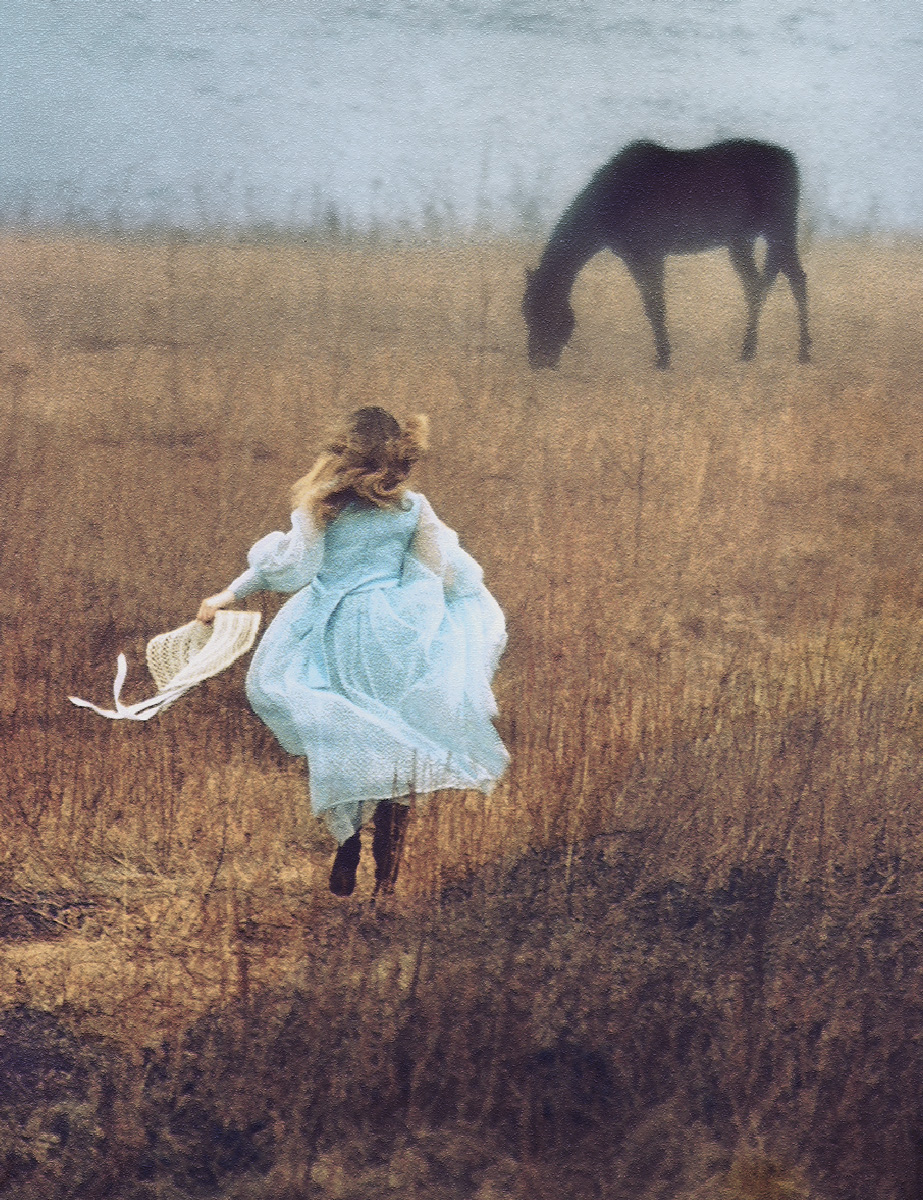
Hi Valerie, I love NZ. There are so many wonderful landscapes. In this case I prefer the Before image which could be brought up with some local contrast adjustments and conversion to black & white. The parts of the sandwich image I find problematic are the washed out lake (The Mt Cook reflection is gone.) and the 'halo' over the mountain area. I've made a lot of sandwiches in my life starting with putting two slides together years ago. It's great fun but doesn't always work. I've attached a color slide sandwich in which the horse is on a separate slide taken in the snow which was nearly clear film. For your image i would try to optimize Mt Cook as a b&w or try other blending modes and layer opacity. It's a great scene. Wish I was there. Karl Posted: 09/18/2020 15:12:13
Funny Marie....the things you take for granted in your own culture! Tussocks everywhere in NZ, so we assume...wrongly... :-) Yes, both Karl and yourself are probably correct about the lack of detail where the water once was. It has become a big empty space, hasn't it! I'll try it without removing all that detail.
These photos of Cook are a dime a dozen for us folk here so didn't want to have just another one, hence the experiment. Good comments. Funny about that halo...it's not showing on my computer....hmmmm. Thanks for your input...and Karl your interesting composite. Great to get some constructive comments!! Posted: 09/18/2020 23:29:50
Judith Lesnaw
What a majestic location. The image is very artistic. The faint and hazy pink and peach colors against the stark white water and sky have a watercolor feel to them. The broad pink outline of the mountain and the peach striations that span the reflection and ? tree line ? seem to have been painted on with a broad brush and very this paint. The black swaths of trees and reflection grab my eyes immediately and continue to tug at them. They are in sharp contrast to the subtle high key that characterizes the other areas of the image. It would be interesting to see the effect of lightening the black areas and thereby producing a more uniform high key appearance. Posted: 09/20/2020 13:26:24
Very majestic! I love the mountain being closer, and the reflections on the water and the clarity of the birds on the sand. I agree with Marie that the brightness of the water draws my attention away from the mountain. I like the pink in the lower portion of the photo, but I find it confusing above and around the mountain. It doesn't seem realistic in an otherwise realistic photo. Posted: 09/25/2020 15:21:31
very dreamy! I love the combination of the two photographs! Posted: 09/29/2020 20:13:23