Susan Ashford
January 2019 - The Dream

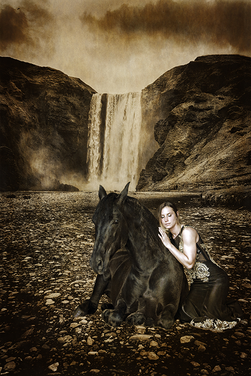
Original 1
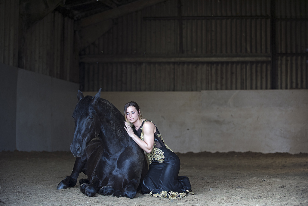
Original 2
About the Image(s)
My image is aimed to draw the viewer in to as imagine " stories " from the scene, hence i titled it The Dream ,as it could be ?
I used a Nikon D600 for the Icelandic Waterfall , and a D750 for Kat and the horse , both taken with hand held camera.
I used the Waterfall for the background, deciding to edit it to Mono , then cut out Kat and the Horse and pasted them onto the
background. I used Edit , Transform to resize them to scale .
I also used the dodge and burn tool , and added a sepia tone.
This round’s discussion is now closed!
10 comments posted
Hi Susan, The waterfall itself is a very nice image without additions. The toned monochrome is beautiful. The idea of a foreground subject is also good. But in this instance a few questions are raised. Your lovely model, Kat, and her horse look pasted into the picture. That happened because of a difference in lighting, contrast, and lack of shadows which would help 'glue' the girl/horse into the landscape. After looking at the scene awhile, my knees started to hurt in sympathy to the subjects kneeling in the river rocks. Having Kat and horse standing or riding with a shadow into the scene might 'feel' better. And who says they couldn't gallop through the air in an altered reality possibility?
I love this kind of thinking and the fact that you asked us to tell you how we see the image. We all learn and refine our work this way. I'm a bit jealous of the waterfall since I haven't been to Iceland.
Karl Posted: 01/06/2019 12:22:11
I love this kind of thinking and the fact that you asked us to tell you how we see the image. We all learn and refine our work this way. I'm a bit jealous of the waterfall since I haven't been to Iceland.
Karl Posted: 01/06/2019 12:22:11
Hi Karl, Thank you for your honest critique, and you are quite right about the lighting, contrast and lack of shadows.
I totally agree, i posted this image here as there was something that stopped me using it, and i am open to advice.
I liked my original idea and am so glad that you have pointed these out as well as giving me altered reality options.I'll go back to some images of Kat and play around.
Sorry about your knees! lol.
Iceland is highly recommended.
Posted: 01/06/2019 15:08:04
Daring adventure, Susan!
Great start to this image story. Several small options to consider:
1. Play with the "Luminance" and "Color Intensity" of Kat and her horse to align with the background imagery. In Photoshop: Image > Adjustment > Match Color > Image Options > Luminosity (then Color Intensity)
2. Disrupt the symmetry and centering of Kat and the horse. The asymmetry will create more interest and help form an elegant triangle among Kat, the horse and the waterfall. In the current view, the three elements are "crowding" each other. Each is similar in size and the placement does not create a triangle view.
a. For example, perhaps allow Kat's image to emerge from off of the side of the image
b. For another example, move the horse out from under the waterfall to avoid the illusion that the horse is "under" the waterfall.
You can do both symmetry-disrupting actions by making the foreground characters larger using the Transform tool.
I've done a very rough example attached (using my mobile phone on a crowded moving train, so forgive the crude work).
One last thing to experiment with: Less sky. I think the dark sky clouds unfairly draw attention to themselves. Also, the sky creates a third vertical layer above the foreground and mountain layers. Let's keep the story in the centre/lower-part of the image. The result will be three focal images (Kat-horse-waterfall) triangulated nicely on just two vertical layers (mountains/sky/waterfall as one level and the foreground as the second level).
Fun work. I think this could become a powerful image. Posted: 01/10/2019 23:40:49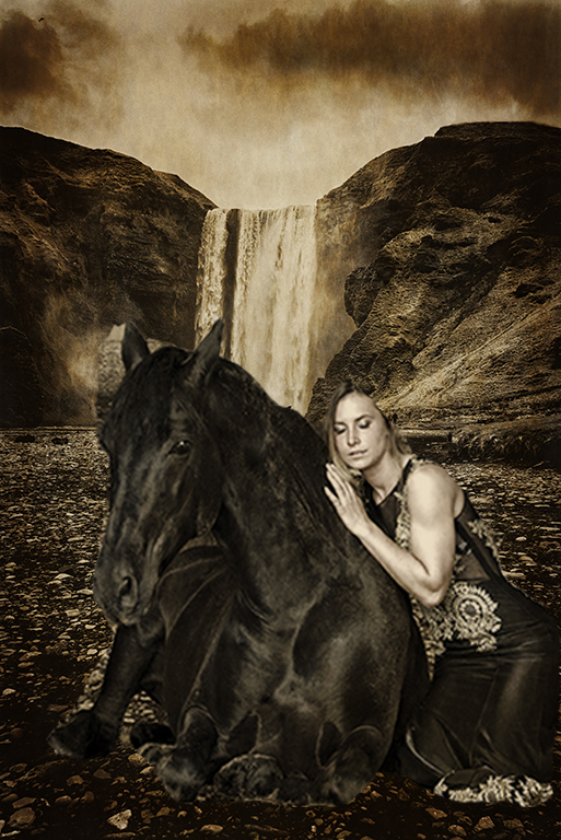
Hi Susan,
There is still so much for me to learn , and i am looking forward to trying out your suggestions on the raw files.
Composites are pretty new for me (as is obvious) yet i really enjoy trying to be creative.
I wasn't aware of the Luminance or colour intensity , and i must say you have done a great adjustment ,so i am now eager to use different directions.
I am very pleased with the feedback on my image. Posted: 01/11/2019 06:45:52
(Groups 57 & 77)
Hi Susan - I also love creating composites. I agree with the above comments for improving your composite - keep experimenting, I like your ideas.
I have made myself a short checklist that I use when shooting for composites. Top of my list is direction and type of light. I have found I can post-process for most other things - but getting the light the same in both images makes a huge difference to the finished image.
I look forward to seeing what you create next :) Posted: 01/16/2019 16:32:31
Hi Mary,
Thank you for your encouragement and advice.I shall also make a list for future composites.
I find i have lots of images that aren't usable on their own,as well as a vivid imagination. All i need now is the skill.
The pointers i have been given from this group here have helped tremendously , all are positive and much appreciated. Posted: 01/16/2019 17:38:53
Hi Susan...gorgeous image, but agree with Susan and Karl. Appreciate Susan's suggestions and example...great lesson - thanks Susan! I'm just starting out on composites too, so these tips are invaluable. I like what Susan has done with your image, although I would like to see the details of the horse bought out a little more perhaps. However, I appreciate this may be quite difficult in that she is so jet black. I wonder if it's possible to keep the ears against the contrast of the waterfall along the lines of the original, giving us more information re her form. Anyway, I really enjoyed what you tried to achieve in your composite and see that it has real potential. The waterfall image on its own was quite stunning as well! Look forward to more! Posted: 01/20/2019 17:02:47
Hi Valerie,
Thanks very much for your valid suggestions , and positive comments.
I agree, i will try to bring out some of the Horses details in Shadows and highlights on my original raw file , or maybe HDR in a diluted form.
As much as i like my waterfall image i feel that there is nothing to rest my eye on , and in my mind i have created this vision that i am trying to get balanced . I have enjoyed the groups comments, you have all inspired me to carry on with this creation.
Good luck with your composites, I look forward to seeing more of your work.
Posted: 01/21/2019 16:42:52
Susan, I have yet to attempt a composite, and I am dazzled by your concept and "pasting" of the subjects. The monochrome treatment really brings out the drama in the clouds and rushing water. I agree with Susan and Karl's comments, and I love the tonal adjustments Susan made. The waterfall looks huge. I might try contrasting the power and immensity of the waterfall with the vulnerability of the woman and horse by reducing their size a bit and moving them just a bit back and to the right. This image tells many stories! Posted: 01/29/2019 09:27:43
Hi Judith,
Your comment is much appreciated and noted. The ideas put forward here demonstrate how we all have different visions that would make this intended composite work . I now have lots to play with , and thanks to Susan H for advice on the tonal adjustments ,it has become a possibilty.
Posted: 01/29/2019 15:14:01