Sunil Mehta
May 2023 - Young family…
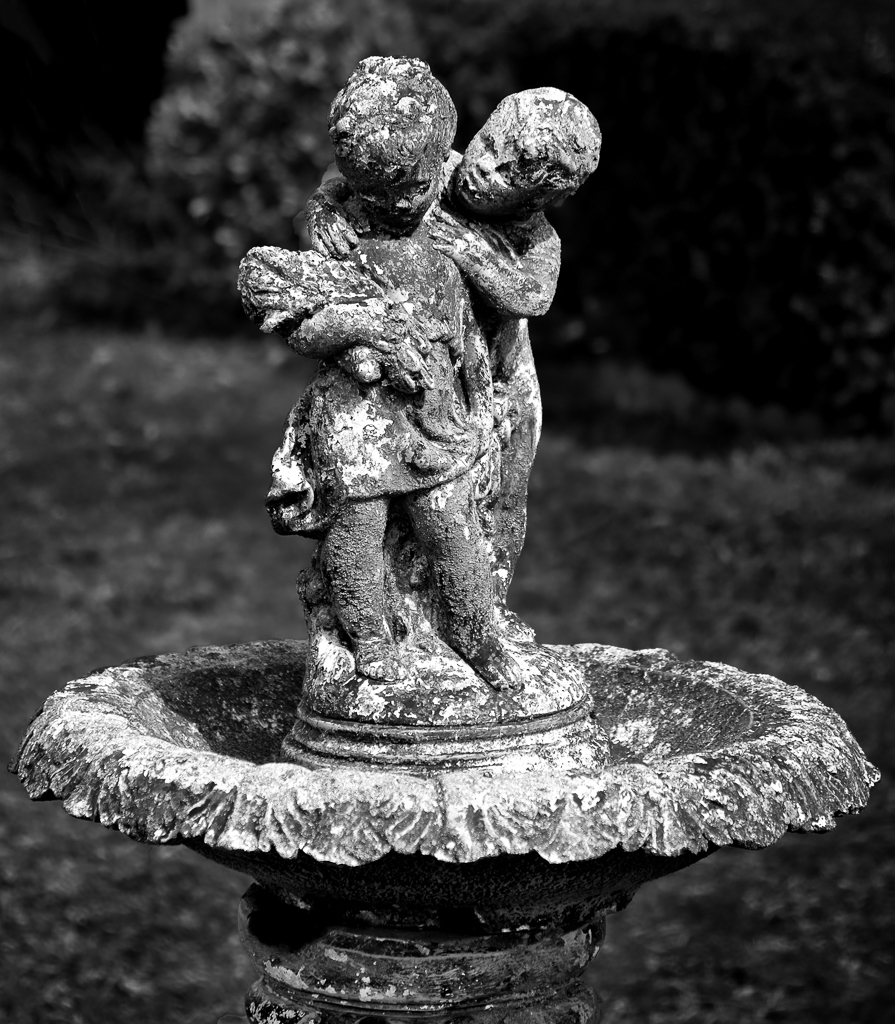
Original
About the Image(s)
Camera : Fuji XE-1
Lens: Zoom 18-55 at 55 (83mm)
Exposures: 1/1800; f/4.0; ISO 400
Was visiting family and this abandoned fountain was in the backyard.
Post processing,
Light room. PS and Tonality CK.
Cropped and used high the contrast setting for monochrome conversion.
This round’s discussion is now closed!
12 comments posted
It is a compelling subject, and I like the way it has been cropped. I also like the fact that the heads are in focus. I'd like it still more if, somehow, the front part of the ring at the bottom could also have been in focus. Posted: 05/03/2023 06:46:22
Agree Robert,
Extra f stop required, was focusing on the face and failed to visualize the final, was free that morning and had time on hand to experiment, also did not set on RAW also resulted in difficulties in recovering highlights.
Posted: 05/07/2023 20:53:46
Extra f stop required, was focusing on the face and failed to visualize the final, was free that morning and had time on hand to experiment, also did not set on RAW also resulted in difficulties in recovering highlights.
Posted: 05/07/2023 20:53:46
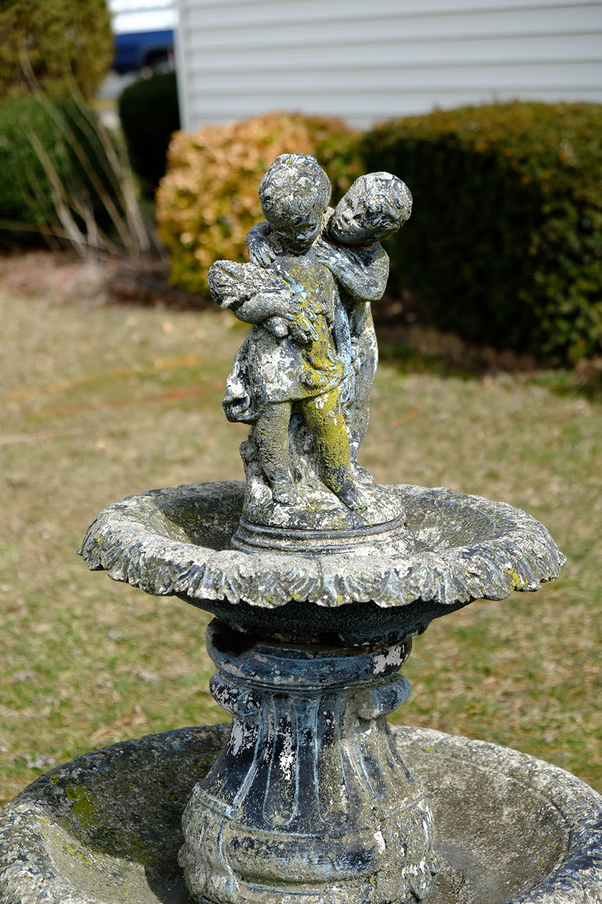
Sunil, love how you took a brightly colored image and turned it into a fab monochrome (as always).
A couple of ideas....I do think the top of the ring at the bottom is a bit hot. So I would darken it just a bit. I'm also a little sad that part of the left face is in dark shadow. If you could lighten it just a bit, I think it would bring us more into the image. Posted: 05/04/2023 20:55:51
A couple of ideas....I do think the top of the ring at the bottom is a bit hot. So I would darken it just a bit. I'm also a little sad that part of the left face is in dark shadow. If you could lighten it just a bit, I think it would bring us more into the image. Posted: 05/04/2023 20:55:51
Brenda,
Attached changes as suggested. Posted: 05/07/2023 22:18:16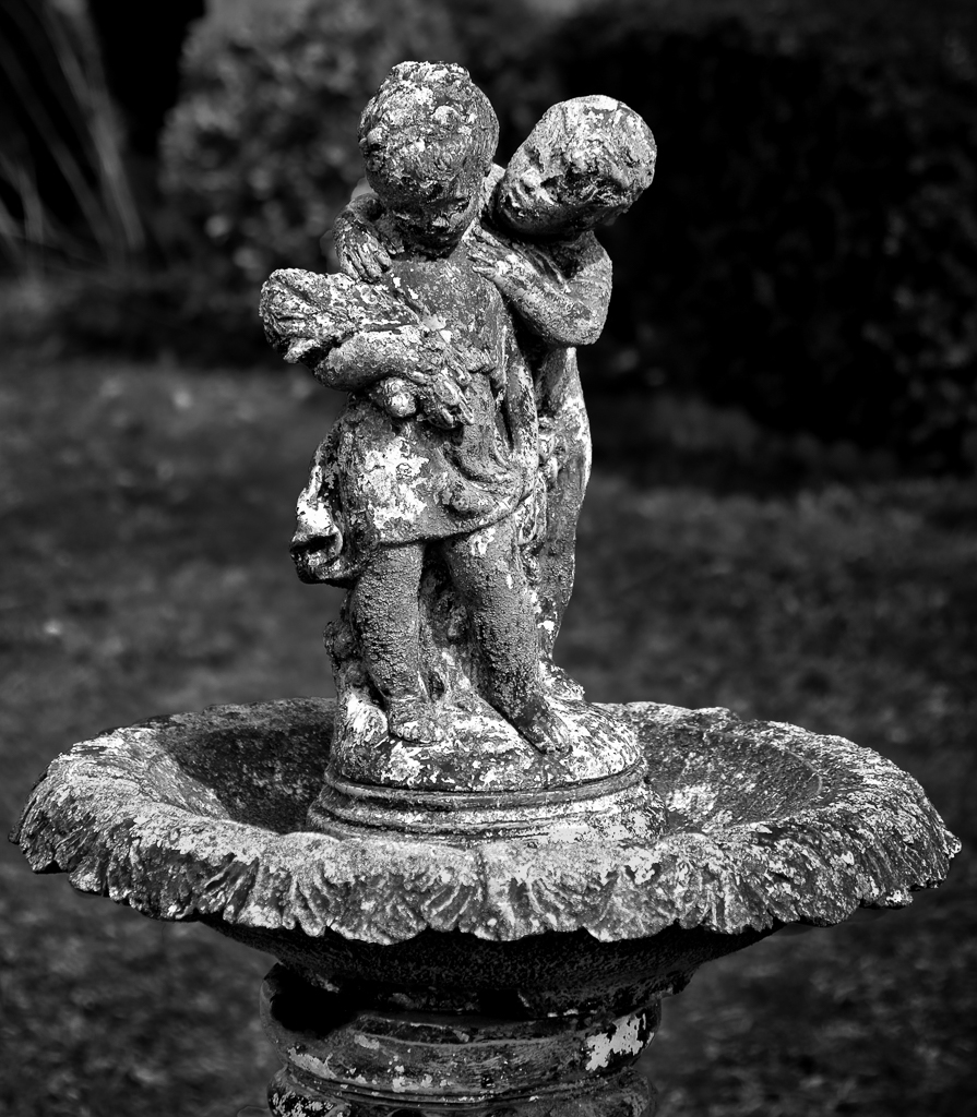
Attached changes as suggested. Posted: 05/07/2023 22:18:16
Nice conversion. And, as has been said, I would brighten the left face. Posted: 05/06/2023 07:21:54
Jim,
Thanks, I tried, check attached image in replay to Brenda. Posted: 05/07/2023 22:20:09
Thanks, I tried, check attached image in replay to Brenda. Posted: 05/07/2023 22:20:09
As echoed by others already, Sunil, your monochrome conversions are always a joy.
I offer the same comment on brightening the left face, and darkening the top-leading edge of the bowl.
Additionally, darkening the entire background just a touch more might help make the statue/fountain stand out even further. Especially darkening the top-left in the area where the brighter-colored bush is such that it's brightness and contrast levels are similar to the darker-colored bush to its right may help it compete less with the figurine on the left of the statue. Similarly, darkening the bottom half of the background so it contrasts more starkly with the bowl might help the subject stand out even further. Posted: 05/07/2023 08:31:05
James,
Thanks for suggestions, appriciate.
I tried, attached. Posted: 05/07/2023 22:34:43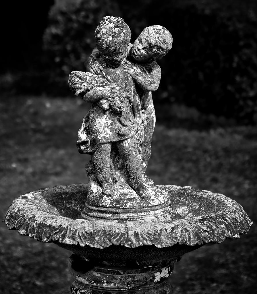
Thanks for suggestions, appriciate.
I tried, attached. Posted: 05/07/2023 22:34:43
Very nice rework, Sunil.
The figurine and the bowl look very nice in the rework.
After seeing it, I actually agree with Terry in that I preferred the lighter background despite having believed I would prefer the darker background. Posted: 05/11/2023 21:06:04
The figurine and the bowl look very nice in the rework.
After seeing it, I actually agree with Terry in that I preferred the lighter background despite having believed I would prefer the darker background. Posted: 05/11/2023 21:06:04
Hi Sunil, it's pretty much all been said. The last iteration looks good for the figure but I preferred the previous version's lighter background.
Posted: 05/08/2023 10:18:42
Posted: 05/08/2023 10:18:42
Thanks Terry Posted: 05/17/2023 19:34:38
Nice rework, Sunil! I agree that the lighter background was the right choice originally! Posted: 05/17/2023 17:53:14