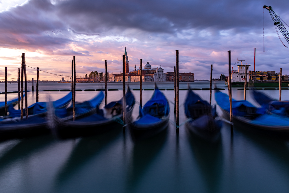
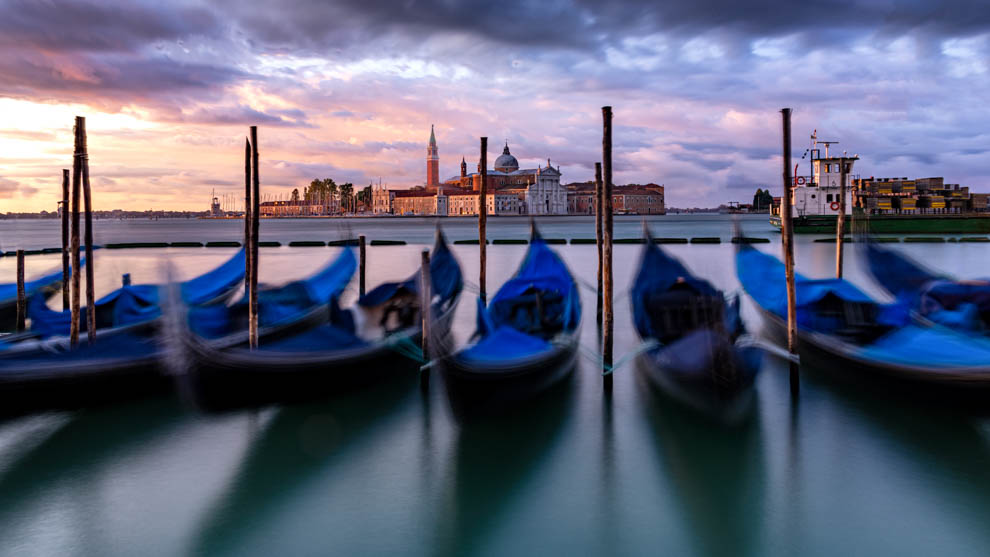
I was confused at first with the out of focus but then saw the far buildings and realized what was being portrayed. I like it. Posted: 12/01/2019 11:28:14

Brenda Fishbaugh
Thanks, Alan. I wanted it to be out of focus enough you knew it was on purpose, but still could make out what you were seeing. Did you recognize them as gondolas? Or were they not identifiable? Posted: 12/01/2019 17:30:58
Sunil Mehta
Very nice image, more I see more I like it. It has the early morning look and feel about weather. Yes, this is how Venice is you have captured very well in this image. Posted: 12/01/2019 21:30:01
Brenda Fishbaugh
Sunil, In a new post all the way at the bottom, I tried a different view with the moving gondolas and removed most of the poles. Three different examples are below. What are your thoughts? I appreciate your expertise! Posted: 12/25/2019 19:02:59
Sunil Mehta
Removing poles is a good idea but i will go with original post. I did not like Vertical & BW.
Original image without poles will look good, also try 16:9 crop as suggested by Jason, that too will look good. Posted: 12/26/2019 23:23:36
Brenda Fishbaugh
Sunil, head down to the very bottom--I've added the tower to the 16:9 crop. Thoughts? Thanks so much! I appreciate your expertise and experienced eye! Posted: 12/27/2019 20:03:18
Hi Brenda. It has good mood in the picture. The color looks pretty good, and the exposure is well controlled.
Couple of thoughts.
1) The overlap of the tower. I guess there must be many photographers there and it might be hard to adjust position. I might move a little bit to avoid that if possible.
2) Can you elaborate on the purpose of getting your camera low. I might try a higher position.
3) For the gondolas, I think that the blurry not enough. I might try a longer (or even much longer) exposure with darker filters. If it is really a quiet morning with no waves, taking a snapshot might be another option.
4) With gondolas getting that much space in the composition, I feel that it might be better to be sharp. With that much blurry (but not so blurry) area, I might crop out the shadow.
Again a nice picture, and you are the expert of long exposure...Cheers.
Posted: 12/01/2019 22:36:39
Brenda Fishbaugh
Thanks for your thoughts! I have more pix that are more blurred, so I'll try those up here in the next few days. And I have a pic from another angle, I will post those also. Yes, it was a big stretch to post a blurred pic...just trying to do something different. The water was rough and choppy, its the ocean, coming straight into a city. The post and tower is completely my fault, as the poles bob around and I didn't catch it moving into the tower. Posted: 12/10/2019 08:03:39
Brenda Fishbaugh
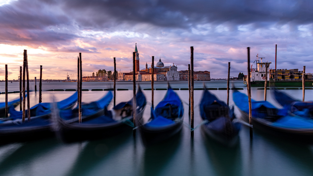
Richard, Thanks SO MUCH for your notes. I finally had some time to work the pix and chose a different view and used the "content aware fill" that Abdo taught me last month and removed a lot of distractions--and the tower doesn't have a pole through it. I have posted three photos in a new post, let me know your thoughts on them. It is a single image, and I could blur the boats more if you feel they are not blurry enough. Posted: 12/25/2019 19:07:13

Larry Treadwell
(Groups 36 & 67)This is an interesting effect, but not really my personal preference. What you did worked well, but maybe could be a bit more blurred.
I have several crop suggestions. First the boat pole that merges with the tower might be adjusted to separate the two of them. Since the boats are the real subject maybe give them a bit of breathing room at the bottom edge and use their shadows to create leading lines to the boats. I would crop off the crowd of poles on the far left and the partial boat on the far right. The poles look very busy and the partial boat (since it is so small) looks lost. By cropping some of the dark sky you drive more attention to the boats and also help to shift the horizon line out of the middle.
Opps---maybe just barely crop off the pole on the right in my attached image.
Just some things to think about. Maybe try some variations andsee what you like.
Posted: 12/05/2019 14:02:55
Brenda Fishbaugh
Great ideas, Larry! I have more pix that are more blurred, so I'll try those up here in the next few days. And I have a pic from another angle, I will post those also. Yes, it was a big stretch to post a blurred pic...just trying to do something different. The water was rough and choppy, its the ocean, coming straight into a city. The post and tower is completely my fault, as the poles bob around and I didn't catch it moving into the tower. I was trying for a wide landscape, but I think your idea of cropping tight and minimizing poles and bringing attention to the background helps my composition. Thanks! Posted: 12/10/2019 08:05:55
Brenda Fishbaugh
Larry, thanks so much! I just got a new computer, then travel, then a cold...so sorry to take so long to respond about this and the clouded leopard suggestions you made.
All the way at the end of the comments, I have added a different view with the moving gondolas and removed most of the poles. Three different examples are below. What are your thoughts? I am so appreciative! Posted: 12/25/2019 19:10:49

Terry Walters
You seem to have achieved what you set out to do, so that's good. I'm not a great fan of blur but am learning that it has a place, and this is a good example of where to use it.
The pole overlapping the tower is covered by Richard, and I would also look to do something with the top left corner, however the crops suggested resolve that.
Going higher to stop the overlap risks splitting the image into two, especially with the strong difference between blur and sharp, and be careful not to get the horizon bang in the middle.
Overall I'd crop some off the top but leave the rest, making the boats a more dominant subject that justifies the movement capture with blur. Posted: 12/07/2019 12:37:50
Brenda Fishbaugh
I didn't catch I had put my horizon line in the middle! Will try some different crops! Will post in the next couple of days. Thanks! Posted: 12/10/2019 08:07:34
Brenda Fishbaugh
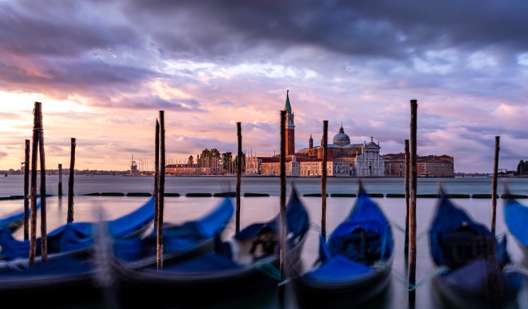
Terry, thanks so much for your comments. I used a different photo, cropped in so it was more focused, as you suggested. I removed a lot of poles. I do have the horizon line in the center. Should I lose sky or water? Do you like the three new versions I posted at the bottom of the post? Thanks for taking a look! Posted: 12/25/2019 19:14:24
Man, you were getting some fantastic light that day. I love the colors in this image in the sky and buildings.
I'm ok with the motion in the boats and I think this is a creative take on this classic Venice scene.
I was also bugged by the overlapping tower but not much to do about it after the fact. I was thinking that this seems a very cinematic scene so maybe a 16:9 crop might be a nice composition for this photo. It remove some of the top and bottom and brings the eye through the frame to the buildings.
Posted: 12/07/2019 15:28:29
Brenda Fishbaugh
Jason, Thanks so much for your crop. Do you have an article on when to use what crop? You always have interesting crop suggestions for me. I do have another couple of views of this scene I am going to work and post and see if I can incorporate everyone's suggestions. Posted: 12/10/2019 08:11:02
Brenda Fishbaugh
Jason, love having you in this group! I agree the pole through the tower is a fatal flaw--I couldn't see the problem with the poles bobbing in the dark. I chose a different view and then removed a lot of the poles. I'd love for you to take a look at the three photos I posted at the very end of this thread and see if you think they have more promise. do you think I need to crop to remove the horizon out of the middle? Thanks a million! Posted: 12/25/2019 19:22:48
I don't know of one off the top of my head, but sounds like a great idea for a new article!
I think a widescreen (16:9) crop works well when the main elements / subject are more in the center across the whole frame like this. Posted: 12/11/2019 17:30:10
Brenda Fishbaugh
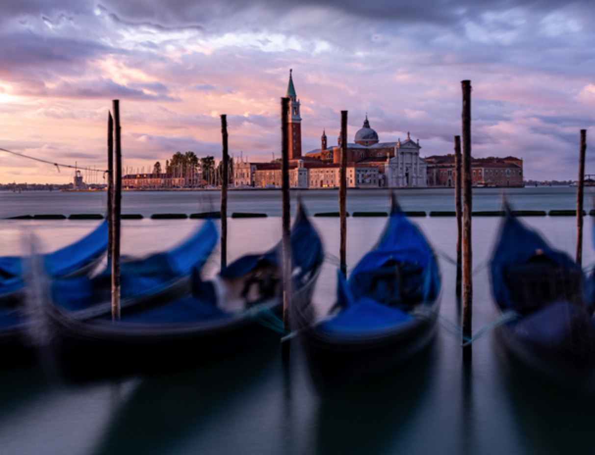
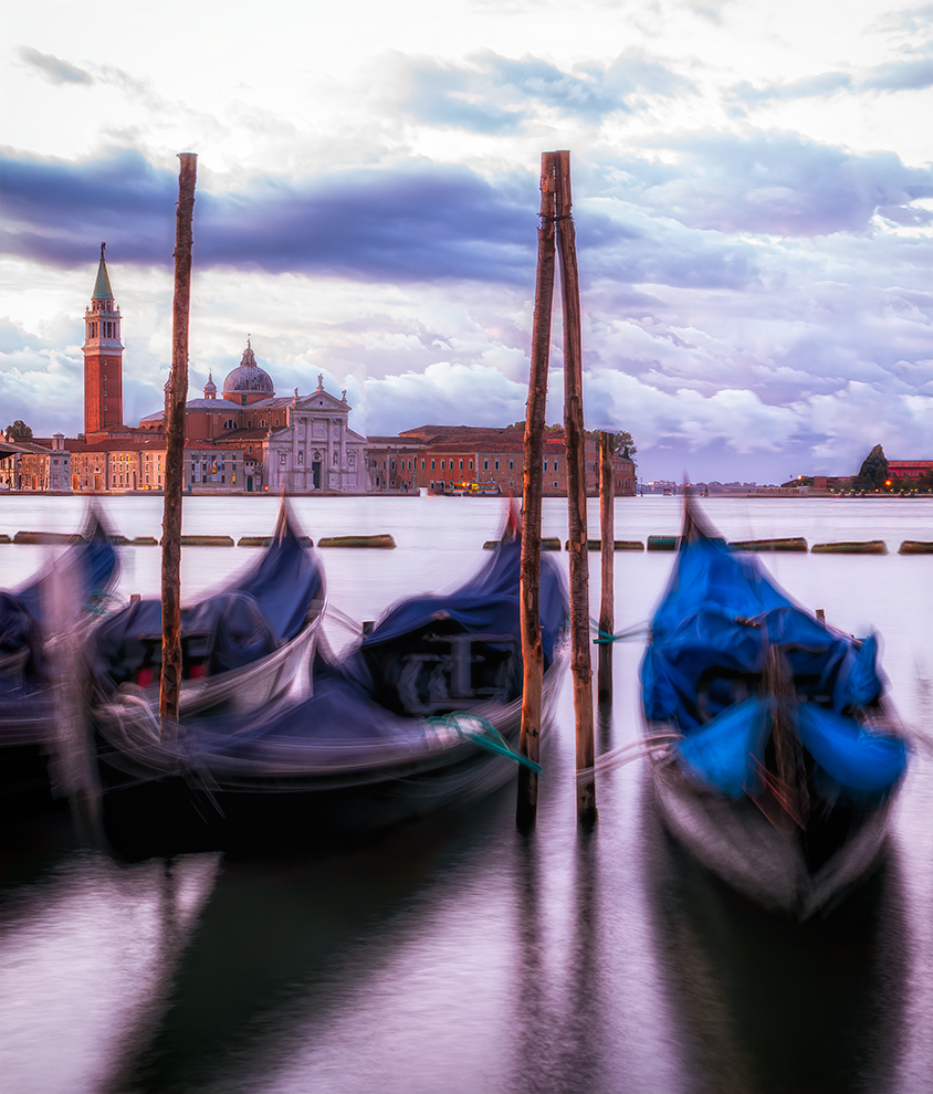
I took in everyone's thoughts on my experiment, and pulled another photo, where I was able to remove most of the poles. I cropped it into a vertical, which I think made the church more of a focus. Here are three renditions of the idea to see if this is better. Thanks so much!
Posted: 12/25/2019 19:00:14
Brenda Fishbaugh
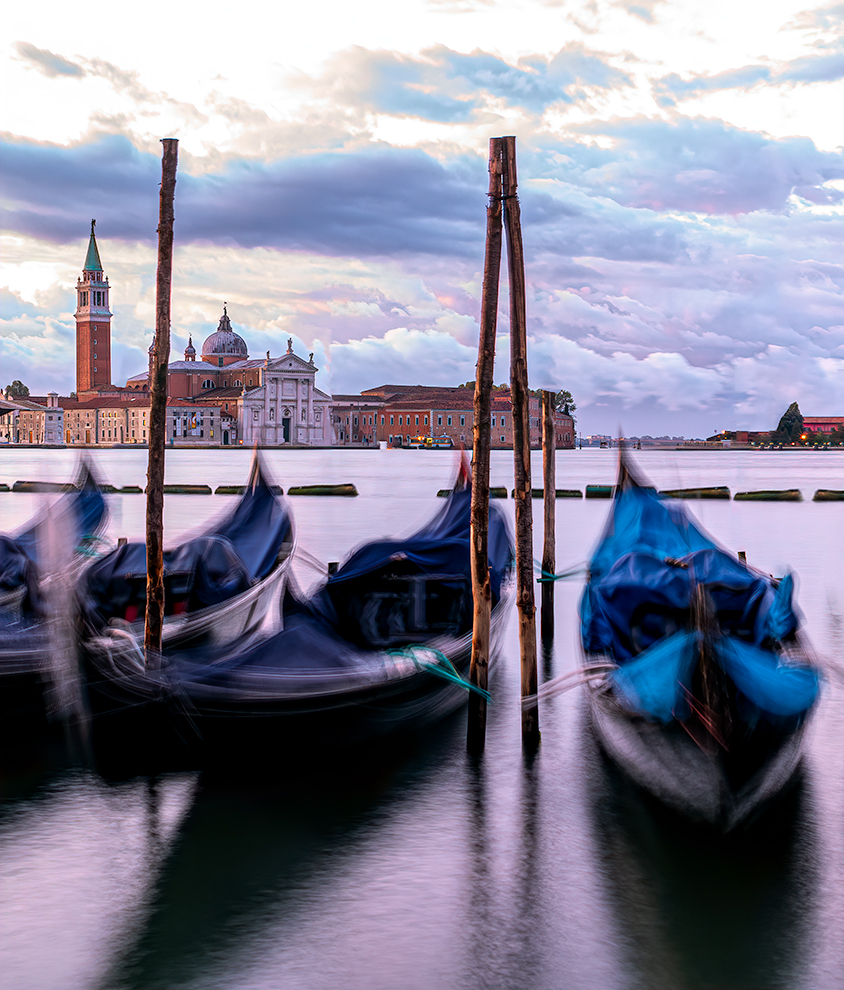
Posted: 12/25/2019 19:00:44
Brenda Fishbaugh
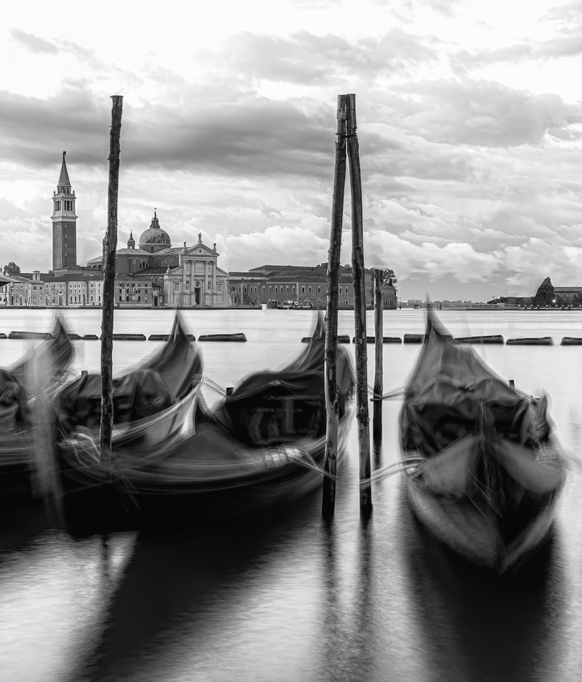
Posted: 12/25/2019 19:01:00
Larry Treadwell
(Groups 36 & 67)I think I like this one best of the vertical shots. Overall the horizontal is a better composition. The color vertical makes the boat on the far right such a dominate force that it is disturbing. However the B/W I think works for what you are trying to accomplish. Posted: 12/26/2019 21:03:36
Brenda Fishbaugh
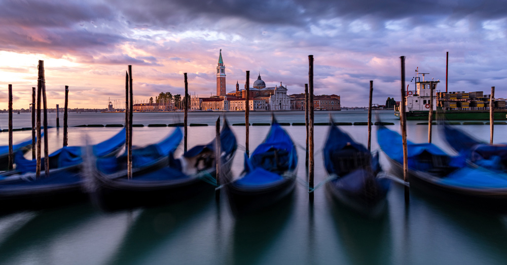
Larry, thanks for your thoughts on my vertical. If you head to the very bottom of this thread, I've gone back to the horizontal, turned it to a 16:9, copied the tower from the vertical (my first time, is it believable?) and I've removed some poles to increase the church view. What do you think of my latest version? Thanks again for your expertise! Posted: 12/27/2019 20:06:23
Terry Walters
I preferred the original format, for me these crops have lost the essence of movement amongst the gondolas. If the objective was just to get a clean view of the tower then why not take the tower from here and put it in the other image?
Of the 3 crops I would vote for number 3, mono has brought back the shapes to the fore.
Posted: 12/26/2019 07:35:29
Brenda Fishbaugh
Terry, thanks for the tower add--I've never done that. Check out my latest post at the bottom of the thread and tell me if its believable. I've removed some poles. I've gone to a 16:9--would you chose more sky and lose water? I chose this crop to keep the horizon out of the middle and make the blur more of the subject. Posted: 12/27/2019 20:10:02
Good thinking Terry !
The replaced tower looks natural and makes for a stronger image.
Brenda, I also agree with Terry that the horizontal image is better than the vertical. The vertical is good and seeing that alone I'd find it to be a quality photo -- but seeing it in comparison to the wider view and it seems closed in or too closely cropped to me. Posted: 12/27/2019 13:54:02
Brenda Fishbaugh
Jason--check out my latest post--a 16:9--do you think I should have cropped water and left sky? And I've added Terry's tower (my first add--it is believable?). And I've removed a bunch of poles. Thanks for hanging with me on this! Posted: 12/27/2019 20:07:59
I like this edit Brenda. The tower position is believable to me , the crop looks good, and the removal of the poles helps to create a cleaner image. Posted: 12/29/2019 16:39:40
Brenda Fishbaugh
Here's my next edit--its a 16:9--do you like where I've chosen to leave more water and remove sky or should I reverse? Trying to keep horizon out of center--is that critical in this photo?
I've added the tower--thanks, Terry! Does it look believable? And I've removed some poles to increase the view. Thoughts? Thanks a million, guys!
Posted: 12/27/2019 20:02:13
Terry Walters
Looking good to me, the removal of more posts means seeing further into the picture becomes easier on the eye, and does change the flavour of the scene, if that's what you want to viewer to do.
My final comment will depend on your philosophy and the truthfulness of the image, so far all the changes are believable and anyone who has been there would recognise the scene as what they remember. Now the view is clearer I don't like the white cabin boat passing on the right so would like to do something about it, remove it and clone some sea, but that would alter the truth completely. Unfortunately just updated PS to 2020 and now it doesn't work! Posted: 12/28/2019 07:17:11