Connie Reinhart  


Fall Colors by Connie Reinhart

November 2020 - Fall Colors

November 2020 - Connie Reinhart

Original

About the Image(s)

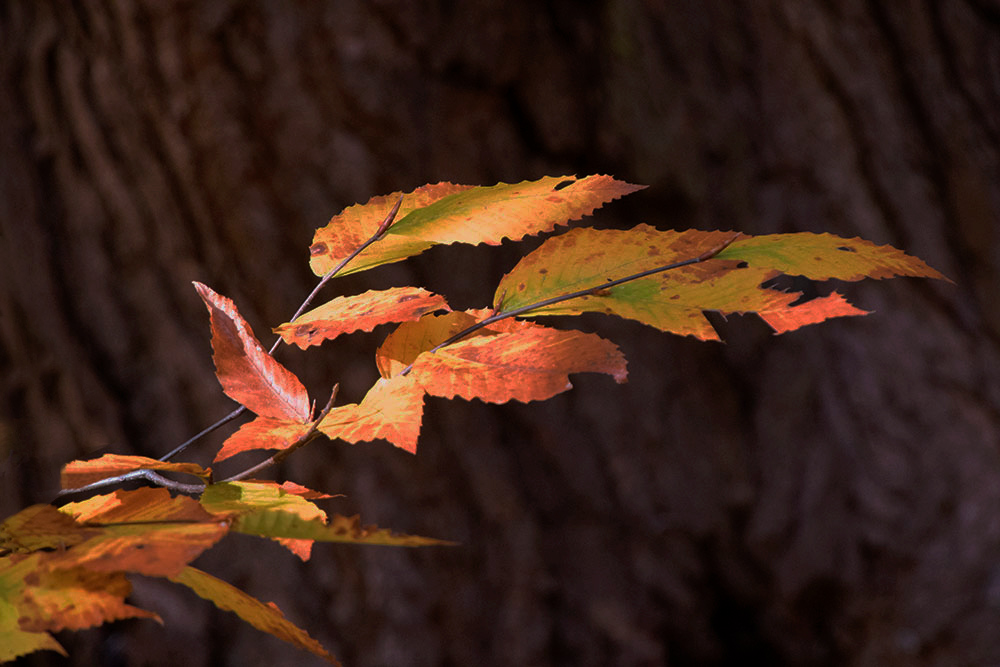
The Pocono Photo Club has been having virtual ‘shoot outs’. The subject is assigned, the date set. The photographers choose where to take the photos “ slogging around in a bog or the comfort of the kitchen table. October 17 was “Fall Colors”. This was one from our back yard. The back lighting made the leaves glow with a golden light; the dark bark made a good background. Not knowing how to meter this, I just shot on auto to get a starting point. But that looked good, so I stopped there. F/7.1, 1/160 sec. at ISO 10,000. Hmmm. That’s pretty high, but the results are OK. The original was flat, not at all what it looked like in real life. Processed through PS; all adjustments on a separate layer. Topaz AI Clear, Topaz Precision Contrast, Topaz HSL Color Tuning, NIK Color Effects contrast color range.


This round’s discussion is now closed!
7 comments posted


Georgianne Giese   Georgianne Giese
This is a nice fall color shot. You were quite successful in bringing out the glow of those sunlite leaves.

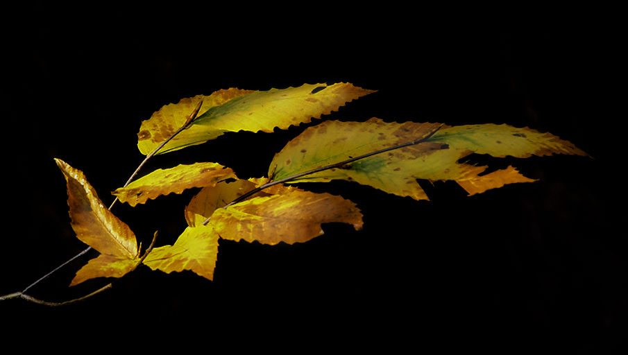
to me, the image lacked a story, a punch. I decided to play with it, to bring out the story it tells, more clearly. What was needed, in my opinion, was to bring out the bark in the background. Though it is just the background, without accentuating it clearly, there is just too much dark space, in my opinion.

I selected the subject (Select > Subject), tweeked the selection to include all of the golden branch leaves; duplicated the layer of the selection (Ctrl J); applied an Exposure adjustment layer on a layer beneath the leaf (subject) layer and moved the sliders of the Exposure complex up a little, on all three sliders. That brought out the detail of the bark while muting it a bit.

here is the result. I don't know if you'll care for it, but to me, it told a better "woodsy" story of fall.   Posted: 11/02/2020 11:46:44
Comment Image


Denise McKay   Denise McKay
Your edits did a nice job of bringing out the warm glow of these beautiful leaves. I like the composition of the branch leading us into the frame from the left. I feel the bark of the tree is a great backdrop for this shot as it makes you feel as if you are taking a walk through some shady woods and you've stumbled upon a branch struck by a ray of sunlight that was able to break through.

Very nice, simple fall image in my opinion.   Posted: 11/02/2020 15:15:28


Colorful autumn leaves are always a joy to behold. And the bark as the backdrop was an excellent choice that helps with the story.
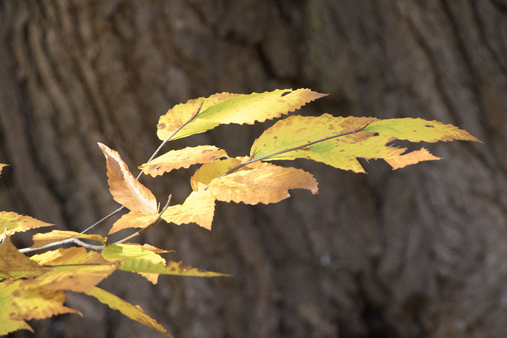
My color preference is for reds and oranges, so I shifted your photo in that direction. I started with your original and in PS added 3 adjustment layers: Levels, H&S (masked onto the leaves), and Brightness and Contrast (lowering both values). I also cloned away some of the distractions in the left hand corner. Not the reality, but…
?   Posted: 11/05/2020 20:50:51
Comment Image
Connie Reinhart   Connie Reinhart
I was considering changing the tones to the red family. But what captured my eye the the beautiful golden color of the back-lit leaves. But I like your reds, too. Unlike painters, we can easily make these changes. But then how do we choose?   Posted: 11/14/2020 10:27:53


Linda M Medine   Linda M Medine
I love fall colors and all the trees that is producing beautiful leaves. I think this images has impact. I made a few changes to make the beautiful leaves standing out. I cloned out the cluster of leaves in the left bottom corner and went into camera raw and work with the color of the leaves and made the background black.   Posted: 11/10/2020 19:50:48
Comment Image
Connie Reinhart   Connie Reinhart
Oh! Removing those extra leaves really puts the emphasis right where it should be. Thanks.   Posted: 11/14/2020 10:28:44


Connie, Your simple composition and the sunlit gold say fall. I prefer the gold tones as opposed to the reds for this small branch of leaves. Because the background is not in focus, allowing more of the tree trunk's texture into the image does not distract from the leaves. Or, you can do as others have suggested and pretty much completely separate the leaves with a darker background. To my taste, both alternatives work as does removal of some of the lower left leaves. You could print each alternative and all would be stunning with those beautiful leaves.   Posted: 11/18/2020 18:48:37