Connie Reinhart
September 2020 - Still Life
Original
About the Image(s)
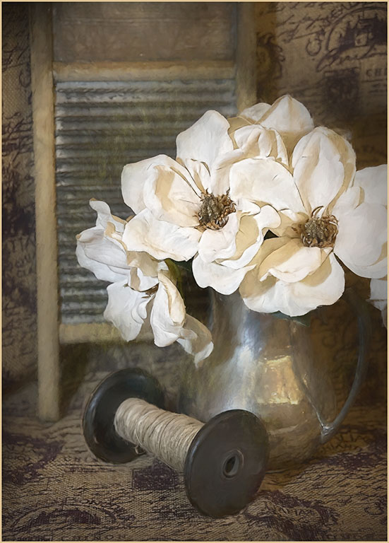
This image was taken at a photo conference a couple of years ago. I was attracted by the arrangement of ordinary household items. I’ve worked on it on and off for 2 years, never quite satisfied. I could see it as an oil painting, and tried to get that effect.
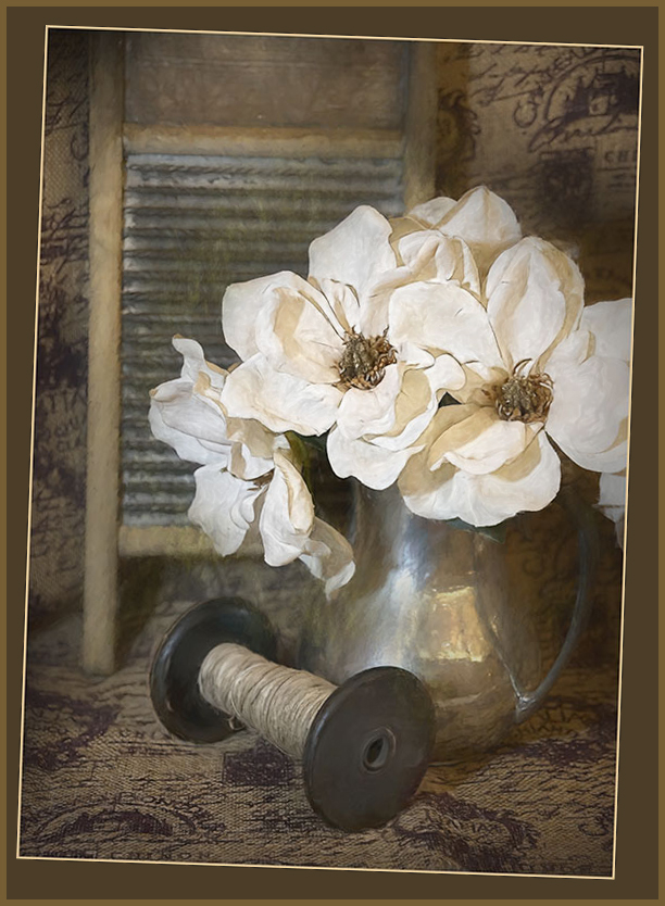
Processed in PS and Topaz. First AI clear, then precision contrast and precision detail, burned in the hot spot on the pitcher. So far, so good. Then a stamp up layer in case the next steps looked awful. Added a brightness/contrast adjustment layer, and underpainting filter in PS, dark glow in Topaz, a textured vignette. Another stamp up, just in case. The final touch was Impression in Topaz using stroke 1 with the original as background. The stroke border is just to make it stand out against our black background. Perhaps if the image requires this much work, I should choose another image. Comments, please.
This round’s discussion is now closed!
10 comments posted
(Group 43)
(Group 32)
I really like a lot about this image. The finished image is very pleasing and successful. I think you got what you were after. I like the arrangement of shapes and textures very much.
My only suggestion is to consider that the objects do not relate to each other or tell a story together--consider arranging the ewer with a batch of freshly cut flowers lying on the drape and a pair of scissors. Just an alternative for another composition. Posted: 09/02/2020 00:40:33
However, I am wishing the edge of the flower petals on the far right were in the picture as well. If you did that, you'd probably have to add some space on the left to balance everything out again; or maybe not. But just a thought. Posted: 09/02/2020 15:29:55
Connie, you wrote: "Perhaps if the image requires this much work, I should choose another image." An interesting thought… In my mind, it asks: can the camera or mother nature produce fine art images? Or are they made by the "artist"using their skills and their vision? As you can probably guess, I believe artists make fine art.
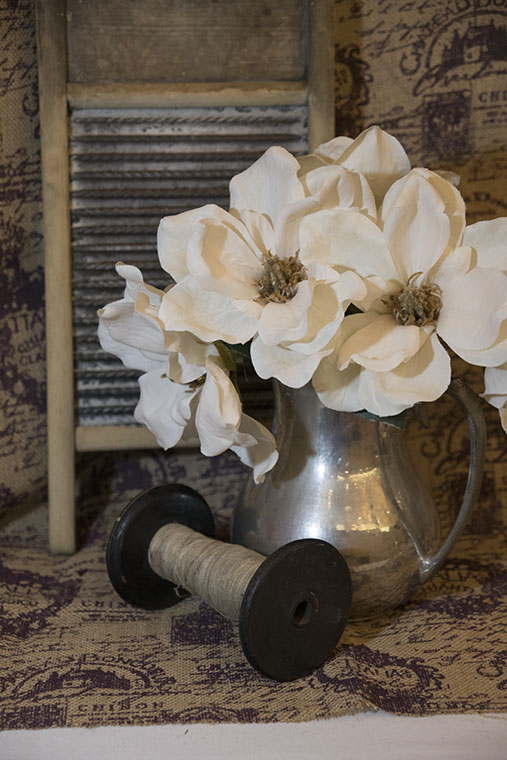
I really like the image you chose this month. Great DOF, lots of interesting objects and textures, a lovely muted color range, and excellent lighting. On the other hand, it seems to me that the flowers (the main subject) look synthetic, rather than real. I also find the angle of the washboard problematic - neither vertical nor enough off-vertical to make it seem purposeful.
So, here's a creative straightening job - a double frame, since I didn't want to cut off any of the flowers. Also, I added a "plastic wrap filter" (masked) only on the flowers (at 30% opacity) to add some "texture" so they looked more real to me. BTW, I found this filter while checking out the "underpainting filter" that you had written about. Thanks for sharing. Posted: 09/02/2020 18:56:29
I sometimes create two entirely different looks for an image, so I can take the time to consider which one best tells the story.
I don't find the objects in your image disparate - I feel your processing has pulled them together. The objects are old, the flowers fresh. A great story :) Posted: 09/09/2020 22:32:14
The only thing that bothered me about the image, is that there is not a uniform 'blurriness' or softening of the background on the plane of the washboard. The center of that plane is soft while the edges are sharper on the same plane. To my taste, all parts of the background would look better if they had the same degree of softness. Posted: 09/25/2020 20:02:59