Cecilia Clark
August 2020 - Lost in Thought
Original
About the Image(s)
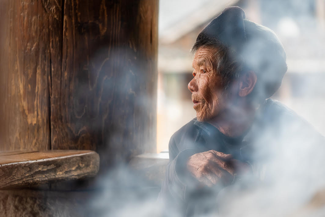
Last October, I was on China on a photo tour. This image was not one of the scenes set up by the tour guide. In fact, we had been given free reign to photograph Zhaoxing Dong Village in Guizhou province. It was a cold day and this person and several others were warming themselves near the fire under the Dong Tower. (The ethnic group is Dong. Each Dong village has several Dong Towers that are community gathering points.) I was hanging around watching for something interesting. Anyway, it was time for our group to go when I noticed the dreamy look and how the smoke was enveloping him/her. Everyone else was headed toward our minibus while I took this photo. Nikon D750, 70-200mm lens at 160mm focal length, ISO 800, f/4.0, 1/250.
In LR, I adjusted the exposure and contrast. I darkened a hotspot on the window sill. I also darkened the lower right corner of the image. I exported to PS. From there I used Luminar 4’s “soft and airy” look (modified) to obscure the background visible in the window opening. Back in PS, using a mask, I removed the effect from the person’s face and hand. In another PS layer I used a brown color similar to the other woodwork to paint the opening on the left side because it was too bright.
Back in LR, I again adjusted the exposure, used the brush to reduce the highlights at the edges of the window opening, sharpened, and added a slight vignette.
This round’s discussion is now closed!
5 comments posted
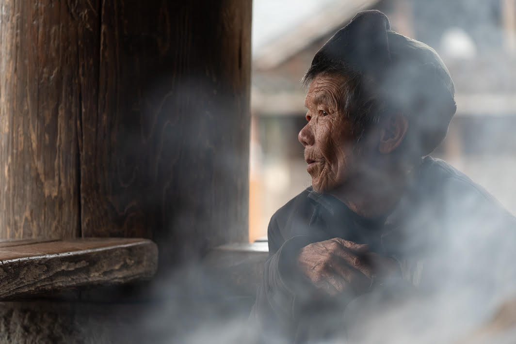
In my opinion, there is much too much visual weight on the left. The intensity and tone of the color on the wall picks up the color on her hands and face, and pulls ones eye away from her, toward the wall.
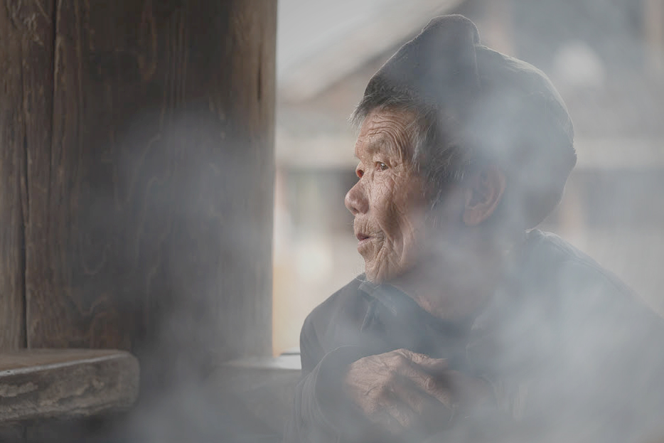
Starting with your original (which I prefered), I handled the window background by adding a Levels adjustment layer in PS. I moved the sliders around until the smoke obscured the background better. then I painted with black, with a soft brush at 50% opacity, on that layer mask, over her face, to hide half of the adjustment there.
Next, I added a Brightness/Contrast adjustment layer, to tone down the brown wall. I took both sliders down to the left end, and then, once again, I used a soft, lower opacity brush to paint over her entire face in black, so as to hide that layer's adjustment there.
An image on the monitor is emitted light, so it is always brighter than the reflected light on a print. This image, with my adjustments, was too dark. To correct for this, I added another Brightness/Contrast adjustment layer, and brought up the brightness of the entire image, just a bit.
Finally, I cropped the image, to get ride of some of that remaining visual weight on the left, and emphasize this wonderful woman's face.
Secondly, I Posted: 08/02/2020 12:19:28
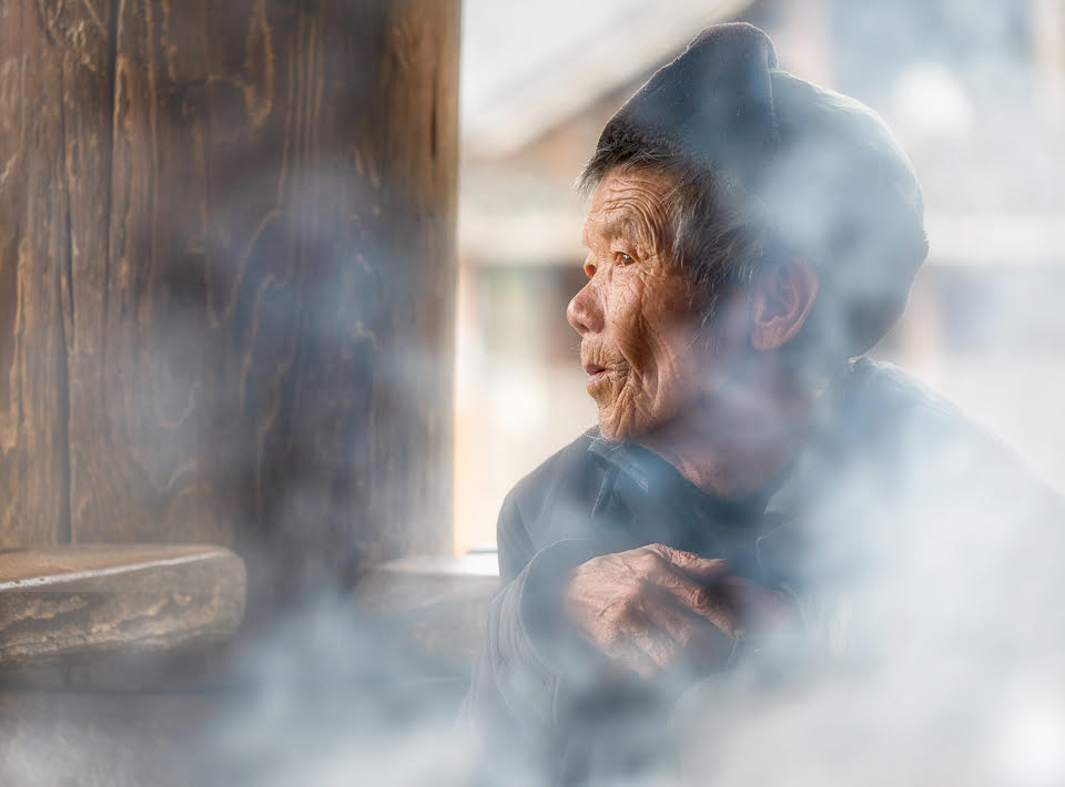
I agree with Georgianne that I like the tones of the original image better than the edited version. I do like the exposure adjustments on her face and hand.
When someone is looking into the distance, I have a tendency to want to give some room to that area (to the left side), so I'm a little torn about cropping in there. Does it lend more to the story to have more room to gaze into, or does focusing on her expression work better? I think it's a toss-up for me.
Excellent image! Posted: 08/03/2020 07:11:57
(Group 43)